Finding, Downloading, and Mapping Census Data
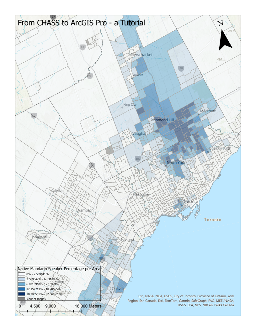
The CHASS Canadian Census Analyser allows members of the University of Toronto research community to generate custom tables from the Census of Canada (1961-2021) and the National Household Survey (2011). The interface enables the selection of relevant variables and census geographies, providing access to data down to the dissemination area (DA) level. If you would like to know more about downloading specific datasets from CHASS, please see our Downloading data using CHASS Canadian Census Analyser tutorial. For this exercise, we will explore how to incorporate and visualize census data through a ArcGIS Pro's geospatial framework. For this example, we will map the percentage of people whose mother tongue is Mandarin living in the Toronto Census Metropolitan Area (CMA) by census tract (CT) based on the 2021 Census Data.
In this tutorial, we will cover the following topics:
B. Download the census boundary files
D. Colour code the data to create a thematic map
E. Additional descriptive elements
A. Download the census data
-
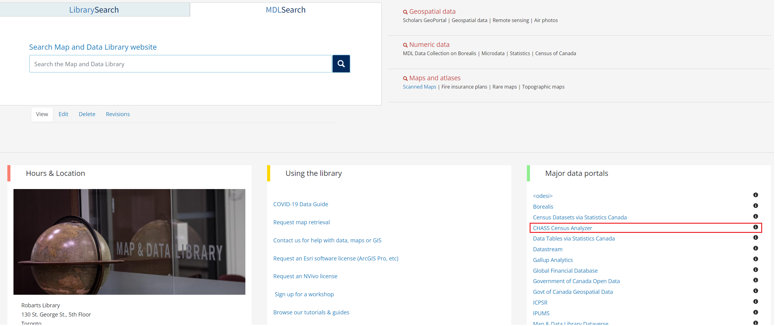
Access CHASS Census Analyzer, either through the link provided here or by visiting the MDL homepage and clicking on "CHASS Census Analyzer" under "Major Data Portals".
-
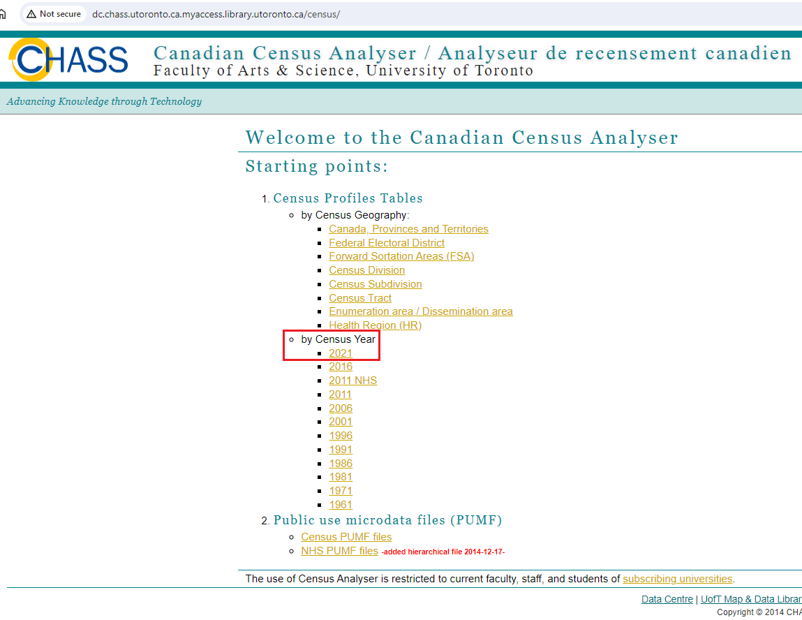
We see two options for obtaining data, by geography or by year. Since we want Census data for 2021, click on 2021.
-
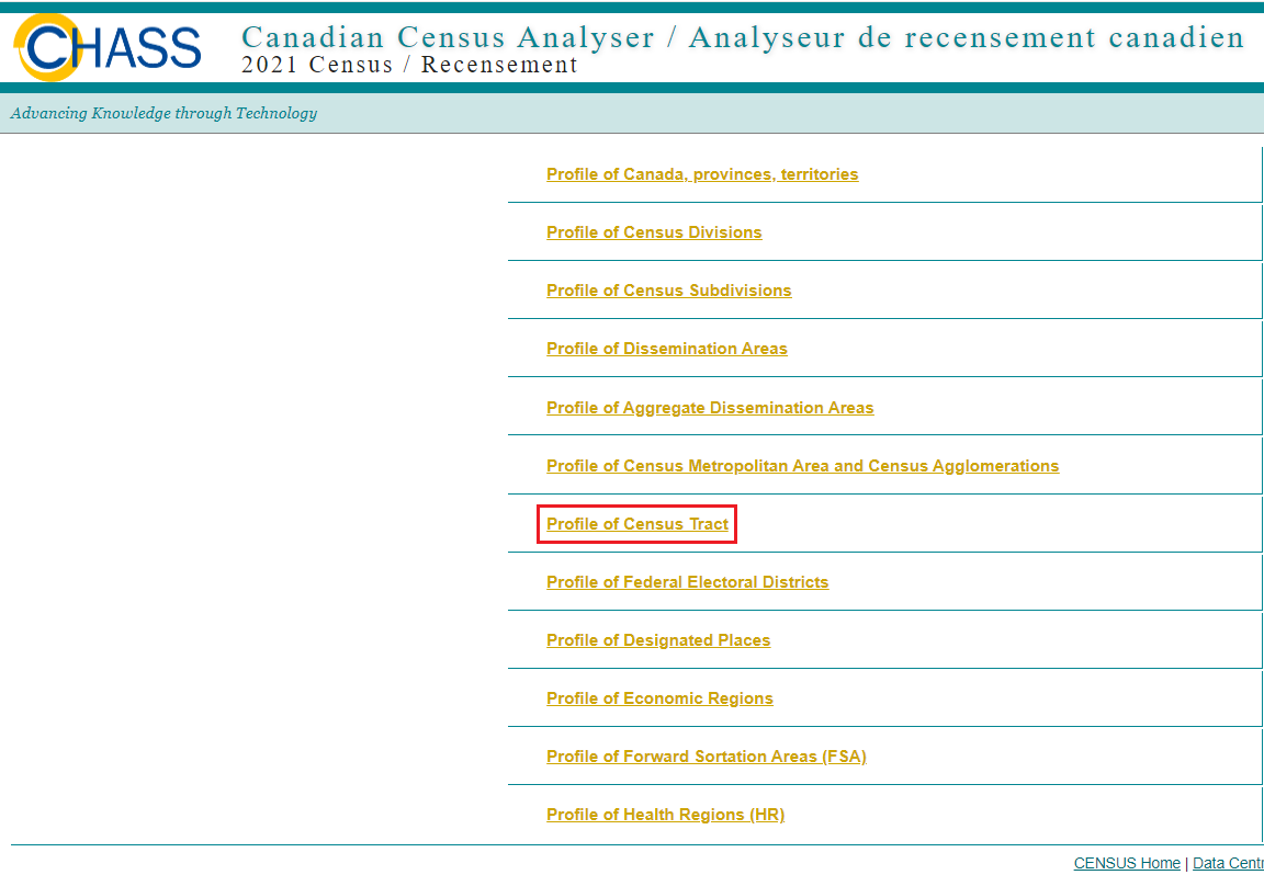
Next, we need to download the appropriate geography - the Census Tracts (CT) of Toronto. Click on Profile of Census Tracts. (Note: a CT is a small area contained in a larger urban core of 50,000 persons. Individual CTs typically have populations underneath 7,500 persons. Visit the Statistics Canada website to learn more.)
-
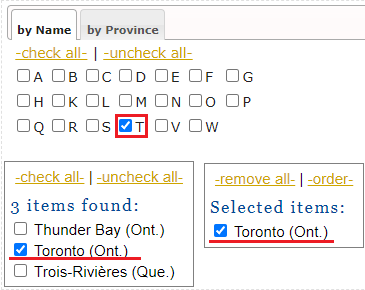
Under the Step1's "By Name" tab, select T and then Toronto from the list of available items below.
-
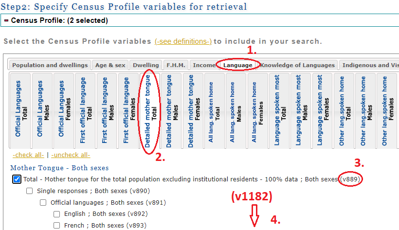
Now we must navigate the census' categories and find the variables we are interested in: today, we are looking for total number of Mandarin speakers and total population (in order to calculate a percentage). Under Step2, (1) click on the Language tab and the (2) Detailed mother tongue - Total subsection to find our two variables:
5.1. (3) Select Total - Mother tongue for the total population excluding institutional residents - 100% data; Both sexes (v889) - in this case, "v889" stands for "Variable 889" within the census dataset.
5.2. (4) Further down find and select Mandarin; Both sexes (v1182). Alternatively, you can locate this variable by using ctrl + f and typing it out.
-
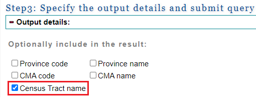
Next, under Step3, we will select Census Tract name. (We will talk more about this variable later.)
-
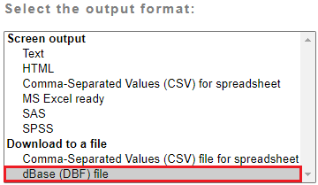
Finally, we must select the output format best suited for our visualization; in this case, DataBase File (DBF) format - a table-like format that structures datasets by columns and rows. At the bottom of Step3, under "Select the output format", select dBase (DBF) file and then click on Submit Query.
-
Download the .dbf and text files from the links provided and save them to a folder of your choosing (you may have to wait a few seconds before the links appear on the page). The .dbf will have your data and the text file will contain information about what the column headers mean.
B. Download the census boundary files
-
We will obtain the census boundary files from the Census Geography website. You can access the site through the previous link or any time through the Statistics Canada Census website, by clicking on the Geography tab.
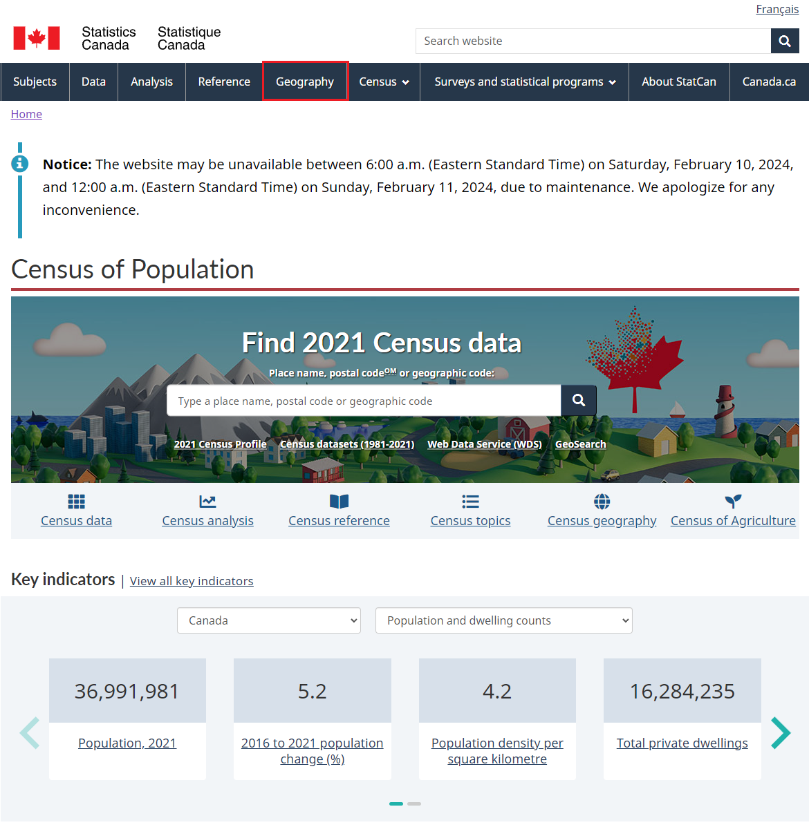
-
Under Spatial information products, click on Boundary Files.
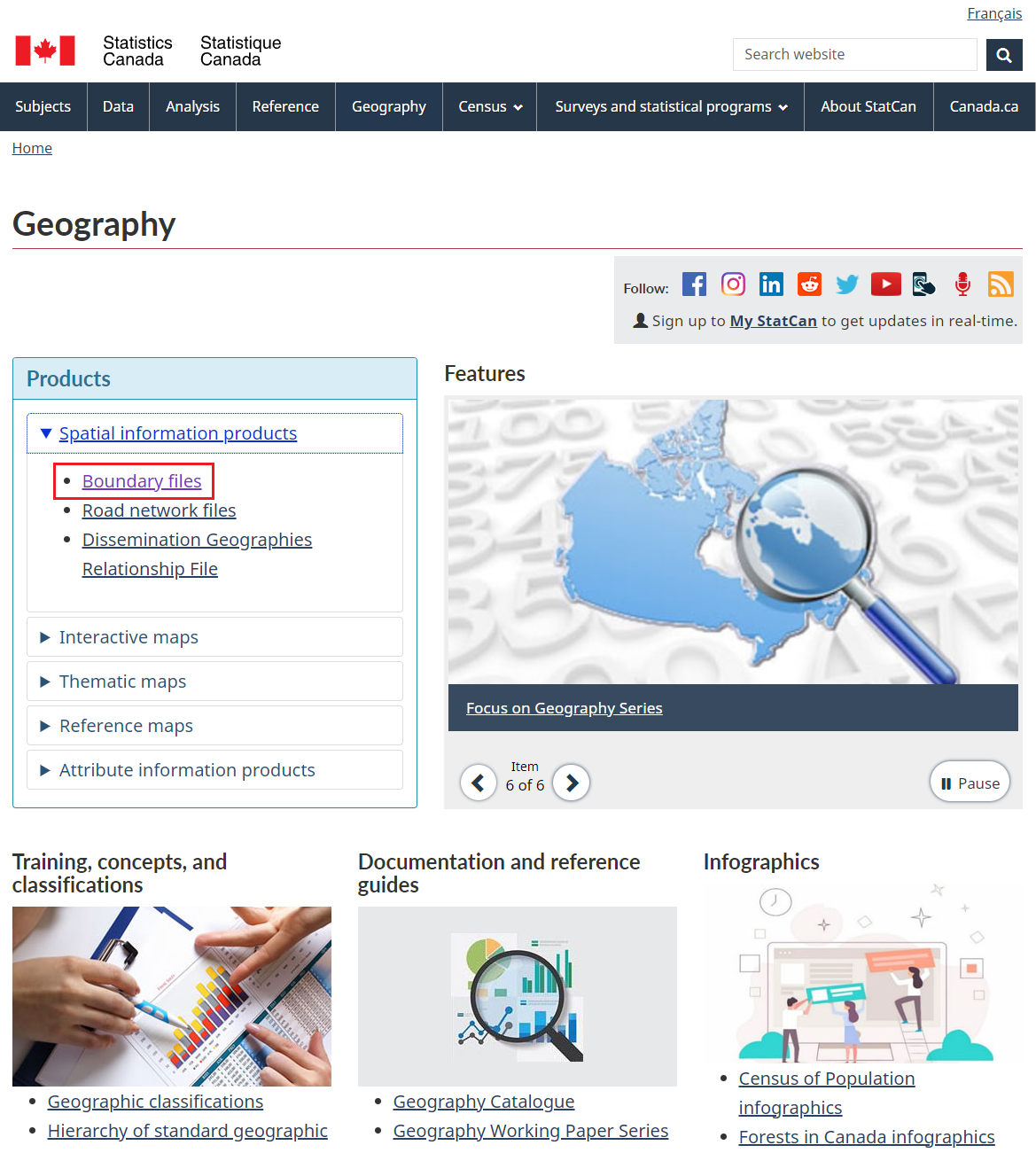
-
Under Census Year, click on 2021.
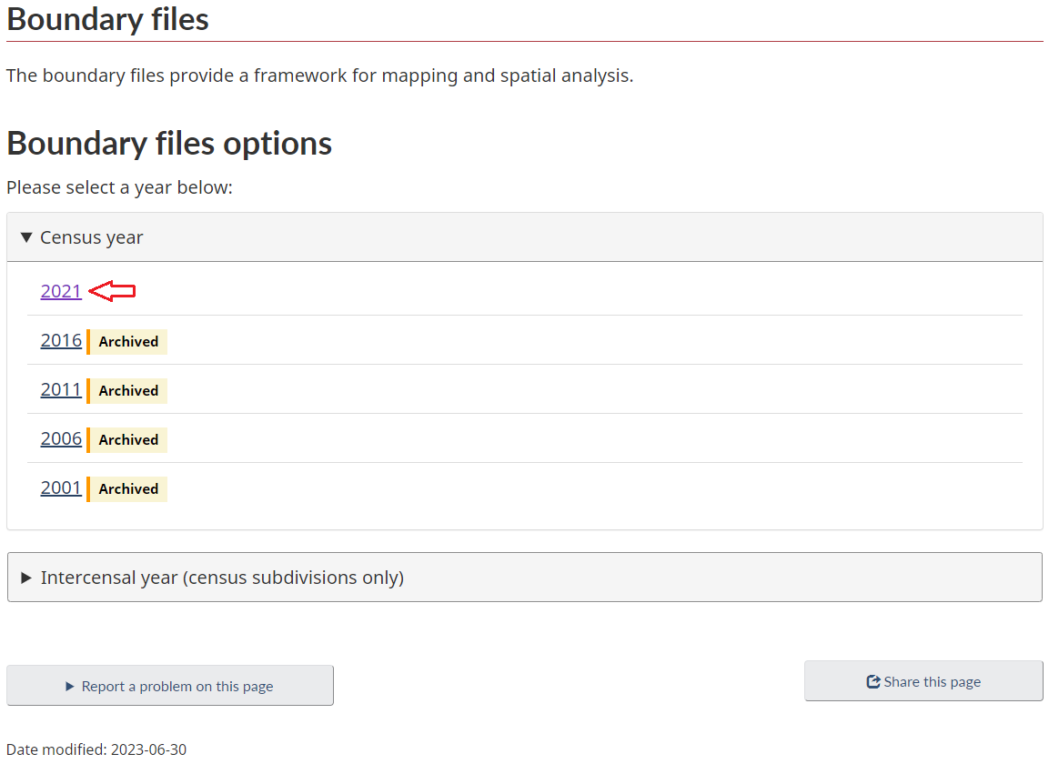
-
To set up your download, select English, Shapefile (.shp), and Cartographic Boundary File under the Type dropdown menu. (Note: Cartographic Boundary Files (CBF) follow coastlines and include water bodies whereas Digital Boundary Files (DBF) are defined around major land masses). Make sure to select Census tracts under the Statistical boundaries menu. Once the required parameters are selected, click Continue.
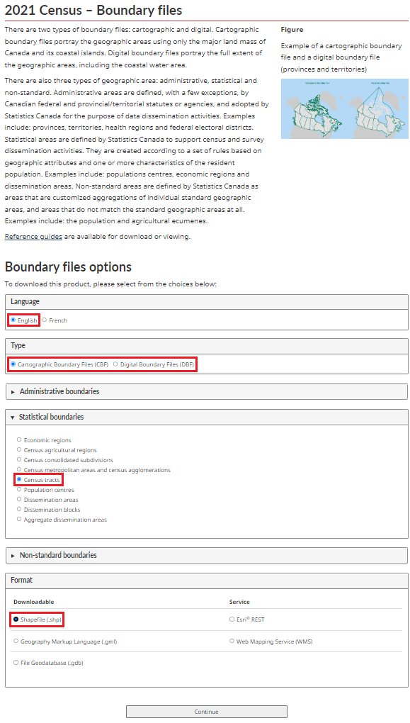
- Download the zip file from the link provided and save it to the same folder you used above.
-
Geospatial data often comes in a zip file as it is made up of a collection of files. You will need to unzip it to use it in ArcGIS Pro. To do so in a Map and Data Library computer, right click on the zip file and select 7-Zip -> Extract Here.
C. Match the two datasets
- Open ArcGIS Pro. If you are using a Map and Data Library computer, an ArcGIS Pro shortcut is available through the desktop or the start menu.
- Click on Map to create a new Map.
-
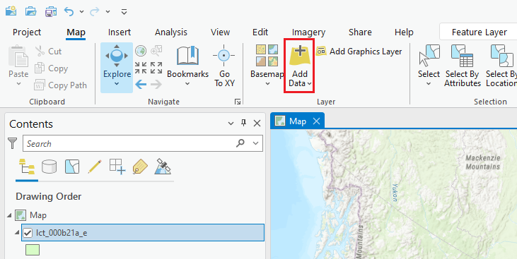
Click on the Add Data icon to start adding your census data.
-
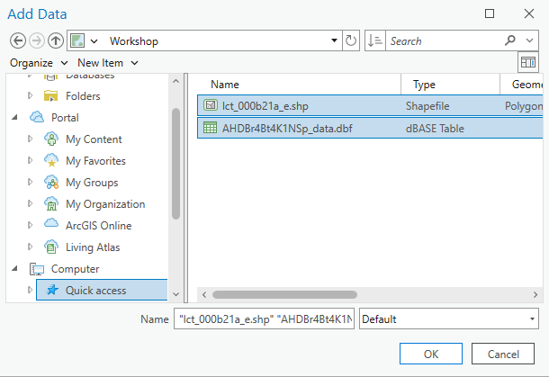
(1) Browse to the directory in which you saved your files to, and select the files containing your census data and boundaries. To select multiple files, hold down the ctrl button when choosing your files. (2) Once all required files are selected, click Ok. (Note: unlike the shapefile (.shp) which contains vectors representing the census tract boundaries, integrating the database file (.dbf) into ArcGIS Pro will not change the map displayed. Instead, a standalone table will be added to the Contents pane). Alternatively, you can drag and drop your datasets from their folder directly onto the map from the file explorer window.
-
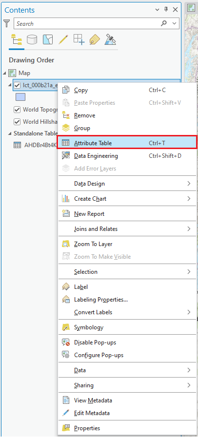
To view the information associated of either dataset, right click on the layer of the corresponding dataset in the Contents pane and select Attribute Table or Open - depending on which file type (.shp vs. .dbf) you are looking at.
-
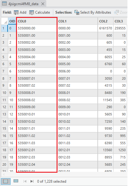
If you look at each table, you will notice that the boundary file's column CTUID (i.e., Census Tract Unique ID) is equivalent to the CHASS census data's COL0 (i.e., the GEOID or Geography ID). They both identify the same type of regional division, along with any associated information. Note: Remember you can always change each column's title in ArcGIS Pro by right-clicking on the header, selecting Properties... and changing it's "Alias", just make sure you referred back to the text file CHASS provided with the dataset to understand what each column's code stands for.
Table of attributes associated with the boundary file:
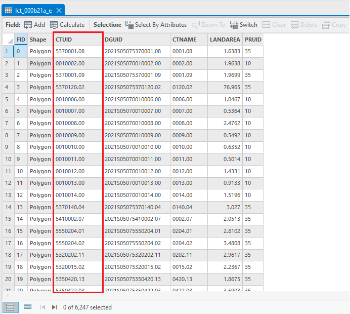
Table of attributes in the census data DBF:
-
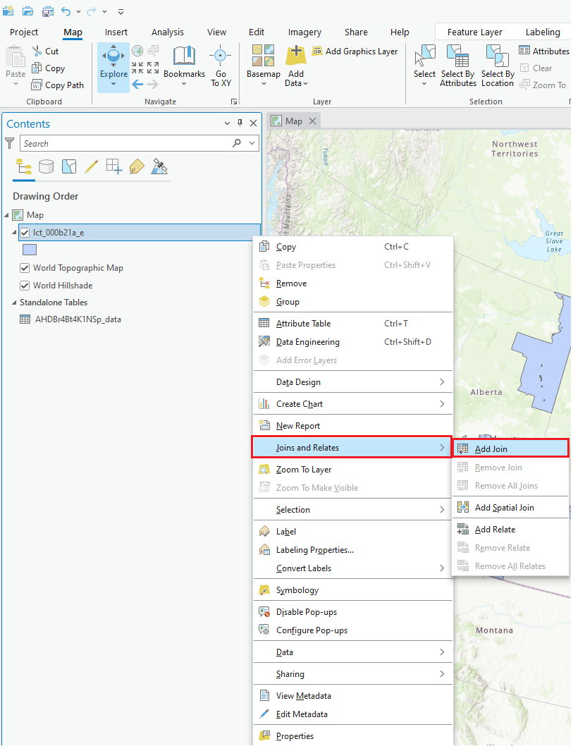
We can now join the two tables of data together into one. Right-click on the boundary dataset name in the layers list (i.e., lct_000b21_e), and select Joins and Relates, and then Join... (Note: if you wish, you could also join the layer to the dataset, although the steps described below will not entirely match the settings for that process.)
-
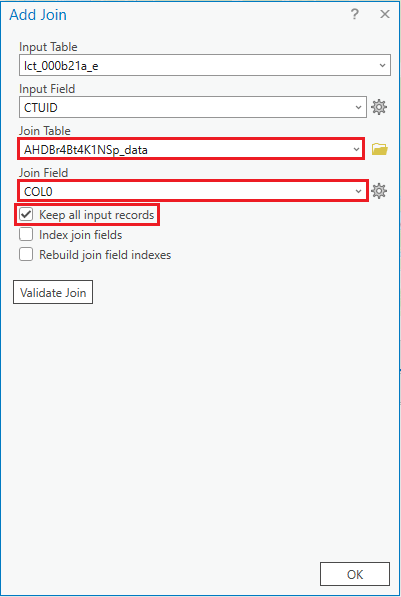
(1) Pick the column name we want to match in the boundary file, CTUID. (2) The second field should be automatically filled in. (3) Pick the column name we want to match with the DBF, COL0 (if it has not been filled in automatically or correctly). (4) Finally click OK. Note: Validate Join can be used to ensure the integrity of the join you are about to commit to, without changing the data.
-
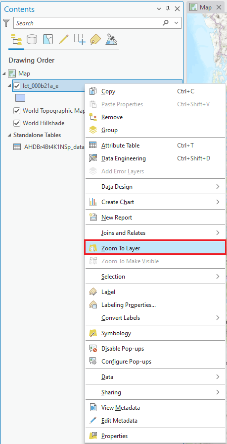
Let's look at the result of our join. Right-click on the boundary dataset name in the layer list to the left (i.e., lct_000b21a_e), and this time select Zoom to Layer. Your map should look more recognizable now, showing you areas of Toronto. Alternatively, you can navigate to the City of Toronto by holding and dragging the map until you can see the city. (Note: if you now went back in and opened the attribute table of the boundary dataset, you would notice that your columns of census data have now been appended - i.e., joined - to the end of the table - all the data is consolidated in one place.)
D. Colour code the data to create a thematic map
-
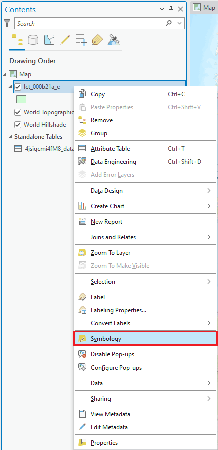
Right-click on the boundary dataset name in the layers list on the left (i.e., lct_000b21a_e), and this time select Symbology to open the Symbology pane.
-
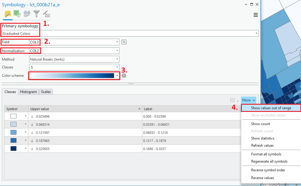
(1) Click on the Graduated colors in the Primary symbology dropdown menu. If you recall when we downloaded the .dbf, there was an associated text file telling us which column was which. In our example here, COL3 is the number of people whose mother tongue is Mandarin, and COL2 is the total population. Let's divide the number of Mandarin speakers by the total to get the percentage of Mandarin speakers living in each area. (Note: even if you follow these exact steps, the column headings are not always the same, so always check the text file to confirm.) (2) Under Fields, for Value, select COL3 and, for Normalization, select COL2. (3) Select a colour ramp (a graduated colour ramp makes sense to show areas ranging from lower to higher intensity/percentage). (4) Since the are some neighbourhoods that have a recorded value of zero for the number of people whose mother tongue is Mandarin, click on the More dropdown menu menu in the classes tab and select Show values out of range.
-
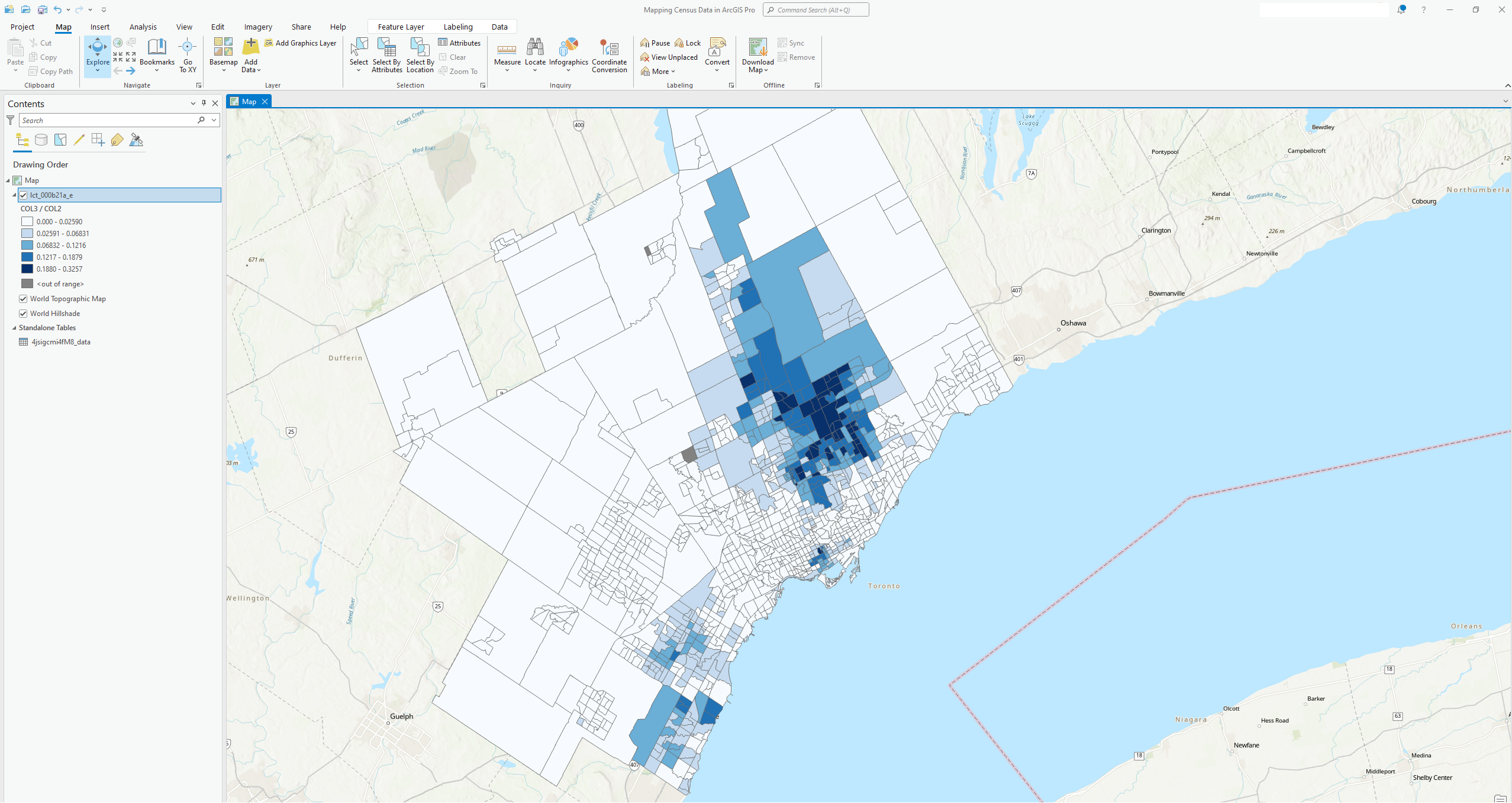
You should now see a thematic map of the CMA of Toronto displaying colours representing a percentage of those people whose mother tongue is Mandarin living in various census tracts based on 2021 Census Data. Visualizing data through GIS can help us see spatial patterns not obvious by viewing the data in a table: for example, here we can see a large concentration of people whose mother tongue is Mandarin living in the northeast side of Toronto.
E. Additional descriptive elements
-
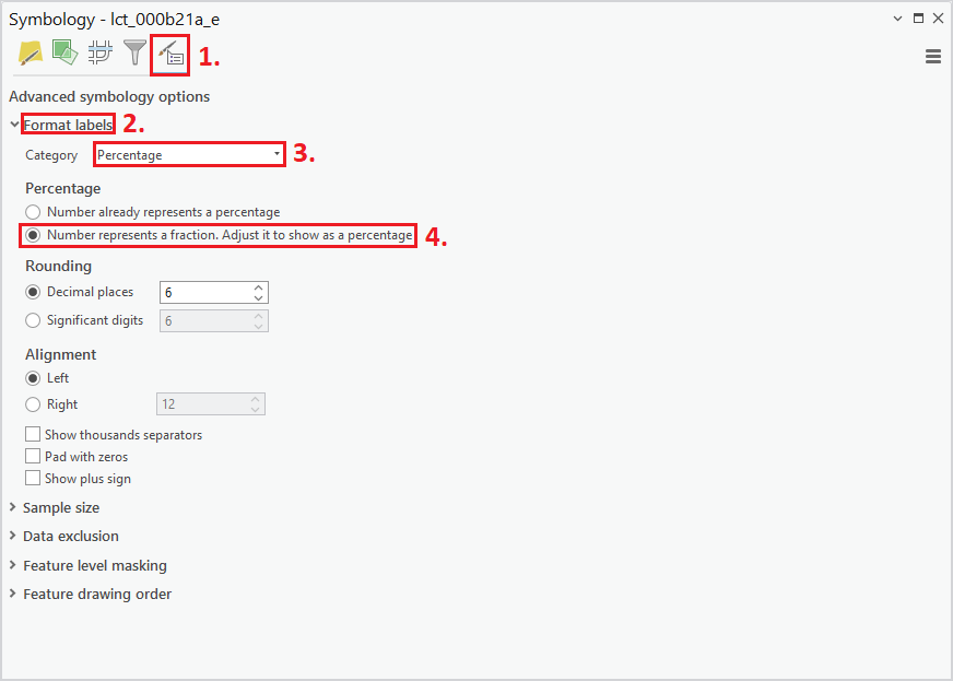
Before formatting our map, we should edit our labels to make the data we wish to present clearer. Right-click again on the boundary dataset name in the layers list on the left (i.e., lct_000b21a_e) to access the Symbology tab. (1) Now, click on the Advanced symbology options button, (2) and expand the Format labels header. (3) Next to Category, select Percentage and (4) mark that our number represents a fraction so we would like to adjust it to show as a percentage.
-
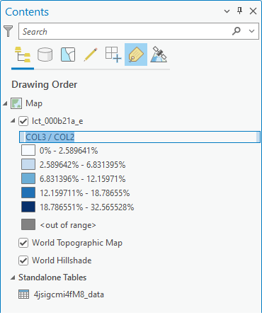
Do a long click on the "COL3/COL2" label within the layer list to the left. You should be able to change the name of the field to something more informative; for our example, we will call it "Native Mandarin Speaker Percentage per Area".
-
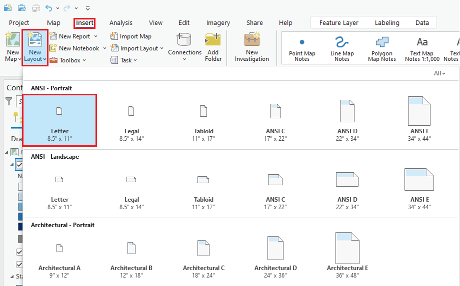
Now, let's format how our map will print and add a couple of additional elements such as a legend and a scale bar. First, click on the Insert tab in the ribbon and select New Layout. From the options shown, chose Letter 8.5" x 11" under the header ANSI - Portrait.
-
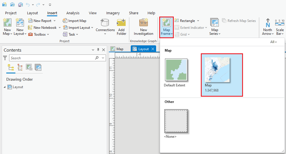
In order to add the current map to your layout, go to the Insert tab in the ribbon and click on Map Frame. From there, you should see a small thumbnail of the map you had map at its current viewing extent. Click on this thumbnail and drag your mouse across the layout to the desired size you want. You can click on the map frame and pull from points in its sides or corners to resize its placement on the sheet. (Note: To change the areas displayed, right click on the Map Frame and select Activate. Then, using your mouse you can pan around the map to your location of interest. To close the Activation frame, go to the Layout tab in the ribbon and select Close Activation. Alternatively, you can click on the left-pointing arrow at the top of the Map Frame.)
-
To add a scale, select the Insert tab in the ribbon and then click on Scale Bar.

-
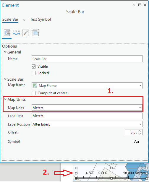
Now you can select whichever scale bar style you would like for your map. For this exercise, we will pick "Scale Line 2". (1) If you would like to change your scale's units, right click on scale bar in the Contents pane under Drawing Order and select Properties. Under the Map Units header, chose your desired units in the Map Units dropdown menu. (2) To resize the scale bar (using the points marked in white) or change its placement, click inside the dotted box and drag it. You can also add in a North Arrow to your map by clicking on the North Arrow button in the Insert tab.
-
Next, we will add a legend so that viewers can understand our map's symbology. Once again, click on Insert at the top of the window, but this time select Legend.

-
By default, the elements in your .shp file layer (i.e., lct_000b21a_e) will be added to the legend. (If you had more than one layer active on your map, then this too would be added to the legend). To adjust elements of the legend, right click on Legend in the Contents pane under Drawing Order and select Properties.
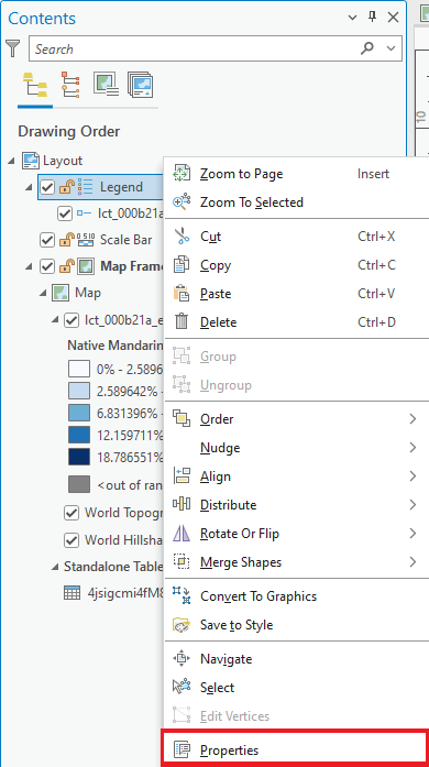
-
To format the legend's border, background, and drop shadow, (1) click on the Display symbol. (2) Next to Symbol under the Border header, input a thickness of 1.0 pt and change the color to black.
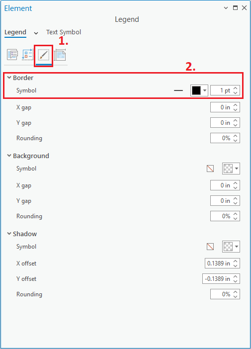
-
To edit the size and shape of the symbols used to represent our colors in the legend, click on Show Properties underneath the Legend Items header in the Options tab. If you would like, you can check the box next to Show under the Legend header to make your own custom Legend title (where just below that is a text box where you can create your title).
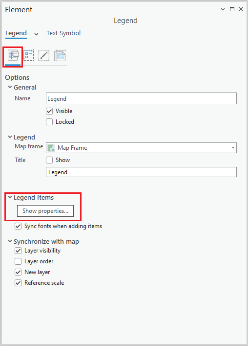
-
In this Legend Items window, you are able to hid unwanted features of your layer (e.g. Layer name, headings...) by deselecting them under the Show header. For now, deselect Layer Name. You can change the patch size of your legend items as you see fit using the options under the Sizing layer. Leave the default measurements and exit out of the window.
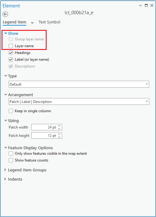
-
The legend shows the information we wanted. Now you can change its placement and size by dragging along the box's corners or sides. Unfortunately, the legend also shows our layer's convoluted name. To change that, we could give the layer another title in a similar way to how we changed the label in step 3 of this section and then insert a new legend. But for educational purposes, we will go through the other option: directly editing the various elements of an existing legend. Start the process by selecting and right-clicking on the legend, Select Convert to Graphics.
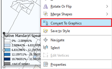
-
Right-click again on the legend, but this time select Ungroup. Each element in the Drawing Order should now have an individual green box around it. To delete elements, right click on them and click Delete. To move around the legend's elements into a preferable arrangement, you can select and drag them to wherever you like.
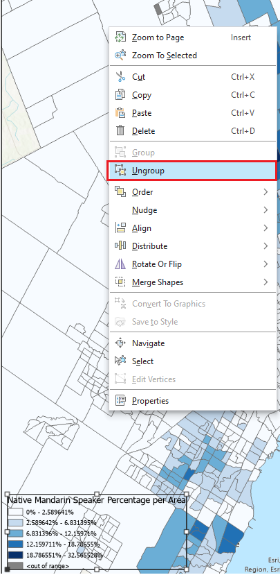
-
To have the legend as it once was, hold down the shift button and click on the elements that you wish to re-group in the Drawing Order. Once everything you want to be a part of the legend is selected, right-click on any of them and click Group.
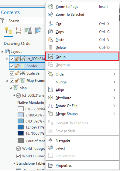
-
Finally, we will give our map a title. Go back up to Insert, but this time click on Dynamic Text. In the dropdown menu under the header Layout, select Name.
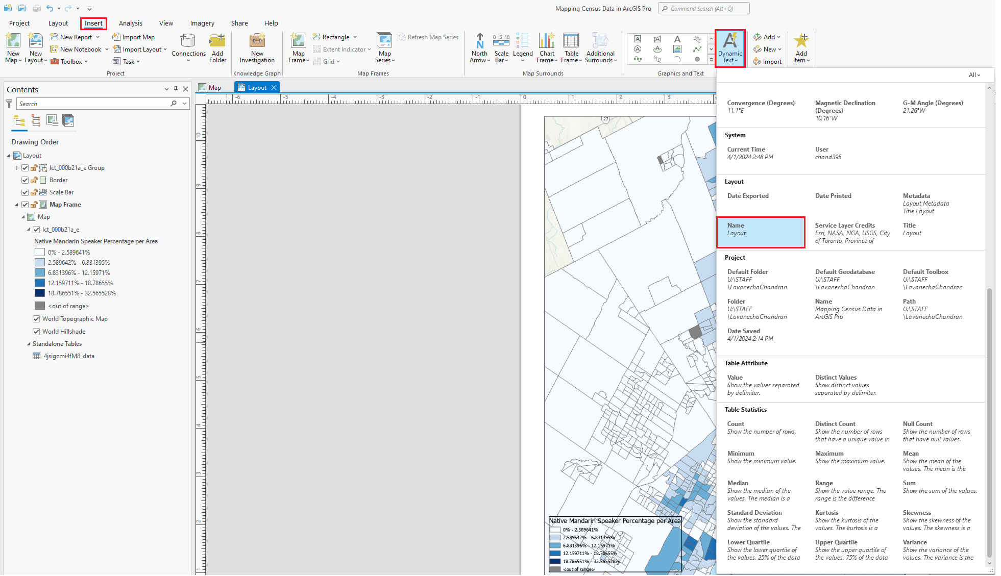
-
In the new window, type whichever name you would like to give your map. For this exercise, we will call the map "From CHASS to ArcGIS Pro - a Tutorial", although you should use what best describes the main idea you want to communicate through our map/data. Click OK and once your title is inserted, you can drag its box to any location on the map where you think it would look best.

F. Final edits and export
-
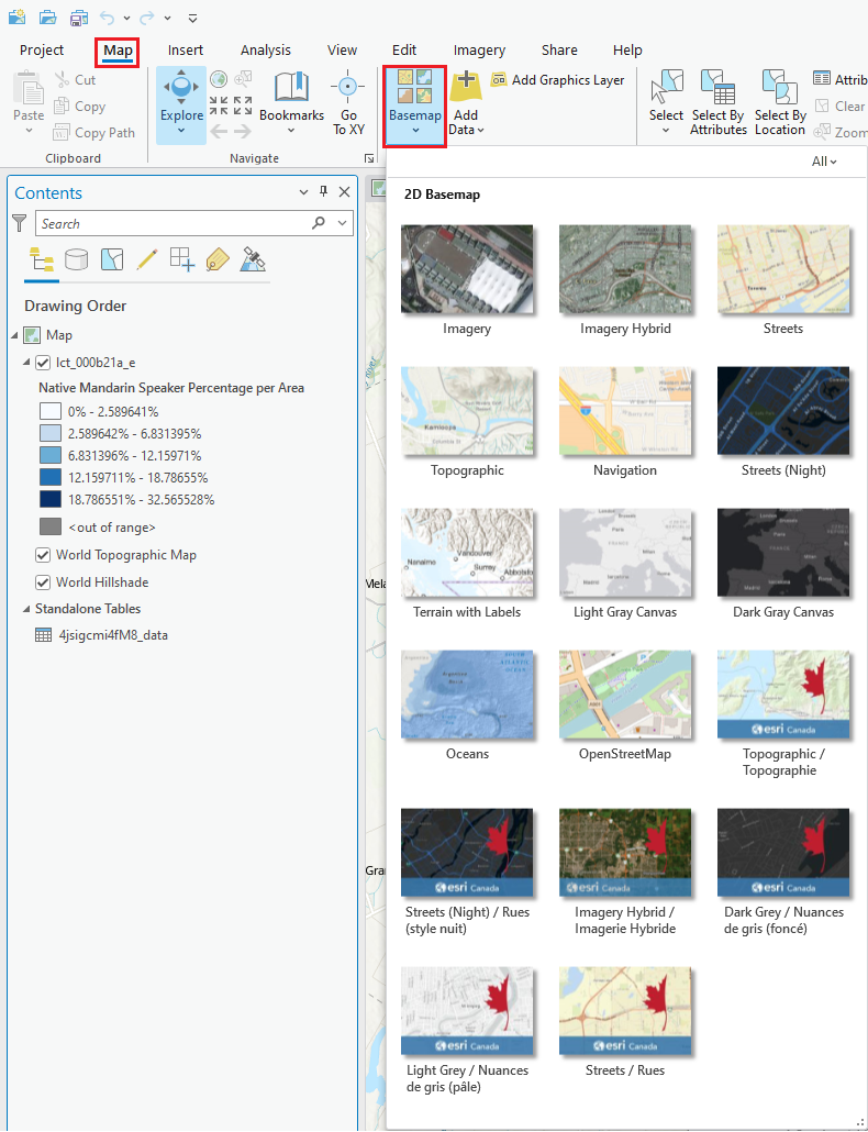
There are a couple of changes we can make to our map in case we want it to look nicer or make its surroundings clearer. For example, we can change the basemap that is underneath our layers by going back to our Map, selecting Map in the ribbon, and then by clicking the downward arrow beneath Basemap. For this exercise, the Topographic basemap has been used.
-
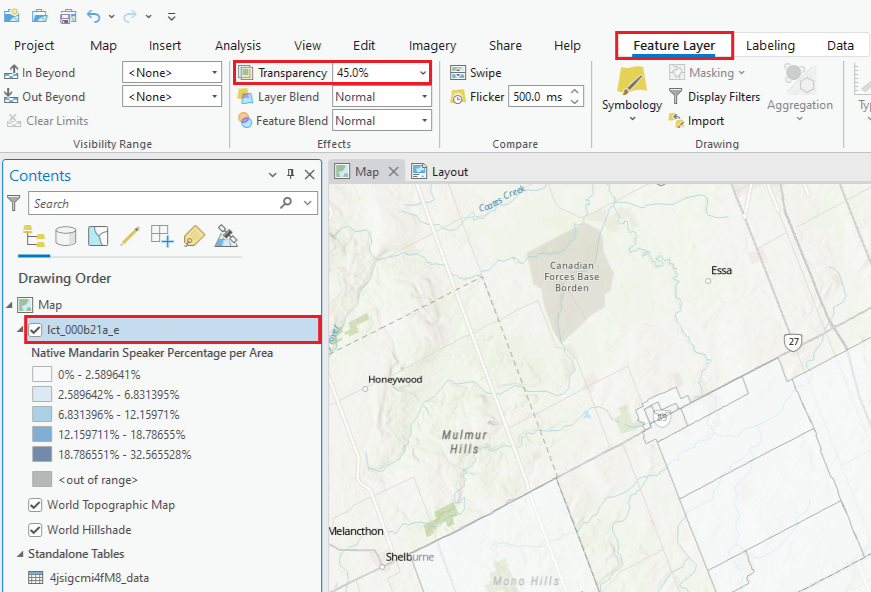
Now that we have a more familiar layout of the city, its streets, and neighborhoods. Let's make our color-coded symbols slightly transparent so that we can present both layers of information - our census data and the map. Left-click on the census data layer (i.e., lct_000b21a_e) then click on the Feature Layer tab in the ribbon. Next to Transparency, type in 45. You should now be able to discern the areas with a highest concentration of native Mandarin-speakers as well as the names of the city's major neighborhoods. (Note: if you would like to have opaque colors again, access the Feature Layer tab again and change the Transparency value to 0.)
-
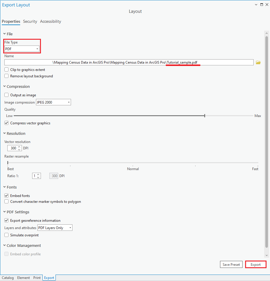
To export your map as an image or PDF, navigate back to your Layout, select the Share tab in the ribbon, and click on Export Layout.

-
In the new window, choose the location or folder you want to save your map in - browse the directory above until you find your preferred repository. Then, name the file you are about to create. Finally, choose the file type from the options shown below within the dropdown menu and click Export. (Note: You can also adjust the file's resolution, size, and quality, based on the options shown at the bottom of the window.)
Congratulations! You should now have a map exhibiting census data you pulled from CHASS on your own. Make sure to visit our other tutorials if you ever want to find out more about ArcGIS Pro or other data visualization tools. For additional help, please submit a request on the Map and Data Library website.
