For this tutorial, we are going to use Gephi to visualize a Romeo and Juliet network dataset. This dataset describes the strongest relationship between major characters in the play. We will learn how to import data into the tool, explore various icons and tools in the graph window, adjust the appearance of nodes and edges, use layout algorithms, add labels, and export final visualizations in various formats.
In this demonstration, we are going to:
A. Set up Gephi
B. Download the tutorial dataset
C. Import this data into Gephi
D. Adjust the appearance of nodes and edges
E. Use layout algorithms
F. Add labels and make final layout adjustments
G. Export visualizations as static images
H. Export visualizations as interactive web pages
This tutorial was created using Gephi version 0.10.1.
A. Set up Gephi
- This tutorial utilizes the free software package, Gephi, as well as the Gephi plugin, SigmaExporter. If you already have these set up, skip ahead to section B of this tutorial.
- You can install Gephi, by downloading it, and following the installation instructions.
-
Once Gephi is set up, navigate to the application's top menu, select Tools and then select Plugins.

-
In the Plugins window, first select the Available Plugins, and navigate to SignmaExporter. Check the Install box, and click Install.

-
In the Plugin Installer, click Next, accept the terms, and click Install. You will need to restart the program before you use the plugin. After choosing your desired restart time, click Finish.

B. Download the tutorial dataset
- Create a new folder on your computer to store the workshop files.
- Download a zip file containing all the datasets you will need for the workshop to that new folder.
- Extract the files into that new folder.
Note: Different computers have different setups. On a Mac, just double-click on the file to extract its files. On a PC, you might first want to install a great little program called 7-Zip (if you don't already have it!). Then you should be able to right click on the zip file and select 7-Zip, then Extract Here to extract its files.
C. Import this data into Gephi
- First, let’s start up Gephi (we can search for it in the Windows Programs menu if we don’t see a desktop shortcut).
-
We should see a welcome screen where we can revisit recent projects or look at sample datasets.
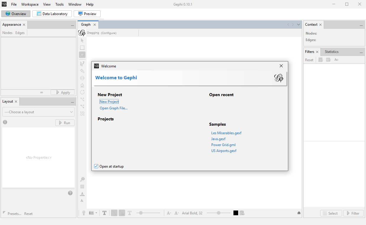
We can also use this screen to open up a graph file, if we had one. In our case, we want to create a new project, so click on New Project from this screen.
If we had closed this window by mistake, we can also use File->New Project.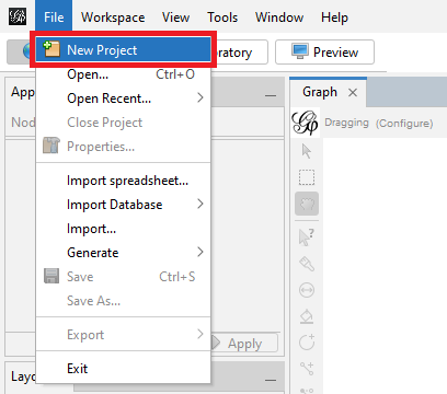
-
Along the top, we notice there are three tabs – Overview, Data Laboratory, and Preview. Let’s look at the Data Laboratory tab first to load some data.

We are going to load the nodes and edges data we have for Romeo and Juliet. Click on the Import Spreadsheet button at the top.
Browse to the downloaded workshop files, into the RomeoAndJuliet folder, open up the nodes.csv, and then click on Open.
-
Gephi opens up a wizard to help us load the data. It will show us a preview of the data. We can see that it says it is importing it as a Nodes table.

We are happy with these settings so click on Next.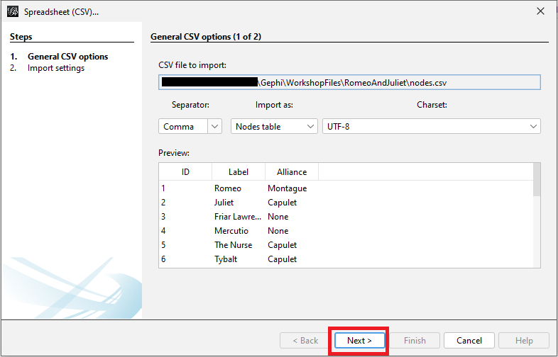
-
We will see a list of imported columns, and this is where we could change what columns are imported and their type, if it is incorrect. We want Alliance to be a string, so it is fine the way it is – no changes necessary. So click on Finish.
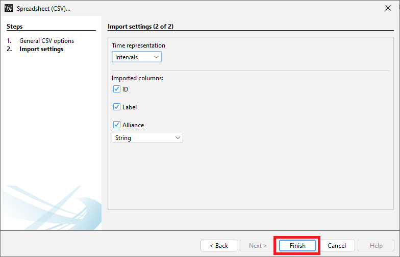
-
Finally, we will see a pop-up window that tells us if there were any issues with the import. This screen tells us how many nodes are in our graph = 19, which is helpful.

We should select that we want to Append to existing workspace, instead of creating a new workspace, as we already have a new project and workspace open, and then click on OK.
Now we should be able to see a preview of the nodes spreadsheet loaded.
-
Next, we need to load the edges spreadsheet. Click on import spreadsheet, and select the Edges.csv. Again, Gephi will open up a wizard, showing a preview of the data and indicating that it is says it is importing it as an Edges table. Click on Next.

-
Keep the defaults and click on Finish.

-
Finally, we will see the window pop-up again to tell us if there are any issues. Here, we should specify that the Graph Type is Undirected for our edges (i.e., the relationship is mutual).

We also see that we have 31 edges in our graph. Again, we want to select Append to existing workspace, and then click on OK. Upon clicking OK, a new window will show up stating that there were 0 mutual edges removed to fulfil the undirected type - disregard this by clicking Close. Now, the edges spreadsheet has been loaded.
-
We can toggle between the different tables using the Nodes and Edges buttons on the top left.

If we toggle to show the edges table, we will see some extra columns have been added to specify the type of edge, in our case, undirected. There are also extra columns; for example, label, which we could have used for edge labels.
Now our network data is loaded, and ready to visualize and analyze.
D. Adjust the appearance of nodes and edges
-
Next, let’s move to the Overview tab. This tab is where we do our network analysis, layout and visualizations.

Let’s look at some of the tools along the edge of the graph pane, starting from the top left. The arrow icon is a direct selection tool and the rectangle allows you to draw a rectangle around the items you want selected. Once nodes are selected, then you can adjust their sizes and colours.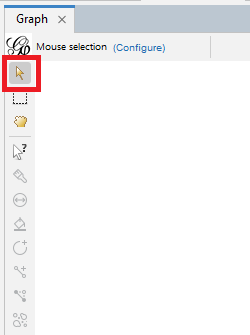

For example, use the rectangle tool to draw a rectangle around all the nodes to select the whole graph.
-
Next, click on the icon that looks like a two sided arrow in a circle. This tool is called sizer and it can be used to adjust the sizes of nodes.

Select the sizer tool. Notice that the tool gives us a hint on how to operate it at the top of the pane.
Click on the white space next to the graph and drag the mouse vertically. All the nodes should be changing size.
-
Another tool is a dragging hand icon. You can use it to move nodes around.

Select it and then use this tool to manually drag and reposition a node in your graph.
-
We can colour certain nodes manually by using the icon that looks like a paint brush – we can use this to highlight a specific node of interest.

Try selecting a node and colouring it red. Every time you click on a node, it gets more vibrant.
-
The next icon after the sizer icon is called brush. Note that when we hover over a tool, it describes how the tools works in a pop-up.

In this case, it colours nodes and their nearest neighbour (i.e., directly connected) the same colour. Select the tool, change the colour at the top to blue, and then select a node.
Click multiple times as before to make the colour brighter.
-
The next two icons allow us to manually create a new node or a new edge. So, in theory we could draw out our network manually, instead of preparing node and edge spreadsheets. Unless your network is very small, this would be a labour-intensive process that could be prone to error.

-
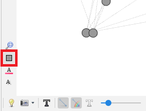
We can reset colours on our graph using the grey rectangle icon near the bottom left of the graph pane. Click on that now.
-
To colour nodes and edges in a graph based on specific attributes, use the appearance pane.

We can toggle between visualizing nodes and edges – let’s start with nodes. There are four ways you can affect the appearance of nodes: we can colour-code the nodes based on an attribute, such as alliance in our case, we can size the nodes based on an attribute, such as degree, and we can also affect the colour and size of labels on our nodes. Let's first take a look at colour. Select the painter’s palette icon. Here, the default is the Unique option, which will colour all the nodes a unique colour, in this case grey.
Let’s try the Ranking option, where it will select a sequential colour palette (so one colour changing from light to dark) to show the range of a numeric variable. Select Ranking and choose Degree from the drop-down menu.
Then click on Apply.
You can see that the darker coloured nodes have more connections.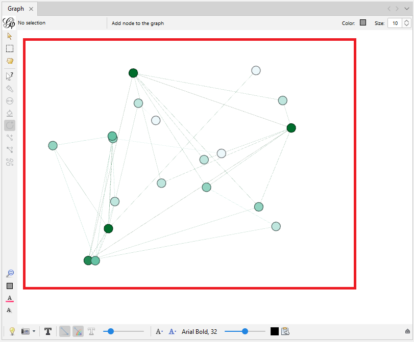
-
However, colours are more effective when used for categorical data. For our example, we want to use partition and assign a qualitative colour palette where different colours match different categories. Let’s click on Partition and select the attribute alliance.

We will see different colours assigned to correspond to different alliances. You can click on an individual colour to change it, or click on the palette link to select from predefined palettes. Let’s keep the default. Click on Apply.
Now the nodes on your graph have been colour-coded correspond to different alliances.
-
Using sizes in visualizations is an effective way of displaying numerical variables, so let’s size the nodes by a numeric attribute that we have: Degree. Click on the icon with multiple circles for node size.

The unique option is where you specify a set size for all nodes, but we want ranking where the node sizes will vary by degree. Click on Ranking, select Degree from the drop-down menu.
Set the Min size to 20 and the Max size to 50, and then click on Apply.
You can see that the nodes on your graph have been sized according to their different degrees.
-
So far we’ve been playing with node appearance. We could also adjust the edge appearance by selecting Edges in the appearance pane.

There are several options to change colours and adjust labels. We could for example just colour all our edges grey by selecting Unique for colour and keeping the default grey colour specified and then clicking on Apply. However, we have an attribute for our edges, so for our graph let’s use partition to colour them by relationship type. Click on Partition for colour, and then select relationship.
Finally, click on Apply.
Now the edges on your graph have been colour-coded correspond to their different relationships.
E. Use layout algorithms
-
When you first loaded the data, Gephi displayed the nodes and edges at random to start. You may find often that you need to adjust the layout of the nodes and edges of your graph so that you can start to make sense of the data visually and set the shape of your graph. Let's navigate to the layout pane.

Select the drop down menu that says Choose a layout. Select an example, such as Contraction
To get more information about the layout, hover over the blue circle with the “i”.
-
From the layout list, we see two similarly named options: Force Atlas and ForceAtlas 2. Force-based algorithms follow a simple principle: linked nodes attract each other and non-linked nodes push apart. The Force Atlas layout is from Gephi – it works best for small networks (up to 10,000 nodes) and can be slow.

ForceAtlas 2 is an improved version that can handle larger networks, for up to a million nodes. For our graph, select ForceAtlas 2.
Note: Different algorithms are appropriate in different situations and for different types of data. Learn more about layouts from Gephi’s website. -
With any of these layout algorithms, there are settings we can play with to adjust how the algorithm works, such as settings that affect the attraction and repulsion of the nodes to each other and to the centre of the graph. The documentation will specify all the parameters – we can see short help snippets show up at the bottom of the pane when you click on a parameter.

Let’s select one of these parameters as an example, Prevent Overlap, so that none of our nodes overlap each other in the layout. Keep the rest of the defaults, and then click on Run.
-
We should see the graph change right before our eyes. The algorithm will continue to run and adjust the graph in small ways until we click on stop – so however long you run an algorithm can also have an effect on the layout. Let it run for 15 seconds or so, and then click on Stop.

-
In our situation, our graph shrinks towards its centre. Click on the graph, and use the mouse wheel to quickly zoom in and out. If the graph is going off the edge of our screen, we can right click on the blank area and then drag to reposition our graph.

We can click on the magnifying glass near the bottom left of the edge of the graph pane, to centre our graph on the screen – but watch out as it does sometimes zoom out again when you do that. Let’s zoom in and centre our graph.
F. Add labels and make final layout adjustments
-
Now, let’s look at node labels and the icons on the bottom of the graph pane edge. Click on the black 'T' icon to show node labels.

Gephi will take the text from the label column we created in our nodes spreadsheet.
Then click on the black 'A' icon and select Node size – so they will be proportional to the node sizes.
Then use the slider on the right of that icon to make the node labels smaller and more readable.
We can also change the font, its size, and colour from here. -
Layouts can help us make your labels more legible. Go back to the Layout pane and run Label Adjust.

Then run Noverlap. Use the blue “i” icon to learn more about these and other layouts.
After we run those layouts, we might need to zoom out a bit. At this point, we can also use the grabbing hand icon near the top left edge of the graph pane to make some final tweaks to the layout by moving individual nodes.
-
Let’s go back to the graph pane icons. The little clipboard next to the node label colour selector allows you to specify which attribute to display as a label – the default is the label column.

-
The white T turns on edge labels, but we are not going to label our edges in this situation.

The sliders adjusts the thickness of our edges – we can make them a bit thicker to see the colours better.
We already coloured all our edges by their relationship type, but if we had wanted, we could have coloured our edges by the source node (which is more helpful in directed graphs), by selecting the rainbow icon.
The icon to the left allows us to toggle the edges off and on in our graph – helpful for working with and viewing very complicated graphs.
-
The lightbulb icon toggles the background between white and black.

Click it to try it out. You can see the background of your graph has toggled to black, and the label text has toggled to white to keep it readable.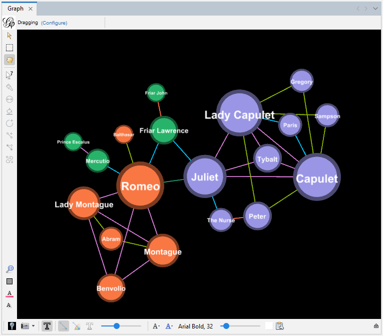
The blue 'A' icon allows us to link node label colours to node colours, but in this case let’s leave the default as the black labels are more legible.
-
If you click on the little arrow icon on the far right, we can reveal even more options to play with, such as the ability to change how edges and nodes are coloured when they are selected.

-
Additionally, there are a few icons to reset colours (which we saw before), along with icons to reset label colours and visibility, all near the bottom left edge of the graph pane.

- We can see that we can use Gephi to visualize our network data to display the characters in a network and their relationships. Sizes and colours can be adjusted to illustrate attributes and then use the network diagrams to spot any spatial patterns. For example, the largest nodes (if node is sized by degree) could show us key entities in the network that have many connections. We could also see if the largest nodes are always the same colour (if we have colour-coded our nodes by a particular attribute) to see if there’s a relationship between that attribute and degree. Some limited analysis can be done visually and and convey interesting characteristics through our network diagrams.
G. Export visualizations as static images
-
At this point, now that we have adjusted the appearance, we might want to export our visualization. The little camera icon at the bottom left of the main graph pane takes a snapshot of your graph as a PNG image file. Before clicking on it, select its drop-down menu and click on Configure.

If you keep the defaults and then use the snapshot tool, you will get a low-resolution image; however, if instead you change the image size to 3000 by 2000 for example, and for the Antialiasing, try the maximum of 16x, the resulting snapshot will be a much higher resolution. Change those settings, click OK, and then click on the snapshot tool to take the image.
-
If you want a higher quality image to export, you might need to use the Preview tab. Click on the Preview tab.

Depending on the plugins you have installed, Gephi may default to showing one of the plugins' panes as opposed to the "Preview Settings" pane. If Gephi defaults to another pane when you first click on the Preview tab, click on "Preview Settings".

-
Click on the Refresh button at the bottom left to show the graph.

Here you might be surprised to notice that it does not look exactly like the graph you created in the Overview tab.
You will have to use the options available on the left of this tab to prepare your visualization again for export. -
First, we have lost our node labels. Under Node Labels on the left, select Show Labels and for the Font, select Arial, bold, size 3.

Click on the Refresh button again to see the changes.
-
Next, let’s work on the edges, as they have lost their colours. Under Edges on the left, select Color, click on the ... button, select Original and then click on OK.

Click on the Refresh button again to see the changes.
-
As you can see there are many other options to try and experiment with to format the visualization.

-
When you are happy with it, click on SVG/PDF/PNG at the bottom next to Export. Let’s export it as a PDF file. Select your desired folder location and give the file a name.

Click on Options... Select Letter for the Page Size and make all the Margins 1 (to try to avoid labels being cut off at the edges, although you may need to play around with these settings, depending on your layout). Click on OK and then click on Save.

- You should now have a PDF of your graph. When you open up the file, you will notice that there is no legend included. You would need to use a tool, such as Adobe Illustrator or Inkscape to add a legend to your graph.
H. Export visualizations as interactive web pages
-
Gephi can also create an interactive HTML web page (that can be hosted on a web server) using the SigmaExporter Plugin. To do so, first ensure that the plugin has been installed and is active. From the top menu, select Tools and then select Plugins.

Click on the Installed tab and ensure that SigmaExporter is listed.
If you are missing the Plugin, you can download it here from Gephi’s website. For further guidance on this step, refer to section A of this tutorial. -
In the same Plugins window, now make sure that SigmaExporter is also active. Click on the Installed tab and check that a green checkmark appears in the Active column for SigmaExporter. If it doesn’t, check the box next to SigmaExporter and click on the Activate button underneath the list of plugins. Then close the plugins window.

-
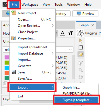
To create an interactive visualization, go to the File menu, select Export and select Sigma.js template...
-
Click on the Browse button at the top and navigate to where you want to save the website, in our case, the RomeoAndJuliet folder.

-
For the Legend you can specify what the nodes, edges, and colours represent. In our case, write “Character” for Node, “Relationship” for Edge and “Alliance” for Colour.

-
Fill in information for the Author, Title, Short Description and Long Description fields.

-
Select alliance from the Group Selector menu so that we can select nodes by alliance.

-
Keep all the other defaults for now and click OK.

-
Open Windows File Explorer and navigate to the folder you just saved to. Within it, open the newly created network folder that contains the interactive web page. You would put these files on a web server to share them online with others. See the section below called Viewing Exported Webpage if you want to view and interact with the finished product locally first.
Note: You can make adjustments to the node sizes, edge thickness, and label sizes by editing the config.json file, and adjustments to the node and edge colours by editing the data.json file. - The last thing to do is to save our project as a .gephi file. Go to File and select Save, give it a name and select Gephi Files (*.gephi) from the Files of type drop-down menu. It saves our layout, colours, sizes and labels. And we are done!
Viewing Exported Webpage Using Visual Studio Code
If you try to open up the newly exported index.html file to view it, you will find that it doesn’t display correctly. That is because newer web browsers block HTML files from running java script locally. There are a number of ways to get around this. Here is one option:
- Install a free software package called Visual Studio Code
- Start it up
- From the Go menu, select Go to File.
- Type in the box: ext install ritwickdey.liveserver
- Press Enter
- Wait for the Live Server to install. It will indicate when it has finished installing on the left panel.
- From the File menu, select Open Folder…
- Browse to the network folder that you just exported and select it. Then click on the Select Folder button.
- The contents of the folder should appear in the left panel. Right click on index.html and select Open with Live Server.
- This should open up the file in your default browser, and you should be able to view it and interact with it.