In this step-by-step guide, you will learn to create the following application: https://mdlutoronto.shinyapps.io/ttcdelays/.
You can download the dataset and the entire R code used in this guide here. You can follow along this code in RStudio or any other platform that allows you to run R code. To review your R skills before completing this tutorial, you can use these introductory and intermediate R courses.
Table of Contents
A. Getting Started
B. User Interface
C. Server Function
D. Resources
A. Getting Started
This section will discuss installing the necessary R packages, the dataset used for this guide, the basic code structure of R Shiny applications and publishing R Shiny applications on GitHub.
Install Package
To create a R Shiny application, you will need to install the shiny package. In addition to the shiny package, in this guide, we will also install the dplyr package to manipulate the dataset and the ggplot2 package to create a graph.
# Packages
install.packages(c(“shiny”, “dplyr”, “ggplot2”))
library(shiny)
library(dplyr)
library(ggplot2)
Dataset: TTC Subway Delays
The dataset that we will be using for this guide is the TTC subway delays dataset. You can download the dataset here. It is in RDS format (the R data file format).
This dataset contains the TTC subway delays from January 2014 until August 2024. The variables of interest for this guide are the date and location of the delay, the length of the delay, and the delay code or cause.
The goal of this application is to explore the trend in TTC subway delays at different time periods, different locations and what the most common causes for these delays are.
Basic Code Structure
The R Shiny application has three components: the user interface, the server function and combining the two to create the application object.
We start by creating the user interface object or UI. The most common function that is used to create the UI is the fluidPage() function. This function creates a blank page for the application. Then, inside this page, we will add a title. We can add a title using the titlePanel() function. We add our title inside the parentheses in quotation marks. We will add the title Toronto TTC Subway Delays.
The second component is the definition of the server function. The server function takes two parameters input and output that we will include in the parentheses. Then we add a pair of curly brackets. Later in this guide, we will add the R code to execute the function of this application inside the curly brackets.
The last step is to create the Shiny application object. We can do this by using the shinyApp() function and specifying the user interface object and the server function inside the parentheses.
 # 1. User Interface
ui <- fluidPage(
titlePanel(“Toronto TTC Subway Delays”)
)
# 2. Server Function
server <- function(input, output){
}
# 3. Create the Shiny Application
shinyApp(ui, server)
Once you have typed the three components, save this R script. In this guide, we save the R script as app.R.
Running the Application
To run the application on your machine, you can either
- highlight and run the entire code or
- click on the “Run App” icon on the RStudio toolbar.
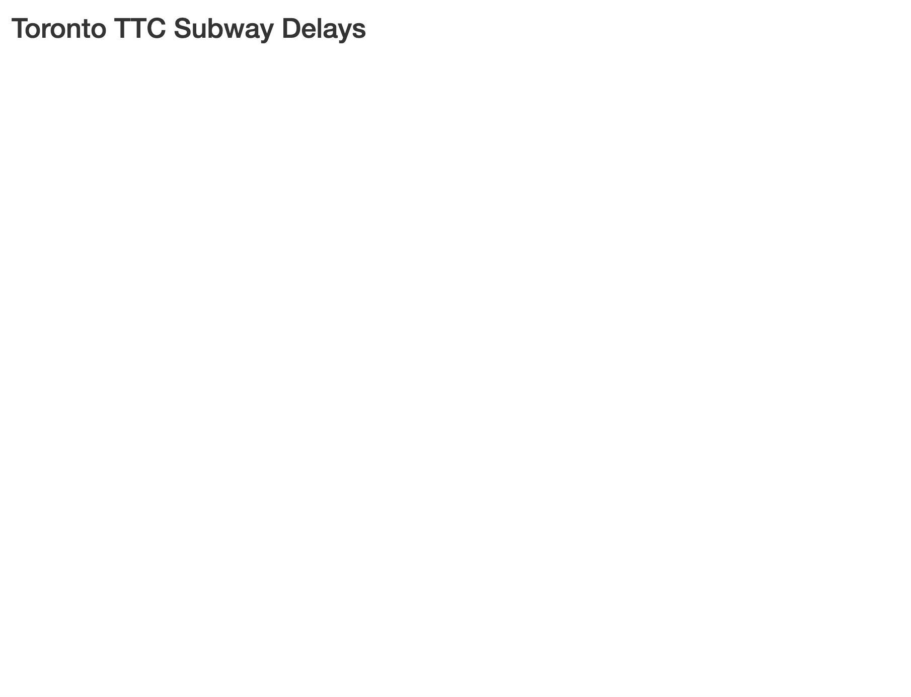
When you run the code at this stage, you should see a new dialog pop open with a blank page and the title Toronto TTC Subway Delays.
Separate UI and Server Function Codes
It is also possible to write the R shiny application code over two R scripts instead of one. This would require you to have one R script called ui.R with the user interface code and another R script called server.R with the server function code. You need to save both files in the same folder. You will not need a third component when you type your application code this way. To run the application, you click on the “Run App” icon on the RStudio toolbar.
Deploying the Application on GitHub
Once you have finalized the code for your application, one way to deploy the application on GitHub is to use the shinyapps.io website: https://www.shinyapps.io/. You can use their free account to deploy up to 5 applications for a total of 25 active hours per month. For more advanced service, you need to pay a subscription fee.
There are three steps involved in deploying the application. First, you install and load the rsconnect package.
# Step 1
install.packages("rsconnect")
library(rsconnect)
Then you connect to your GitHub account from within RStudio. To do this, you need your GitHub username, a token and a secret code. You can get this entire line of code from the shinyapps.io website by logging in with your GitHub account and going to the dashboard: https://www.shinyapps.io/admin/#/dashboard.
# Step 2
rsconnect::setAccountInfo(name='githubusername', token='tokencode', secret=secretcode')
In the final step, you deploy the application by specifying the file path to the folder where you have saved the R Shiny application code and any files used within that code. For example, in this guide, the app.R R script is saved in a folder called ttcdelays.
# Step 3
rsconnect::deployApp('H:/Documents/R Shiny/ttcdelays')
Once you run this final step, you will find the URL where your shiny application has been deployed to in the console window. Note that the shiny application URL contains the name of the folder where you have saved your application code. In this guide, the shiny application was deployed to the following site: https://MDLutoronto.shinyapps.io/ttcdelays/.
B. User Interface
The user interface consists of the layout of the application, one or more control widgets that users can use to interact with the application, and the output objects.
Layout Options
The most common function that is used to create the user interface is the fluidPage() function. Alternatively, you can also use the fixedPage() or boostrapPage() functions.
Once you have created the page, you need to decide what type of layout you want for your application. There are a few layout options possible:
- Single Page Sidebar Layout
- Single Page Multiple Row Layout
- Multiple Pages:
- Multiple Horizontal Tabs
- Multiple Vertical Navigation Bars
You can read more about the different layout options here and here.
Control Widgets
Once you have decided on the layout, you can pick the control widgets that users can use to interact with your application. The choice of control widgets depends on the type of input you want from users. The following image shows you the most common control widgets and the functions used to create them in R.
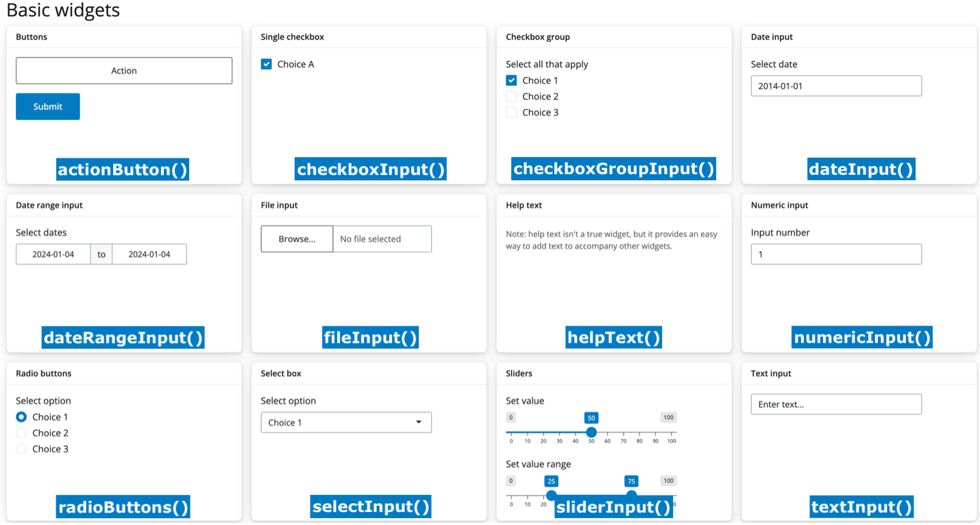
Image Source: https://shiny.posit.co/r/getstarted/shiny-basics/lesson3/
TTC Subway Delays: User Interface
In this section, we will complete the user interface object for our TTC subway delays application. At this stage, we have created the user interface with only a title.
# 1. User Interface
ui <- fluidPage(
	titlePanel(“Toronto TTC Subway Delays”)
)
Layout
The layout we will be using in this guide is the single page sidebar layout. To create the sidebar layout, we add a comma after the title and then we use the sidebarLayout() function. Inside this function, we specify the sidebar and the main panel using the sidebarPanel() and the mainPanel() functions respectively. And we separate these two functions using a comma.
ui <- fluidPage(
  titlePanel("Toronto TTC Subway Delays"),
  sidebarLayout(
		sidebarPanel(),
		mainPanel()
	)
)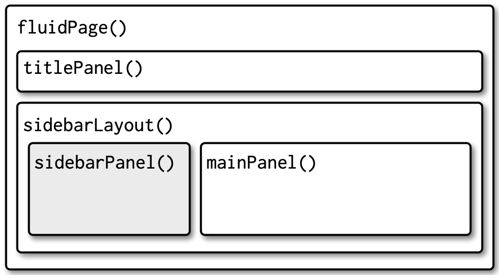
Image Source: https://mastering-shiny.org/action-layout.html
In our application, we will add a few control widgets in the sidebar panel. Then we will add a graph output and a data table output in the main panel. Let’s start by adding our control widgets in the sidebarPanel() function.
ui <- fluidPage(
	titlePanel("Toronto TTC Subway Delays"),
	sidebarLayout(
		sidebarPanel(
            # Add Control Widgets Here
		),
		mainPanel(
			# Add Graph Output and Data Table Output Here
		)
	)
)
Slider Input: Year Range
First, we want to give the user the option to specify the years they are interested in using the slider input widget. To create a slider widget, we use the sliderInput() function.
      # SLIDER: YEAR RANGE
      sliderInput(inputId="year",
                  label="Range of Years:",
                  min=2014, max=2024,
                  value=c(2014,2024),
                  sep="")
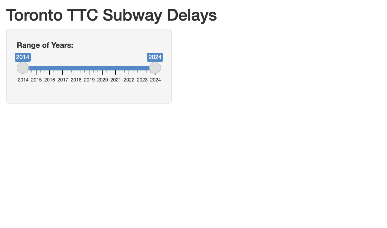
The first argument is the inputId. We assign the inputId argument a variable name of our choosing. In this guide, we use “year”. This variable will store the user’s year range selection on the slider. The label is the title used for the slider input widget.
Then using the min and max arguments, we specify the smallest and largest numbers on the slider. The TTC delays in this dataset range from 2014 to 2024 so we use these numbers. Then we specify the initial or default range of the slider using the value argument. We want the default range to be the entire dataset so we specify the range of 2014 to 2024 inside the c() function. Finally, we use the sep argument to avoid adding a comma to these years (i.e., display 2014 instead of 2,014).
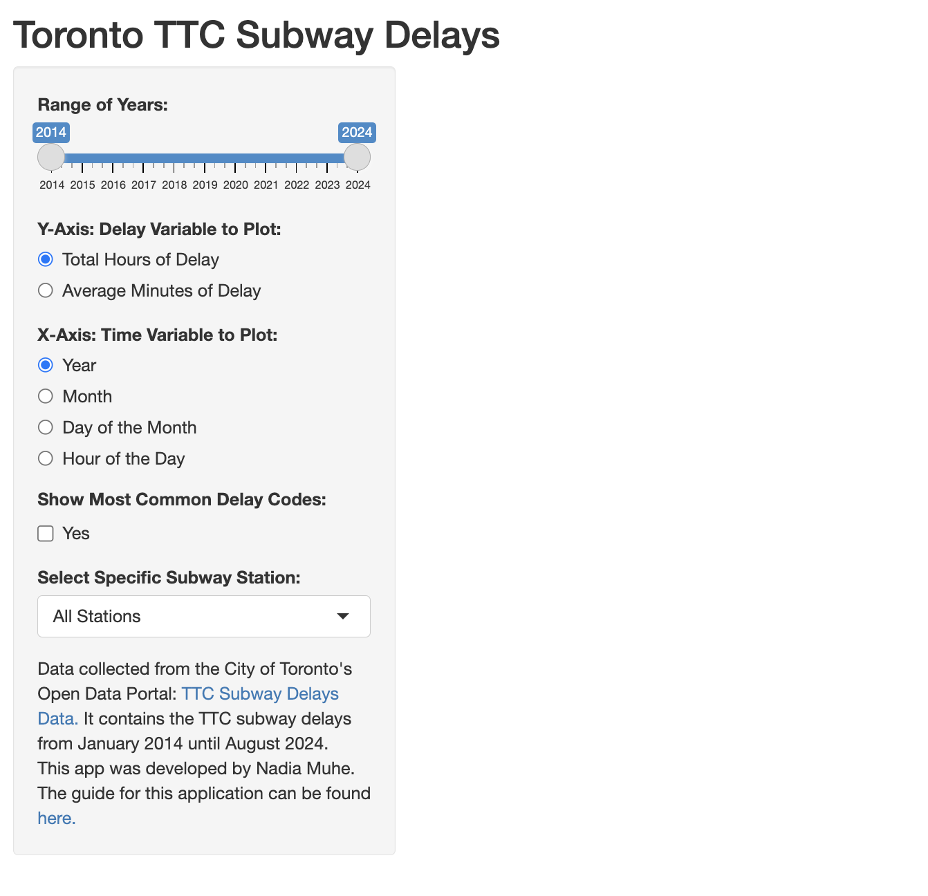
When you save your code and run the application now, you should see the first control widget.
Consecutive control widgets are separated by a comma so we add a comma before moving on to the next widget.
      # SLIDER: YEAR RANGE
      sliderInput(inputId="year",
                  label="Range of Years:",
                  min=2014, max=2024,
                  value=c(2014,2024),
                  sep=""),
Radio Button: Y-Axis and X-Axis of the graph
In the main panel, we will have a line graph showing the trend in TTC delays over different time variables. In the next two widgets, we want to give the user control over the variables used on the y-axis and the x-axis using radio buttons. The y-axis will contain the time delay variable and the x-axis will contain the time period variable to plot.
Let’s start with the y-axis. To create radio buttons, we use the radioButtons() function.
      # RADIO BUTTON: Y-AXIS
      radioButtons(inputId = "yvariable",
                   label = "Y-Axis: Delay Variable to Plot:",
                   choices = list(
                     "Total Hours of Delay" = "totalhours",
                     "Average Minutes of Delay" = "averagemin"))
Inside the function, we specify the inputId as “yvariable” to store the selection of the user. We add the widget title “Y-Axis: Delay Variable to Plot:”.
We will give the user two choices: total hours of delay or average minutes of delay. The default selection will be the first one. We specify the choices as a list using the choices argument. We use the list() function to provide the list of choices. Inside the list() function, for each choice, we provide the choice label, the equal to symbol, and the choice value. The label of the choice is how it is displayed on the application page. The choice value is the identifier for each choice and it will be used later in the server function code.
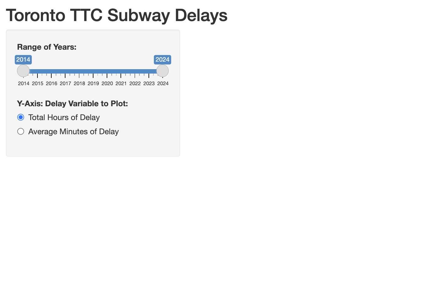
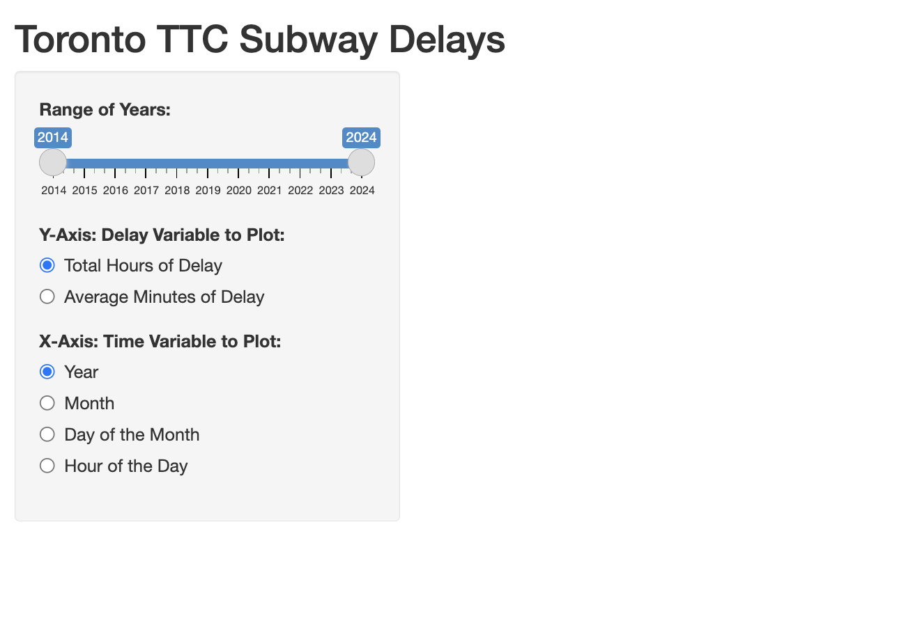
We do the same for the x-axis. For the x-axis, we give the user four choices between year, month, day of the month and hour of the day. Do not forget to add a comma after the y-axis widget before including the code for the x-axis.
      # RADIO BUTTON: X-AXIS
      radioButtons(inputId = "xvariable",
                   label = "X-Axis: Time Variable to Plot:",
                   choices = list(
                     "Year" = "year",
                     "Month" = "month",
                     "Day of the Month" = "day",
                     "Hour of the Day" = "hourofday"))
Now, when you save and run the application code, you should see three control widgets at this stage.
Checkbox: Delay Codes
In addition to a graph, our application will display an optional data table in the main panel. We want to give the user the option to display the data table by checking off a checkbox widget. The checkbox widget does not allow us to add a title so we will add a title first using the h5() function. To get a boldfaced title, we use the strong() function inside the h5() function. Then we add the title “Show Most Common Delay Codes:”.
      # CHECKBOX: DELAY CODES
      h5(strong("Show Most Common Delay Codes:"))
To create a single checkbox, we can use the checkboxInput() function. We store the selection of the user in the variable “showcodes” using the inputId argument. We label the checkbox “Yes” so that the user can check it off to display the data table. And lastly, we set the default value of the checkbox as unchecked or FALSE. In other words, we do not want the data table to be displayed by default.
      # CHECKBOX: DELAY CODES
      h5(strong("Show Most Common Delay Codes:")),
     checkboxInput(inputId="showcodes",
                         label="Yes",
                         value=FALSE)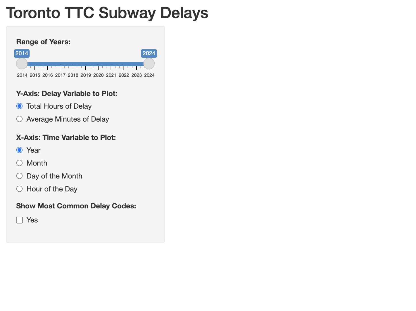
Dropdown Menu: Subway Station
Finally, we want to give the user the option to visualize TTC delays at specific subway stations. We will use a dropdown menu to select a station. To create a dropdown menu, we can use the selectInput() function. Similar to the other widgets, we specify the inputId and the label arguments.
Then we specify the choices inside the dropdown menu the same way we did for the radio button widget using the choices argument. The first choice is the default value of all subway stations. Then we add the full list of Toronto subway stations as the next choices. For each subway station, we add the choice label to be displayed on the application and the choice value to be used in the server function code.
	# DROPDOWN MENU: SUBWAY STATION
     selectInput(inputId="subwaystation",
                  label="Select Specific Subway Station:",
                  choices = list(
                    "All Stations"="allstations",
                    "Kipling Station"="kipling",
                    "Islington Station"="islington",
                    "Royal York Station"="royalyork",
                    "Old Mill Station"= "oldmill",
                    "Jane Station" = "jane",
                    "Runnymede Station" = "runnymede",
                    "High Park Station" = "highpark",
                    "Keele Station" = "keele",
                    "Dundas West Station" = "dundaswest",
                    "Lansdowne Station" = "lansdowne",
                    "Dufferin Station" = "dufferin",
                    "Ossington Station" = "ossington",
                    "Christie Station" = "christie",
                    "Bathurst Station" = "bathurst",
                    "Spadina Station" = "spadina",
                    "St George Station" = "stgeorge",
                    "Bay Station" = "bay",
                    "Bloor-Yonge Station" = "bloor",
                    "Sherbourne Station" = "sherbourne",
                    "Castle Frank Station" = "castlefrank",
                    "Broadview Station" = "broadview",
                    "Chester Station" = "chester",
                    "Pape Station" = "pape",
                    "Donlands Station" = "donlands",
                    "Greenwood Station" = "greenwood",
                    "Coxwell Station" = "coxwell",
                    "Woodbine Station" = "woodbine",
                    "Main Street Station" = "mainstreet",
                    "Victoria Park Station" = "victoriapark",
                    "Warden Station" = "warden",
                    "Kennedy Station" = "kennedy",
                    "Lawrence East Station" = "lawrenceeast",
                    "Ellesmere Station" = "ellesmere",
                    "Midland Station" = "midland",
                    "Scarborough Centre Station" = "scarboroughcentre",
                    "McCowan Station" = "mccowan",
                    "Vaughan MC Station" = "vaughanmc",
                    "Highway 407 Station" = "highway407",
                    "Pioneer Village Station" = "pioneervillage",
                    "York University Station" = "yorkuniversity",
                    "Finch West Station" = "finchwest",
                    "Downsview Park Station" = "downsviewpark",
                    "Sheppard West Station" = "sheppardwest",
                    "Wilson Station" = "wilson",
                    "Yorkdale Station" = "yorkdale",
                    "Lawrence West Station" = "lawrencewest",
                    "Glencairn Station" = "glencairn",
                    "Eglinton West Station" = "eglintonwest",
                    "St Clair West Station" = "stclairwest",
                    "Dupont Station" = "dupont",
                    "Museum Station" = "museum",
                    "Queens Park Station" = "queenspark",
                    "St Patrick Station" = "stpatrick",
                    "Osgoode Station" = "osgoode",
                    "St Andrew Station" = "standrew",
                    "Union Station" = "union",
                    "King Station" = "king",
                    "Queen Station" = "queen",
                    "Dundas Station" = "dundas",
                    "College Station" = "college",
                    "Wellesley Station" = "wellesley",
                    "Rosedale Station" = "rosedale",
                    "Summerhill Station" = "summerhill",
                    "St Clair Station" = "stclair",
                    "Davisville Station" = "davisville",
                    "Eglinton Station" = "eglinton",
                    "Lawrence Station" = "lawrence",
                    "York Mills Station" = "yorkmills",
                    "Sheppard Station" = "sheppard",
                    "North York Centre" = "northyorkcentre",
                    "Finch Station" = "finch",
                    "Bayview Station" = "bayview",
                    "Bessarion Station" = "bessarion",
                    "Leslie Station" = "leslie",
                    "Don Mills Station" = "donmills"))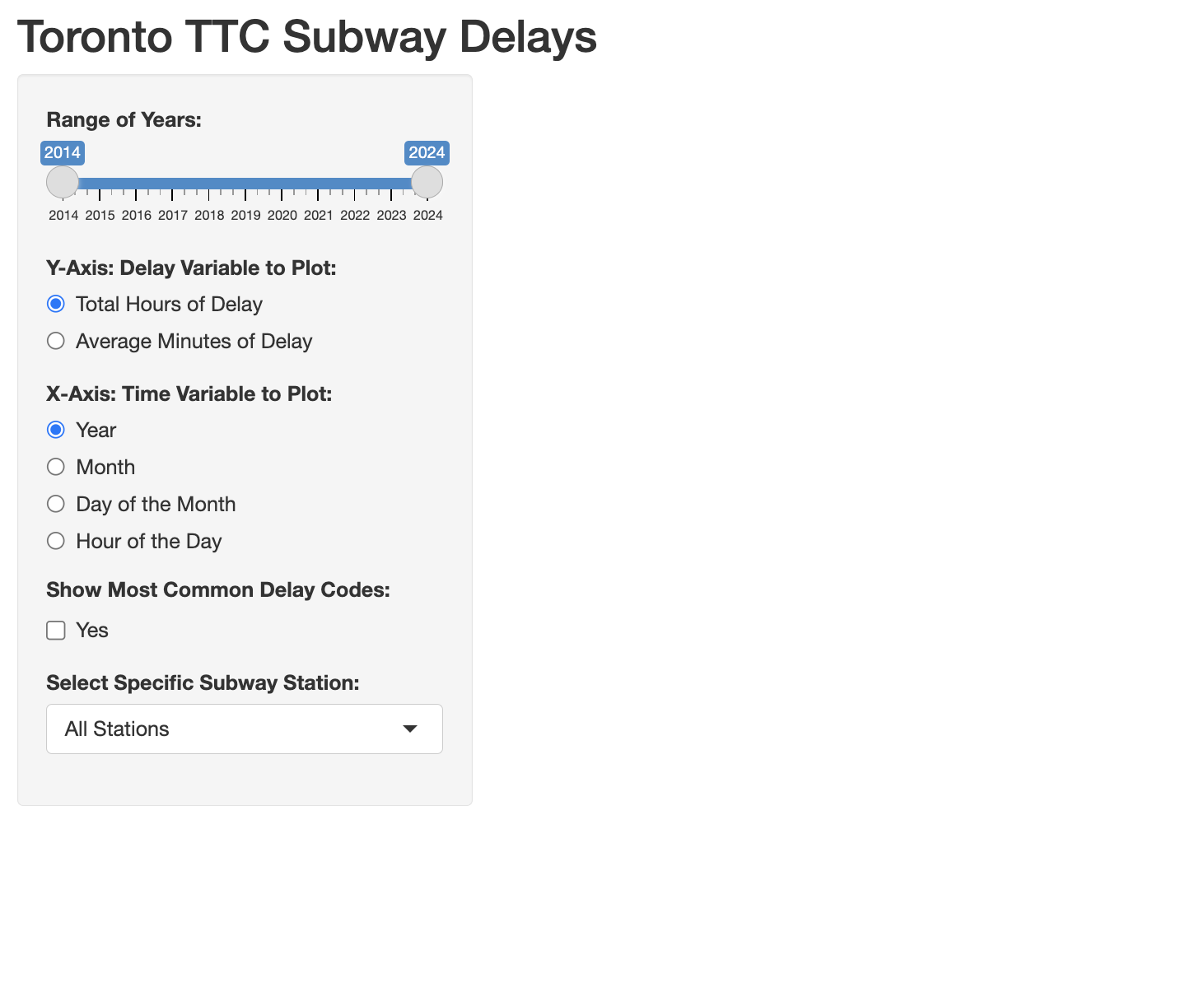
Text: Data Source
At the bottom of the list of control widgets, we want to add some text about the data source, the dataset, the author of the application and the link to this guide. We can simply add text in quotation marks without any function. However, if you are typing text over multiple lines in the R-script, you will need to add a comma at the end of each line before continuing on to the next line.
To add hyperlinks, you can use the a() function from the htmltools package. And to start a new paragraph in your text, you can add a break using the br() function from the htmltools package.
      # TEXT: DATA SOURCE
      "Data collected from the City of Toronto's Open Data Portal:",
      htmltools::a("TTC Subway Delays Data.", href="https://open.toronto.ca/dataset/ttc-subway-delay-data/"),
      "It contains the TTC subway delays from January 2014 until July 2024.",
      htmltools::br(),
      "This app was developed by Nadia Muhe.",
      htmltools::br(),
      "The guide for this application can be found",
      htmltools::a("here.", href="https://mdl.library.utoronto.ca/technology/tutorials/introduction-r-shiny")

This concludes the code for the sidebar part of the user interface. We move on to the main panel.
Main Panel: Graph Output & Data Table Output
Inside the main panel, we want to display a graph and a data table.
    # GRAPH & TABLE
    mainPanel(

    )
To display our graph output first, we use the plotOutput() function and we give our graph the output identifier “graph”. Then to display the TTC delay codes data table output, we use the tableOutput() function and we give the table the output identifier “codestable”. We use a comma to separate the graph and the data table outputs. This code will display the graph first and the data table below it.
    # GRAPH & TABLE
    mainPanel(
        plotOutput("graph"),
        tableOutput("codestable")
    )
When you save and run the code at this stage, nothing shows up on the right-hand side of the application. We need to complete the code for the server function before we can see any output in the main panel.
C. Server Function
The server function is the second component of the R Shiny application. It contains the instructions needed to build the application or more specifically the output of the application based on the user’s input.
Input & Output Parameters
The server function contains two parameters: input and output. The input parameter is used to access the user’s input. We can access the user’s selections by using the inputId variables we specified in the sidebar user interface code. For example, to access user’s selection of years, we can use the following code:
input$yearThe output parameter is used to create the output elements. The output can be a data table, an image, a graph, text etc. Once the output object has been created in the server function, we store it in the output parameter using the outputId variable we specified in the main panel user interface code. For example, when we create our graph, we will store it in the following graph output:
output$graph
Reactive Elements
Reactive elements are Shiny functions or expressions that are sensitive to the input of the user. These expressions react and update the output whenever the user changes the input values.
We want to organize and break up the code in the server function into separate reactive elements to prevent unnecessary computation that can slow down our application. That way, when the user changes one input, instead of having to compute the entire code in the server function, only the particular reactive expression that uses that input will be computed again.
TTC Subway Delays: Server Function
In our TTC subway delays application, the server function will import the TTC subway delays dataset, filter it based on the user’s input, create the graph output, and create the delay codes data table output.
# 2. Server Function
server <- function(input, output){
}
Import Dataset
In the first step, we will import the TTC subway delays dataset. If you have not downloaded the dataset yet, you can download it here. If you store the dataset in the same folder as the application code, you do not need to specify the directory. To import the RDS data file, we use the readRDS() function and store the dataset as ttc.
# 2. Server Function
server <- function(input, output){
	# IMPORT DATASET
	ttc<-readRDS("ttcdelays.rds")
}
Filter Dataset
In the second step, we will filter the dataset. To filter the dataset, we will create a reactive element using the reactive() function. We will store the reactive expression as ttcfiltered. Note that inside the parentheses of the reactive() function, we add a pair of curly brackets to create the reactive expression.
	# FILTER DATASET
 	ttcfiltered <- reactive({

 	})
Inside this reactive element, we will filter the ttc dataset. First, we will filter by the user’s year selection and then by the user’s subway station selection.
We subset the ttc dataset using the filter function from the dplyr package. We want the year variable to be greater than or equal to the user selected minimum year and less than or equal to the user selected maximum year. In other words, we only want to keep the TTC delays within or equal to the upper and lower bound of the user’s year range selection.
The user’s selection of the minimum and maximum year is stored in the input variable year. We use input$year to extract these values. This is a list of two numbers. For the minimum year selected, we use the first index and for the maximum year selected, we use the second index. We store the filtered dataset as ttc.
# FILTER DATASET
 ttcfiltered <- reactive({

    # Filter by Year
    ttc <- ttc %>% filter(year>=input$year[1] & year<=input$year[2])

  })
Next, we filter by the subway station selected. The subway selection input is stored in input$subwaystation. We only want to filter by subway station if the user makes a selection. Otherwise, we want to leave the default of “allstations”. So, we use an if statement. Inside the parentheses, we add our condition: we only want to filter the dataset when the selection is not equal to “allstations”.
Then inside the curly brackets, we filter the ttc dataset by the subway station selected. The ttc dataset has an indicator variable for each station. When a delay took place at a particular station, the station variable has a value of one, otherwise, it has a value of zero. We will use the selected station variable to filter the dataset.
Inside the filter function, if we use input$subwaystation, the selected station will be added as a text value. But we want to use the station name as a variable to filter the dataset. To do this, we use two exclamation marks followed by the function as.name() and inside we add the selected subway station value input$subwaystation (i.e., !!as.name(input$subwaystation)). This step will insert the selected subway station as a variable instead of a text value. Then to select the delays at a particular station, we add the condition equals to 1. Lastly, we store the filtered dataset as ttc again.
# FILTER DATASET
 ttcfiltered <- reactive({

    # Filter by Year
    ttc <- ttc %>% filter(year>=input$year[1] & year<=input$year[2])

    # Filter by Subway Station
   if(input$subwaystation!="allstations"){
      ttc <- ttc %>% filter(!!as.name(input$subwaystation)==1)
    }

  })
Finally, we use the return() function to return the filtered dataset ttc at the end of this reactive expression.
# FILTER DATASET
 ttcfiltered <- reactive({

    # Filter by Year
    ttc <- ttc %>% filter(year>=input$year[1] & year<=input$year[2])

    # Filter by Subway Station
   if(input$subwaystation!="allstations"){
      ttc <- ttc %>% filter(!!as.name(input$subwaystation)==1)
    }

    return(ttc)
  })
Graph Output
Now let’s we move on to the graph output. To make a graph output, we use the renderPlot() function. This function creates a reactive expression.
  # GRAPH OUTPUT
  output$graph<-renderPlot({

  })
First, we prepare the data used for the graph. We take the filtered dataset reactive element ttcfiltered(), convert it to a data frame, and store it as ttcfiltered.
  # GRAPH OUTPUT
  output$graph<-renderPlot({

    # Prepare Graph Data
    ttcfiltered <- as.data.frame(ttcfiltered())

  })
The user will have the option to plot the total hours of delay (default option) or the average minutes of delay on the y-axis. To prepare the data for the graph, we will use the filtered dataset to calculate these two delay variables. For now, we will not consider any input from the user. The default graph uses total hours of delay on the y-axis and year on the x-axis.
To calculate the two delay variables, we take the filtered dataset, group the delays by year and we calculate the delay variable per year using the summarize function. We calculate the total hours of delay as the sum of the delay minutes divided by 60. And we calculate the average minutes of delay as the mean of delay minutes. We store these two variables as totalhours and averagemin respectively. Note that we use these same variable names as inputId values for the y-axis selection in the user interface code. Lastly, we store this dataset as ttcgraphdata.
  # GRAPH OUTPUT
  output$graph<-renderPlot({

    # Prepare Graph Data
    ttcfiltered <- as.data.frame(ttcfiltered())
    ttcgraphdata <- ttcfiltered %>%
      group_by(year) %>%
      summarize(totalhours = sum(delayminutes, na.rm = TRUE)/60,
                averagemin = mean(delayminutes, na.rm = TRUE))

  })
The graph we want to make is a line graph. We will use the ggplot2 functions to create our graph. First, we enter the dataset name ttcgraphdata, the year variable for the x-axis and the totalhours variable for the y-axis. To make a line graph, we use the geom_line() function and we give the line graph the colour yellow and a thickness of 1 unit. Lastly, we apply the black and white theme using the theme_bw() function and we also increase the overall font size of the graph to 15 using the argument base_size.
  # GRAPH OUTPUT
  output$graph<-renderPlot({

    # Prepare graph data
    ttcfiltered <- as.data.frame(ttcfiltered())
    ttcgraphdata <- ttcfiltered %>%
      group_by(year) %>%
      summarize(totalhours = sum(delayminutes, na.rm = TRUE)/60,
                averagemin = mean(delayminutes, na.rm = TRUE))
    # Graph
    ggplot(ttcgraphdata, aes(x=year,
                  y=totalhours)) +
    geom_line(color="yellow3", linewidth=1) +
    theme_bw(base_size=15)

  }
Once we save and run this code, it gives us a plot in the main panel. When you play around with the year range and the subway station selection, you should see the graph updated.
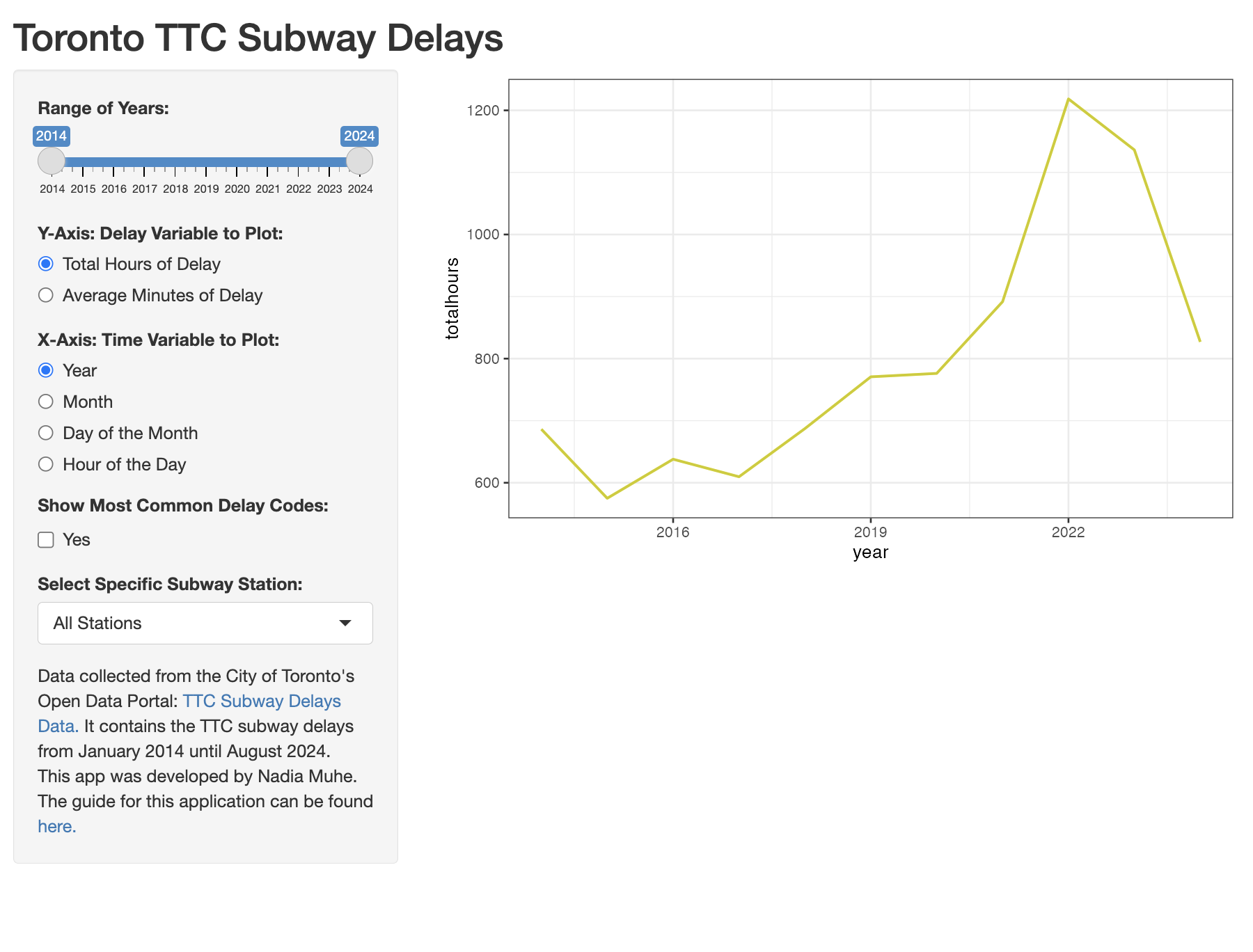
When you change the values of the radio buttons for the X and the Y axes, there are no updates to the graph because we have not included the user’s input in our code yet. To include the user’s input on the graph variables, we need to make the following three changes to our graph output code.
First, in preparing the graph data, we want to group the ttcfiltered dataset by the user’s input rather than just year. The user’s input for the x-axis is stored in input$xvariable. We need use two exclamation marks along with the as.name() function on input$xvariable to include the xvariable input as a variable rather than a text value. So, we replace year by !!as.name(input$xvariable).
Next, we will replace the x-axis and y-axis variables in the ggplot() function with the user’s input. The user’s input for the x-axis is stored in input$xvariable and the user’s input for the y-axis is stored in input$yvariable. Again here, we will use the !!as.name() function with both inputs to insert them as variable names.
  # GRAPH OUTPUT
  output$graph<-renderPlot({
    # Prepare graph data
    ttcfiltered <- as.data.frame(ttcfiltered())
    ttcgraphdata <- ttcfiltered %>%
      group_by(!!as.name(input$xvariable)) %>%
      summarize(totalhours = sum(delayminutes, na.rm = TRUE)/60,
                averagemin = mean(delayminutes, na.rm = TRUE))
    # Graph
    ggplot(ttcgraphdata, aes(x=!!as.name(input$xvariable),
                 y=!!as.name(input$yvariable))) +
    geom_line(color="yellow3", linewidth=1) +
    theme_bw(base_size=15)

  })
Once you save and run the application, you will see that you can modify all of the widgets except for the checkbox and the graph output will be updated. The image below shows the graph of average minutes of delay by hour of the day.
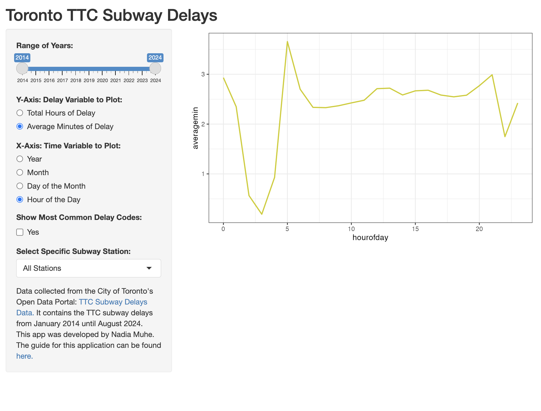
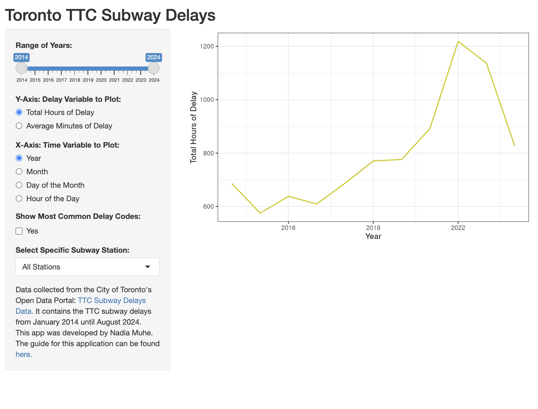
There are few things we still want to improve on this graph. Let’s start with the label of the axes.
To modify the label of the y-axis, we will create a variable called ylabel. And in the first step, we will assign it the value of “Total Hours of Delay” since the totalhours variable is the default option for the y-axis. Then we use an if statement to check if the user selection or input$yvariable has changed to averagemin. When this condition is true, we will change the value of ylabel to “Average Minutes of Delay” inside the curly brackets.
We do the same thing for the x-axis. We first create a variable called xlabel with the value of “Year”. Then we use if and else if statements to modify xlabel based on the user’s input for the x-axis.
To apply these labels to the graph, in the ggplot section, we add the ylab() and the xlab() functions. Inside each of these functions, we include the labels ylabel and xlabel respectively.
  # GRAPH OUTPUT
  output$graph<-renderPlot({
    # Prepare graph data
    ttcfiltered <- as.data.frame(ttcfiltered())
    ttcgraphdata <- ttcfiltered %>%
      group_by(!!as.name(input$xvariable)) %>%
      summarize(totalhours = sum(delayminutes, na.rm = TRUE)/60,
                averagemin = mean(delayminutes, na.rm = TRUE))

    # Y-Axis Label
    ylabel <- "Total Hours of Delay"
   if(input$yvariable=="averagemin"){
      ylabel <- "Average Minutes of Delay"
    }
    # X-Axis Label
    xlabel <- "Year"
    if(input$xvariable=="month"){
      xlabel <- "Month"
    } else if(input$xvariable=="day"){
      xlabel <- "Day of the Week"
    } else if(input$xvariable=="hourofday"){
      xlabel <- "Hour of the Day"
    }
    # Graph
    ggplot(ttcgraphdata, aes(x=!!as.name(input$xvariable),
                 y=!!as.name(input$yvariable))) +
    geom_line(color="yellow3", linewidth=1) +
    theme_bw(base_size=15) +
    ylab(ylabel) + xlab(xlabel)

  })
We also want to modify the title of the graph. To add a title, we use the ggtitle() function. We want the title to be based on the variables selected for the y-axis and the x-axis so we will use the ylabel and xlabel variables. We use the paste0() function inside ggtitle() to combine variables and text to make our final title. We start the title with the label of the y-axis, the term “by”, followed by the label of the x-axis. For example, the default title will be “Total Hours of Delay by Year”.
Then at the end of the title, we will add the size of the filtered TTC subway delays dataset we are using in parentheses. We will use the lowercase letter n to represent the sample size. And to calculate the size of the ttcfiltered dataset, we use the nrow() function. This will give us a default title of “Total Hours of Delay by Year (n=210214)”.
    # Graph
    ggplot(ttcgraphdata, aes(x=!!as.name(input$xvariable),
                 y=!!as.name(input$yvariable))) +
    geom_line(color="yellow3", linewidth=1) +
    theme_bw(base_size=15) +
    ylab(ylabel) + xlab(xlabel) +
ggtitle(paste0(ylabel, " by ", xlabel, " (n=", nrow(ttcfiltered), ")")) 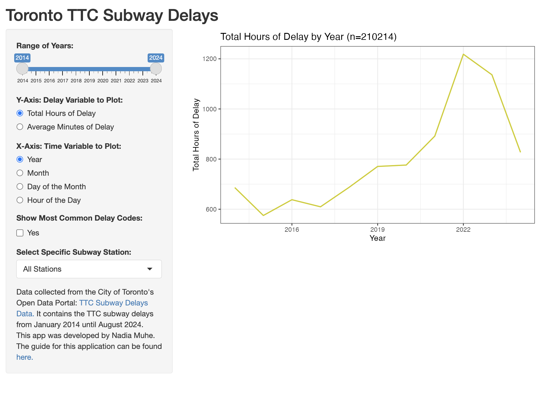
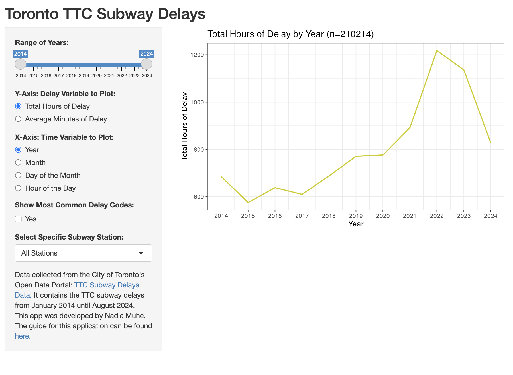
The final improvement we want to make on this graph is the x-axis tick marks. We want to have tick marks for each integer of the time variable selected. To achieve this, first we will store the minimum and the maximum value of the time variable selected for the x-axis.
We start with the ttcgraphdata and we use the summarize() function to calculate the minimum value of input$xvariable. We use !!as.name() to insert the user’s input as a variable. The output from the summarize function is a data frame that contains the minimum value. We will convert it to a number using the as.numeric() function. Then we store this number as xmin. We do the same thing for the maximum value of the time variable and store it as xmax.
To modify the tick marks on the x-axis, in the ggplot section, we use the breaks argument inside the scale_x_continuous() function. We can specify the exact sequence of numbers we want tick marks for using the seq() function. Inside this seq() function, we specify the minimum value as xmin, the maximum value as xmax and the increment in the sequence to be equal to 1.
  # GRAPH OUTPUT
  output$graph<-renderPlot({
    # Prepare graph data
    ttcfiltered <- as.data.frame(ttcfiltered())
    ttcgraphdata <- ttcfiltered %>%
      group_by(!!as.name(input$xvariable)) %>%
      summarize(totalhours = sum(delayminutes, na.rm = TRUE)/60,
                averagemin = mean(delayminutes, na.rm = TRUE))

    # Y-Axis Label
    ylabel <- "Total Hours of Delay"
   if(input$yvariable=="averagemin"){
      ylabel <- "Average Minutes of Delay"
    }
    # X-Axis Label
    xlabel <- "Year"
    if(input$xvariable=="month"){
      xlabel <- "Month"
    } else if(input$xvariable=="day"){
      xlabel <- "Day of the Week"
    } else if(input$xvariable=="hourofday"){
      xlabel <- "Hour of the Day"
    }
    # X-Axis Tick Marks
    xmin <- ttcgraphdata %>% summarize(min(!!as.name(input$xvariable))) %>% as.numeric()
    xmax <- ttcgraphdata %>% summarize(max(!!as.name(input$xvariable))) %>% as.numeric()
    # Graph
    ggplot(ttcgraphdata, aes(x=!!as.name(input$xvariable),
                 y=!!as.name(input$yvariable))) +
    geom_line(color="yellow3", linewidth=1) +
    theme_bw(base_size=15) +
    ylab(ylabel) + xlab(xlabel) +
    ggtitle(paste0(ylabel, " by ", xlabel, " (n=", nrow(ttcfiltered), ")")) +
    scale_x_continuous(breaks=seq(xmin, xmax, 1))

  })
When you save and run the application code, you will see that for any of the time variables, the plot will show a tick mark for all of the possible integer values. We have completed the code for the graph output!
Data Table Output
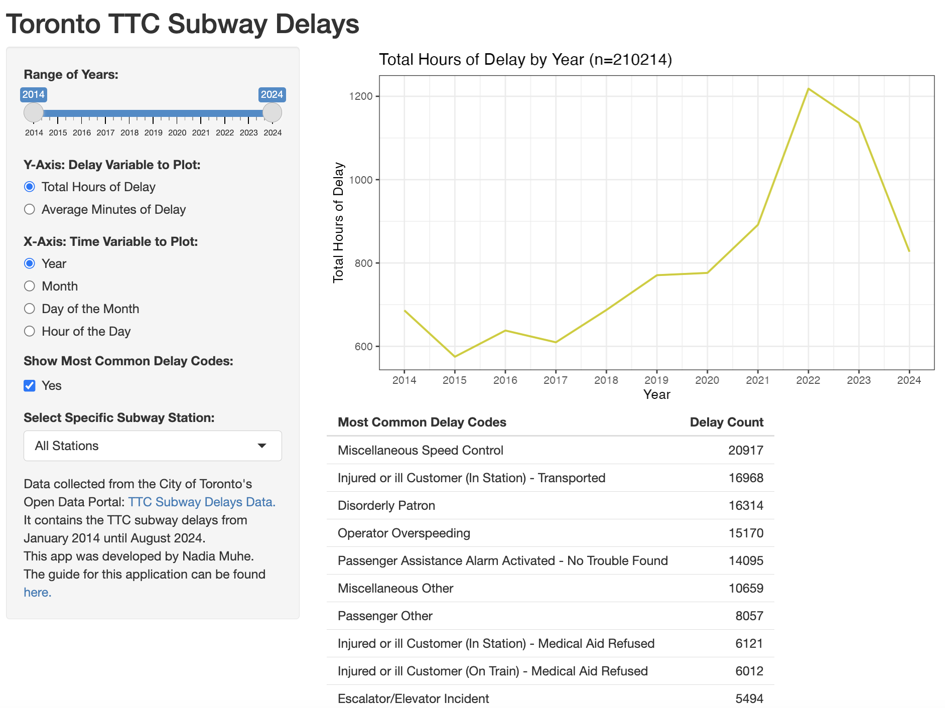
Next, we will build the code to generate the delay codes data table. For the specific time period and location selected by the user, we want to display a data table of the ten most common TTC delay codes.
To create a table output, we use the renderTable() function. We will store the table as output$codestable. The variable “codestable” is the output identifier we specified in the main panel user interface code.
  # DELAY CODES DATA TABLE OUTPUT
  output$codestable<-renderTable({
 })
We only want to display this table if the user requests it by checking off the show delay codes checkbox. The identifier for this checkbox is “showcodes” so we will use input$showcodes to check if the checkbox has been checked off (TRUE) or not (FALSE). We use an if statement to check if input$showcodes is true.
  # DELAY CODES DATA TABLE OUTPUT
  output$codestable<-renderTable({
  	if(input$showcodes==TRUE){
  	}
  })
When the condition is true, we want to take the filtered dataset from the ttcfiltered() reactive element, convert it to a data frame, group it by delay codes and then count the frequency of each code using the summarize() function. Then we sort the dataset by the frequency variable to get the most frequency codes at the top and the least frequent ones at the bottom. We filter this dataset to extract the first ten rows or the ten most common delay codes using row_number(). This entire process will give us a data table with the top ten delay codes and their count. Finally, we rename these two columns, code and count, using the rename() function as “Most Common Delay Codes” and “Delay Count”.
  # DELAY CODES DATA TABLE OUTPUT
  output$codestable<-renderTable({
    if(input$showcodes==TRUE){
      as.data.frame(ttcfiltered()) %>%
        group_by(code) %>%
        summarize(count = n()) %>%
        arrange(desc(count)) %>%
        filter(row_number()<=10) %>%
        rename("Most Common Delay Codes"="code", "Delay Count"="count")
    }

  })
Save and run the application code. Now when you check off the show delay codes checkbox, you will see a data table of the top ten most common TTC delay codes below the line graph.
D. Resources
In addition to this guide, below are some other learning resources you can use to continue learning R Shiny as well as complementary packages that you can use with R shiny to build more complex dashboards.
Learning Resources:
- Shiny Package Official Documentation: https://cran.r-project.org/web/packages/shiny/shiny.pdf
- Shiny Guide by Posit: https://shiny.posit.co/r/getstarted/shiny-basics/lesson1/index.html
- Shiny eBook: https://mastering-shiny.org/index.html
Additional packages to complement shiny:
- shinythemes: https://rstudio.github.io/shinythemes/
- shinydashboard: https://rstudio.github.io/shinydashboard/index.html
Alternative link for the TTC Subway Delays application: