Table of Contents
Introduction
The Dashboard
Starting a Visualization Project
Tableau Tutorial
-
Create side-by-side bar graphs with filters for cases by day
-
Create side-by-side proportional symbol maps of cases with dynamic tooltips
-
Create a dashboard to pull these three visualizations together
Introduction
DISCLAIMER: This is a very complex topic and situation right now. If you are new to data visualization, this tutorial will help you build your skills, but that does not mean you should then be sharing all the COVID-19 visualizations you create. Leave that to experts, many of whom have already done this. COVID-19 data is not a “cool new dataset” to play with and data visualizations in this context MUST NOT be misleading, inaccurate, or incite panic. Each data point represents a person. Responsible and sensitive visualizations are essential. Epidemiology is also a complex area; fully understanding the data, statistics and visualizations is critical to producing and sharing useful and effective visualizations on this topic. So we recommend that for beginners you create visualizations, such as the one created in this tutorial, for just yourself, for your own learning.
Before embarking on this tutorial, do the following:
-
Get more familiar with the topic and data, and the concerns and precautions around visualizing it:
-
10 considerations before you create another chart about COVID-19 (Tableau)
-
A complete guide to coronavirus charts: Be informed, not terrified (Amanda Makulec, Excella, FastCompany)
-
17 (or so) responsible live visualizations about the coronavirus, for you to use (Datawrapper)
-
What the BBC got wrong in their COVID-19 visualization (Tableau)
-
-
Install Tableau Desktop (This tutorial was created using Tableau Desktop version 2020.2)
-
Get more familiar with the tool we’re going to be using by trying some of our other Tableau tutorials first:
-
Creating Data Visualizations Using Tableau Desktop (Beginner)
-
Getting Started with Tableau Desktop (Beginner to Intermediate)
-
The Dashboard
This tutorial will be focused on learning how to recreate aspects of this old dashboard (seen as a screenshot) and this new dashboard using Tableau Desktop. Note: This dashboard used to have information on recoveries as well, which is best practice for COVID-19 visualizations, but unfortunately the dataset it was based on removed recovery information, as they concluded the data was too unreliable. Also, this dashboard (and so the tutorial) was designed using straight case counts, but for comparison purposes, it would make more sense to compare based on cases per # of people (e.g., cases per 100,000 people).
When working to emulate a Tableau dashboard found on the Tableau Public website, you can often click on the download icon (hover over the icons at the bottom right of the dashboard to find it) and download the underlying workbook (if the owner gave permission).


This is a great way to learn how to create dashboards in Tableau. However, in some situations, a workbook can be so complicated that it might take a while to unpick and understand what is going on. That is the situation here, and why this tutorial was created.
Starting a Visualization Project
Before embarking on any visualization project, you should always consider your audience and purpose for your visualization (Stage 1) (see our Data Visualization Guide Design Workflow section for more details). For the purposes of this tutorial, the audience is for your eyes only and the purpose is to learn how to visualize data in Tableau Desktop.
Next, you need to select your data and gain an understanding of it (Stage 2). For this tutorial, we started by using a Google Sheet document that was being continuously cleaned and updated by Tableau daily (see this page for details). This was not necessarily the most authoritative or up-to-date data source to use for this topic; see our resources pages for other sources out there. It was selected as a good source to demonstrate linking to real time data in Tableau.
Note: The dashboard and dataset are constantly changing. Unfortunately, these instructions no longer work with the current google sheet, so instead download this snapshot of the data (from April 7, 2020) to use with the tutorial instead. In Tableau’s Connect screen, connect to an Excel file instead and browse to this snapshot file, then skip to step 2 to continue the tutorial. We leave the old instructions up for your reference on how you would connect to a google sheet datasource. More details about this dataset and how it has changed since this tutorial was created can be found on this Tableau page.
Tableau Tutorial
Connecting to a live dataset that has multiple sheets
-
First start up Tableau Desktop and connect it to a Google Sheet of the COVID-19 data. In Tableau’s Connect screen, under To a Server, select Google Sheets.

Follow the prompts to allow Tableau to access your Google account. Go back to Tableau. From a list of sheets, you should see COVID-19 Cases, highlight it, and then click on Connect. If you don’t see that sheet, then, in the URL bar, paste this link: https://docs.google.com/spreadsheets/d/14quQPFErG-hlpsrNgYcX85vW7JMMK5X2vNZrafRcH8c/edit#gid=1154316396 and click on Search. Then highlight the sheet COVID-19 cases, and click on Connect.

Since this is a popular dataset, it might take some time to first connect to it, and then to load the data.
-
Drag New Union, listed on the left, to the orange box in the centre of the screen that says “Drag sheets here”.

-
Next drag in the sheets called COVID-19 Confirmed and COVID-19 Deaths into the Union box, and click on OK. This will create a dataset combining all the rows in both of these sheets (they share the same columns).

-
Click on Sheet 1 (in orange at the bottom) to create a new worksheet.
Create side-by-side bar graphs with filters for cases by day
-
First, we will create the side by side bar graphs of confirmed cases and deaths over time. Right click on the Sheet 1 tab at the bottom, select Rename, and give it the name “CasesbyDay”.

-
From the Dimensions section, drag Date next to columns. Note that it defaults to YEAR(Date). To format how the date is displayed, right click on YEAR(Date) and select Day, specifically the option that has the example "8th May, 2015".

-
Right click again on DAY(Date) and this time select Discrete - as the data updates daily, it is not a continuous flow.

-
From the Measures section, drag Cases next to rows.

-
On the Marks card, from its drop down that says Automatic, change the selection to Bar.

-
From Dimensions, drag Case_Type next to columns, to the left of DAY(Date). This creates two side-by-side bar graphs showing cases by day. By sharing the y-axis, you can more accurately compare the data. To see them both without scrolling, drop down on Standard at the top and change the view to Entire View.

-
Let’s use colours to differentiate the two categories. Drag Case_Type to Color on the Marks card. Click on Color and then select "Edit Colors...".

Leave Confirmed cases at the default blue, but select Deaths then the purple available in the default palette to change it. Then click on OK.

-
Let’s clean up the axes so that when the graphs are displayed in the dashboard, they don’t take up so much room. Right click on the x-axis listing the dates, and uncheck Show Header. Since one day will be highlighted, click in the white space of the graph to unselect that day.

-
Right click on the Case Type header in the graph, and select Hide Field Label for Columns.

-
We can also add some filters to these graphs, so that a user could filter to see a certain country or date range. From Dimensions, drag Country_Region to the Filters shelf. Click on All and then OK.
Then right click on the Country_Region pill on the Filters shelf and select Show Filter.

You will see a list of countries on the right. If you hover over the title of the list, you should see a small arrow on the right that you can use to access a drop-down menu.

Click on it and select Single Value (dropdown).

This makes the filter take up a much smaller amount of space on the screen, and eventually the dashboard. Make the country filter include All countries for now.
-
From Dimensions, drag Date to the Filters shelf. Select Relative Date and click Next.
!["Filter Field [Date]" pop up menu with the menu item "Relative Date" highlighted.](/sites/default/public/pictures/tableau_intermediate_019.png)
Go to the Starting date tab, check Include Null Values, and then click OK.
![The "Filter [Date]" pop up window the items “Starting date” and "Include Null Values" highlighted.](/sites/default/public/pictures/tableau_intermediate_020.png)
Then right click on the Date pill on the Filters shelf and select Show Filter. You will see a slider Date filter on the right.

Create a parameter so that the graphs change based on whether the user wants to see total cases or new cases
-
Right click in the blank space under the Measures section, and select Create Parameter…

Name it Select Metric. Change data type to Integer. Under Allowable values, click List. In the List of values below, click on the first row under Value and type 0. Next to it, in the same row under Display As, type Total Cases. On the next row, under Value type 1 and under Display As type New Cases. Click elsewhere in the list to stop editing New Cases. Then click OK.

You will see a new section appear under the Measures section, called Parameter, listing the new parameter we just created. This parameter will allow the user to specify if they want to review data for total cases or new cases.
-
Currently, the parameter just collects input from the user, but doesn't act on it. To apply the choice to the graph, we need to create a field that acts on that choice and displays what data was requested. From the Analysis menu, select Create Calculated Field...,
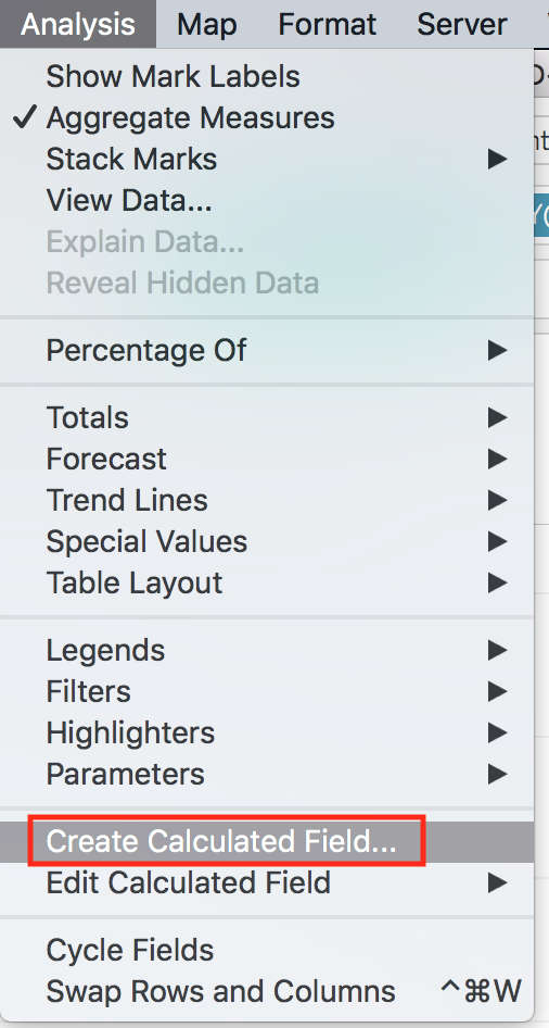
and name it Metric Switcher. Paste in the following formula:
IF [Select Metric]=0 THEN [Cases] ELSE [Difference] END

Then click on OK. You should see this new field in the Measures section.
Note: Whenever a variable is mentioned (e.g. [Cases]), you can either type the variable name exactly as it is shown or drag the variable’s pill into the calculation field. -
In the rows section, right click on SUM(Cases), and select Remove.

Then, from Measures, drag Metric Switcher next to Rows.

-
From the Parameters section, right click on Select Metric, and select Show Parameter.

Now you can adjust whether Total Cases or New Cases are displayed in the bar graphs using this menu. It will sum either the field Cases or Difference depending on what was selected.
Create a dynamic mark label
-
Let’s add a dynamic mark label to highlight today’s data in the graph. From Measures, drag Metric Switcher to Label on the Marks card. From Dimensions, drag Date to Label too.

-
Right click on the YEAR(Date) pill listed on the Marks card, and select Exact Date.

-
Click on Label on the Marks card. Under the Marks to Label section, select Most Recent. Under the Label Appearance section, click on the gray button with ellipses next to Text.

Center both lines (if not centered already) and bold them. Change <SUM(Metric Switcher)> to size 12, and <Date> to size 10. Then click on OK.

-
While still on the Label popup, under the Label Appearance section, click the Alignment dropdown menu. Set Horizontal alignment to right justified, Direction (of text) to a right-side up A, Vertical alignment to top, and Wrap to off.

Note: Sometimes you need to select a sideways A first and then the right-side up A in order to make the change stay – just a bug. Now you should see a dynamic label for our latest data point.
Create a dynamic bar graph embedded in a tooltip
-
Let’s create a small bar graph that will show up as part of a tooltip when you hover over a bar in the graph. First, create a second worksheet, naming it Tooltip.


-
From Measures, drag Metric Switcher next to columns.
-
From Dimensions, drag Case_Type next to rows.
-
Also, from Dimensions, drag Case_Type to Color on the Marks card.
-
Right click on the x-axis and uncheck Show Header.

-
Within the bar graph, right click on the Case_Type header listed above Confirmed and Deaths on the y-axis. Click Hide Field Labels for Rows.

Note: Do not right click on the Case_Type pill next to Rows. This specifically refers to an option only present when clicking on the tab within the graph.
-
Click on Label on the Marks card and check Show Mark Labels. Then click away.

-
Go back to the CasesbyDay worksheet and click on Tooltip on the Marks card.
Delete all text except for <DAY(Date)>. Then, underneath <DAY(Date)>, click on Insert, Sheets, Tooltip.

-
In the ensuing block of text, highlight <All Fields> (but leave the surrounding quotation marks), click on Insert, and then click DAY(Date).

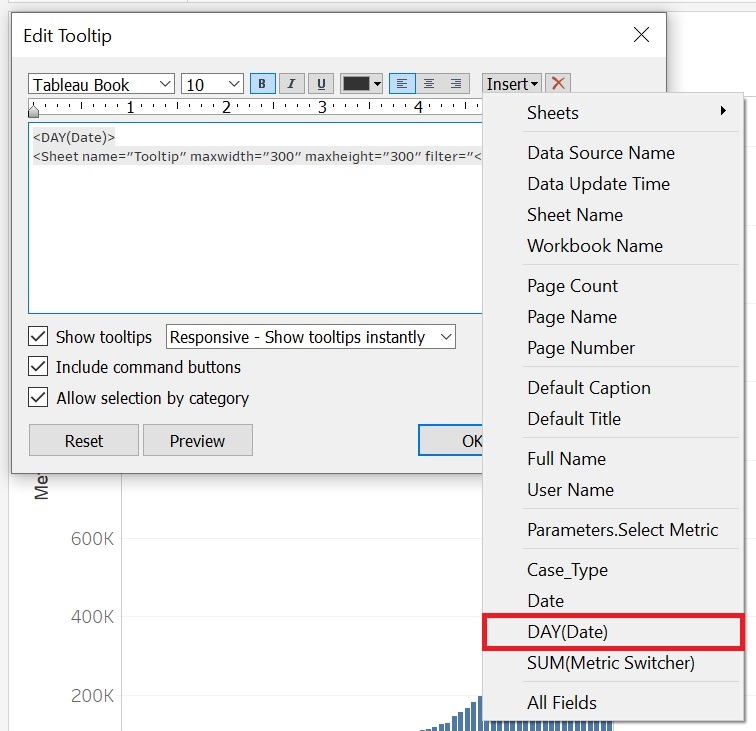

Then click OK. As you hover over the various bars, you will now see the Tooltip worksheet in miniature, filtered by the date, showing the day’s data.

-
To finish up, let’s clean up the axes a bit more. Now that we have added a label and a tooltip, right click on the y axis and uncheck Show Header to remove that extra information and make the graph more compact for our dashboard.


Create side-by-side proportional symbol maps of cases with dynamic tooltips
-
For the next section of the dashboard, we need to create some maps. First, create a third worksheet and name it Map. For best practices on mapping COVID data, including an explanation of the choice of why one might use a logarithmic scale to size the proportional symbols (which we will do in this case), see this blog post from Esri on Mapping Coronavirus, responsibly.
-
From the Analysis menu, select Create Calculated Field..., and name it Log of Metric Switcher. Paste in the following formula:
LOG(SUM([Metric Switcher]))

	//Used for the map mark size scaling
Then click on OK.
Note: The double forward slashes are used to denote comments. They are notes to help you and anyone else looking at your code to understand what it is doing, but it has no effect.

-
Holding the CTRL key (or the Command key on a Mac), click on Lat, Log of Metric Switcher, and Long to select all of them from the Measures section. Release the CTRL key and click on the Show Me tab (top right). Click on the recommended graph type, which is a proportional symbol map. Then, click on the Show Me tab afterwards to close it.

-
In the columns section, right click on the Long pill and select Dimension. Do the same thing for the Lat pill.

-
From Dimensions, drag Case_Type next to columns, to the left of Long to create side-by-side maps.
-
From Dimensions, drag Case_Type to Color on the Marks card to apply the same colour scheme as the previous visualization.

-
From the Analysis menu, select Create Calculated Field..., and name it Max Date. Paste in the following formula:
{MAX([Date])}

	//A Level of Detail calculation, using curly brackets to calculate at the level of whole table, to find the most recent date

-
Create another calculated field: from the Analysis menu, select Create Calculated Field..., and name it Date is Max, Paste in the following formula:
[Max Date] = [Date]

	//Boolean logic used to display the most current date’s information

-
From Dimensions, drag Date is Max to the Filters shelf, select True, and click on OK. This will ensure that the map is only displaying data for the most recent date.
!["Filter [Date is Max]" pop up window, with the item "True" checked](/sites/default/public/pictures/tableau_intermediate_049a.png)
-
From Measures, drag Metric Switcher to the Filters shelf. Select Sum and click Next.
![The "Filter Field [Metric Switcher]" pop up window with the item "Sum" highlighted.](/sites/default/public/pictures/tableau_intermediate_050.png)
Click on the At least tab, set the minimum value to 1, and then click OK. This ensures the map will only show data where there is at least 1 case.
![The "Filter [Metric Switcher]" pop up window with the item “At least” and the minimum value of "1" highlighted.](/sites/default/public/pictures/tableau_intermediate_051.png)
-
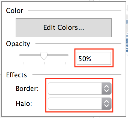
Click on Color on the Marks card, and in the window that pops up, make the following changes: under the Effects section, set Border and Halo to white, and set the Opacity to 50%. Click away from the popup to close it.
-
From the Analysis menu, select Create Calculated Field…, and name it Location Detail. Paste in the following formula:
IF [Country_Region] = "US" THEN [Admin2]

	ELSEIF [Province_State] != "N/A" THEN [Province_State]

	ELSE [Country_Region]

	END

	//Used to determine the smallest level of detail for which there is information

	//Note that Admin2 stores information on US counties

-
From Dimensions, drag Location Detail to Detail on the Marks card, so that data displayed on the map is shown at the smallest level of geography available (i.e., country, province/state or county).

-
Next, we will need to create a few calculated fields to use in our tooltip. From the Analysis menu, select Create Calculated Field…, and name it Province State Label. Paste in the following formula:
IF [Province_State] != "N/A" THEN [Province_State]

	ELSE ""

	END

	//Used in map tooltip to display a province/state name, if present

-
From the Analysis menu, select Create Calculated Field…, and name it Admin2 Label (US). Paste the following formula:
IF [Country_Region] = "US"

	THEN " | County: " + [Admin2]

	ELSE ""

	END

	//Used in the map tooltip to display a county name as well, if in the US

-
From Dimensions, drag Max Date, Country_Region, Admin 2 Label (US), and Province State Label on to Tooltip on the Marks card.

-
Go to the Tooltip worksheet we created for the first visualization. Right click on the Tooltip worksheet’s tab at the bottom and select Duplicate. Rename the duplicate (called Tooltip (2) by default) MapTooltip.

-
In the MapTooltip worksheet, right click on Tooltip(DAY(Date)) in the Filters shelf and select Remove.
-
From Dimensions, drag Date is Max on to the Filters shelf, select True, and click on OK.
-
Return to the Map worksheet and click on Tooltip on the Marks card. Delete all the text and insert the following attributes in order (on separate lines where noted):
<ATTR(Max Date)>

	<ATTR(Country_Region)>

	<ATTR(Province State Label)><ATTR(Admin2 Label (US))>
Then, insert the MapTooltip sheet by clicking on Insert, then Sheets, then MapTooltip.
Within the new line for the MapTooltip sheet, highlight <All fields> (leaving the quotation marks unselected) and then insert Location Detail.
The final text should look like this:
<ATTR(Max Date)>

	<ATTR(Country_Region)>

	<ATTR(Province State Label)><ATTR(Admin2 Label (US))>

	<Sheet name="MapTooltip" maxwidth="300" maxheight="300" filter="<Location Detail>">

Once you are done, click on OK. Hover over symbols on the map to see this tooltip in action.
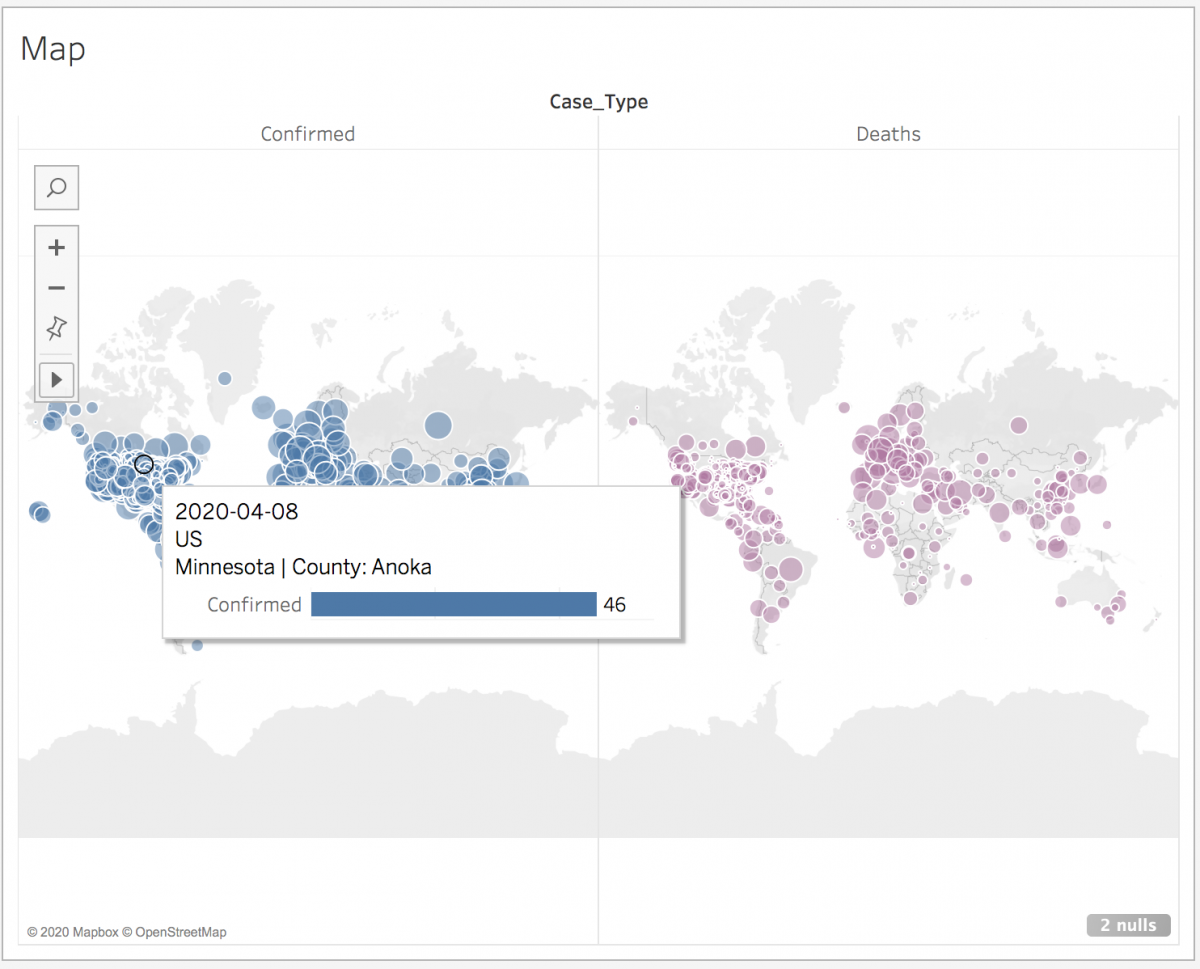
-
Finally, let’s clean up the map. In the lower right corner, there is a gray warning listing the number of null values. Click on this box.

When it asks you what to do, click on Filter data.

-
Also, let’s remove a few headers as we did with the first visualization. Right click on the Case_Type header at the top of the map, and select Hide Field Labels for Columns. Right click the Confirmed header on the top left of the map, and uncheck Show Header.

Create side-by-side bar graphs for cases by country
-
For the third section of the dashboard, create a new worksheet, and name it “CasesbyCountry”.
-
From the Measures section, drag Metric Switcher next to columns.
-
From the Dimensions section, drag Country_Region next to rows.
-
From Dimensions, drag Case_Type next to columns, to the left of Metric Switcher.
-
Also, from Dimensions, drag Case_Type to Color on the Marks card.
-
Right click on the Country Region pill next to rows and select Sort.

Change Sort by to Field, under Field Name pick Metric Switcher, sort Descending, and then close the sort window.
![The "Sort [Country_Region]" pop up window with the settings customized as described](/sites/default/public/pictures/tableau_intermediate_065a.png)
-
From the Analysis menu, select Totals, and then select Show Columns Grand Totals.

-
Go back to the Analysis menu again, select Totals, and then select Column Totals to Top.

You will see the grand total appear as the first bar in the graph.

-
From Dimensions, drag Date is Max to the Filters shelf, select True, and click on OK. This will ensure that the graph is only displaying data for the most recent date.
-
Click on Tooltip on the Marks card. Deselect Show tooltips to remove tooltips for this graph.

-
Let’s clean up this bar graph so it will be ready to use in our dashboard. Right click on the x axis and uncheck Show Header. Right click on the Case Type header, and select Hide Field Labels for Columns. Right click on the Confirmed header and uncheck Show Header. Right click on Country_Region header and click Hide Field Labels for Rows. After clean up, your graph should look like this:

-
Click on Label on the Marks card and select Show Mark Labels. Also check off Allow labels to overlap other marks.

Create a dashboard to pull these three visualizations together
-
Finally, let’s create a dashboard to pull all of these visualizations together. Click on the new dashboard icon at the bottom to create a new dashboard.

-
Under Size on the left, use the dropdown menu to change Fixed Size to Automatic.

-
Drag CasesbyDay, from the sheet list on the left, on to the dashboard.

Then, drag Map, from the sheet list, to take up the bottom half of the dashboard.

Finally, drag CasesbyCountry, from the sheet list, to take up the bottom quarter of the dashboard.

-
From under Objects (bottom left), drag Text to the top of the dashboard. This will be your title.

Call your dashboard COVID-19 Cases. Change the text size to 20 points, bold it, and click on OK.
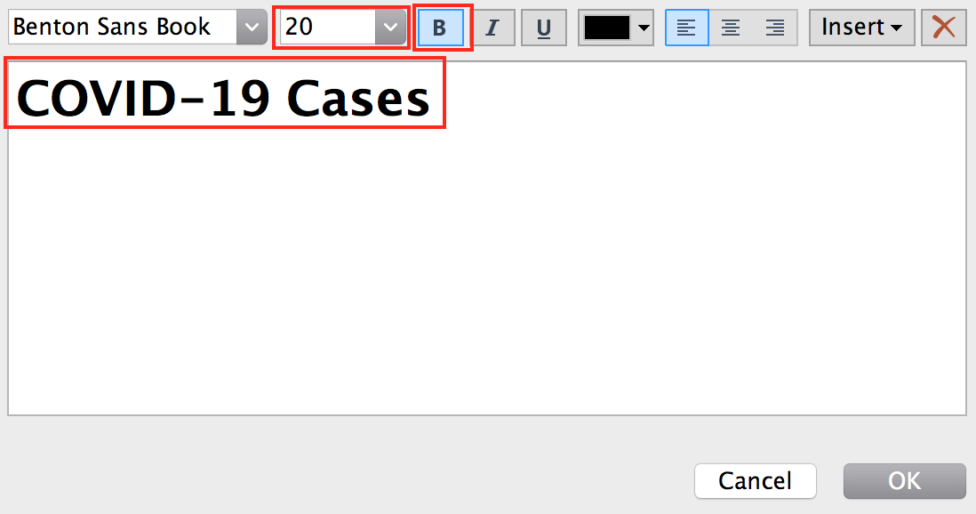
Resize the bottom of this new text box to minimize white space.

-
Drag the date filter (using the dark gray handle that appears when you click on the title of the Date filter box) to right underneath the title, such that it extends across the top of the dashboard.

You might need to resize its height.

-
Similarly, drag the Selected Metric parameter and position it so that it occupies half of the row that Date currently occupies.

-
Finally, drag the Country_Region filter into the same row and resize the widths of all three boxes so that they have equal space. There should be three filters all at the top of the dashboard under the title. You might need to resize the visualizations after doing this, as the filters might squish the first bar graph a bit.

-
Remove the Case_Type and Log of Metric Switch boxes on the right by clicking on them and then clicking on the X that appears in the top left corner of the box.

-
Click on the CasesbyDay container, and then click on the More Options arrow from the dark gray menu on the left. Uncheck Title.


Repeat this step for the Map and CasesbyCountry containers.
-
From the Objects pane on the left, drag Blank space to the left side of the row with the first bar graph. Repeat with the row immediately under: the map. Adjust the blank spaces so that they are aligned – they should snap into alignment - and take up approximately the left 15% of the dashboard. Use these blank spaces to try to align the centre line of all 3 visualizations. Consider switching into Presentation Mode (by pressing F7 and using the ESC key to exit) to better assess the overall look.

-
Finally, let’s apply the Country_Region filter to the first two visualizations. Click on the Country Region filter, and then click on the More Options arrow from the dark gray menu on the left. Under Apply to Worksheets, select Selected Worksheets...
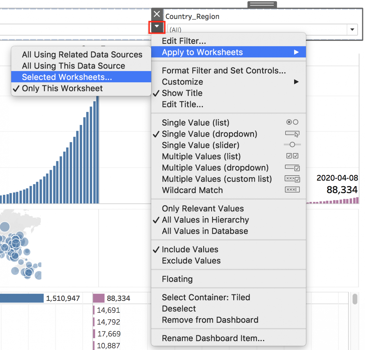
Select everything except CasesByCountry.

-
It’s time to test your dashboard. Change between a few different countries. Hover over the proportional symbols in the map to see the count of cases. Under Switch Metric, switch between Total Cases and New Cases. Ensure that everything is working as expected; if not, consider retracing your steps with the problematic worksheet.
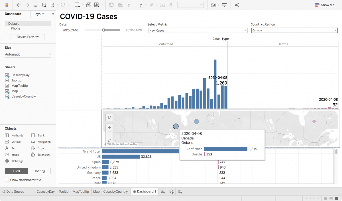
-
Change Country_Region back to (All) and under Select Metric, return it to Total Cases.
-
Right click on the Dashboard1 tab at the bottom of the screen, and select Hide All Sheets.

This will hide all sheets other than Tooltip and MapTooltip. Right click on each of them and select Hide.
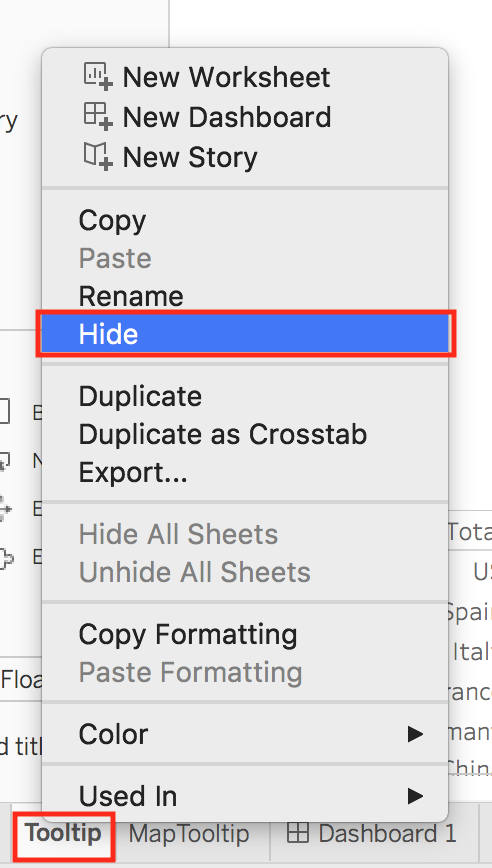
This ensures that your viewer will only see the main dashboard, and they will not be distracted by seeing the other sheets listed as tabs at the bottom. You might at this point also want to adjust the sizes of your visualizations to even out the display.

That’s it! Your dashboard is now complete. If you downloaded Tableau’s dashboard workbook file from Tableau Public, you will notice that not everything in that file is covered in this tutorial. Feel free to explore further and try to understand and recreate all aspects of the dashboard for your own learning.