This tutorial is a beginner friendly introduction to work with GIS data using R. The topics covered are creating and importing GIS data including point, line, and polygon features; making maps; and running common spatial analyses. The main spatial package used is the sf package.
The datasets and the R code used in this tutorial can be downloaded here. You can follow along this code in RStudio or any other platform that allows you to run R code. Additional introductory R tutorials can be found here and here. For additional assistance, please fill out the Map & Data library support request form here.
Table Of Contents
Setting Up
1. Point Features
2. Line Features
3. Polygon Features
4. Mapping using ggplot2
5. Spatial Analysis
6. Choropleth Map using ggplot2
Setting Up
After downloading the datasets used in this tutorial, you want to set the working directory to the folder where you have saved these datasets on your machine using the setwd() function. In the code below, enter the path to your RGISfiles folder. Note that you will need to change all backslashes to forward slashes.
# Set Working Directory
setwd("Enter Path to the RGISfiles Folder")
Next, we install and load the necessary packages for this tutorial. The spatial package used is the sf package. We also use the ggplot2, ggspatial and the RColorBrewer packages to make maps.
# Install and Load Packages
install.packages(c("sf", "ggplot2", "ggspatial", "RColorBrewer"))
library(sf)
library(ggplot2)
library(ggspatial)
library(RColorBrewer)
1. Point Features
This tutorial will show you how to work with point, line, and polygon features in R. Let’s start with point features. This section will show you how to create a point feature dataset from scratch and then make a map of it.
In this section, we want to create a spatial dataset of four museums from scratch. First, we create three lists of the longitude values, latitude values and museum names for four museums of interest. To create a list in R, you can use the c() function. We keep the order of museums in each list.
Then we combine these three lists using the data.frame() function to create a new dataset. We call this dataset or data frame museums. When we run museums by itself, we can see the three columns longitude, latitude and names for the four museums.
# 1. Point Features
# Creating data using longitude/latitude pairs and names of places
longitude <- c(-79.4094, -79.3946, -79.3322, -79.5169)
latitude <- c(43.6781, 43.6677, 43.7253, 43.7735)
names <- c('Casa Loma', 'Royal Ontario Museum', 'Aga Khan Museum',
           'Black Creek Pioneer Village')
# Convert list to dataframe
museums <- data.frame(longitude, latitude, names)
museums
To convert the museums data frame to a spatial dataset or a sf (simple features) object, we use the st_as_sf() function. Inside this function, we specify the museums dataset. Then using the coords argument, we specify the longitude and latitude variable names in our dataset as a list using the c() function. We also specify the coordinate reference system using the crs argument. We save the converted spatial dataset as museums_sf.
Now, when we run museums_sf by itself, we can see that it is a simple feature object with four point features and one field or variable called names.
# Convert dataframe to sf object
museums_sf <- st_as_sf(museums, coords=c("longitude", "latitude"),
                     crs="EPSG:4326")
museums_sf
We can make a map of these museums using ggplot2 functions. To make a basic map, we first initialize the plot area using the ggplot() function. Then we use the geom_sf() function to specify the museums spatial dataset. When we run this, it gives us a map of the latitudes and longitudes of the four museums.
# Map museums using ggplot2
ggplot() + geom_sf(data=museums_sf)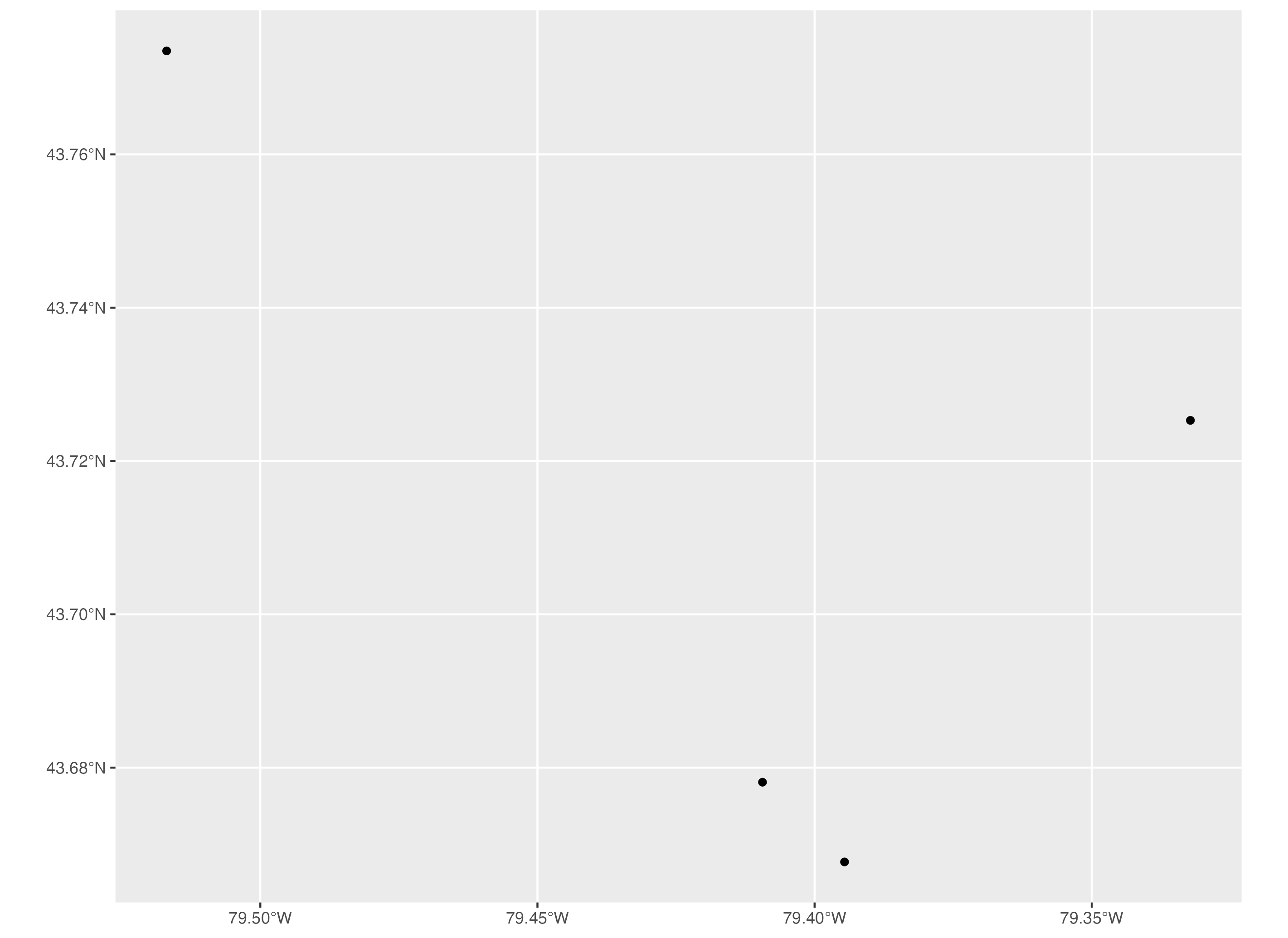
2. Line Features
Let’s move on to line features. The spatial dataset we will use is the City of Toronto’s TTC subway lines dataset. In the section, we will import and map subway lines. We will also map the subway lines with subway stations to show you how to map line and point features together.
The TTC subway lines dataset is called TTC_SUBWAY_LINES_WGS84.shp. To import this spatial dataset, we can use the read_sf() function. And we store it as a dataset called subway_lines_sf.
When we run subway_lines_sf by itself, we can see that it is a simple features object with four lines and three fields or variables.
# 2. Line Features
# Import data
subway_lines_sf <- read_sf('TTC_SUBWAY_LINES_WGS84.shp')
subway_lines_sf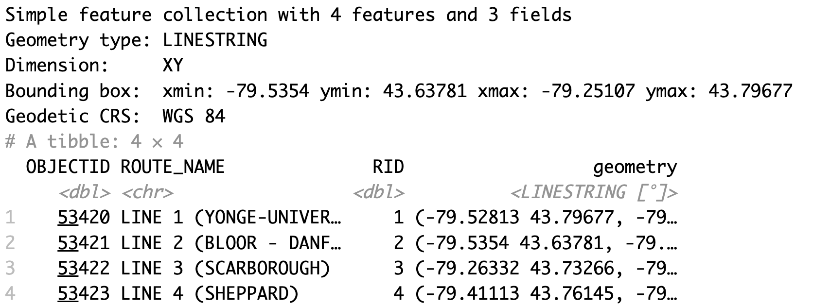
To make a basic map of a line features spatial dataset using ggplot2, we use the same approach as we did with point features. We initialize the plot area using the ggplot() function then we specify the subway lines sf object using the geom_sf() function.
# Map subway lines
ggplot() + geom_sf(data=subway_lines_sf)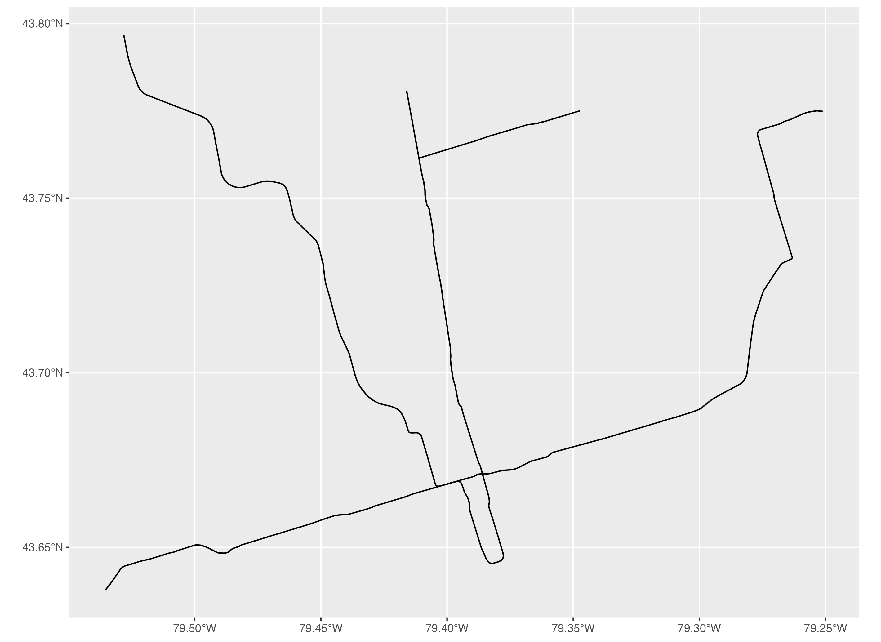
Next, we will import the subway stations CSV file to add subway stations to the map above. To import this subway stations dataset, we use the read.csv() function and we store it as subway_stations.
To convert it to a spatial dataset or an sf object, we use the st_as_sf() function. We specify the longitude and latitude variables using the coords argument and we specify the coordinate reference system using the crs argument. Then we store this sf object as subway_stations_sf. Now we can add it to the subway lines map above.
# Additional data for subway lines: subway stations
# Import CSV file & convert dataframe to sf object
subway_stations <- read.csv('subway_stations.csv')
subway_stations_sf <- st_as_sf(subway_stations, coords=c('lon', 'lat'), crs=4326)
To make a basic map of the subway lines with the subway stations, we initialize the plot area using ggplot(). Then using the geom_sf() function, we specify the subway lines first then the subway stations afterwards. This order places the layer of point features or subway stations above the layer of subway lines on the map.
# Map subway lines with subway stations
ggplot() + geom_sf(data=subway_lines_sf) +
  geom_sf(data=subway_stations_sf)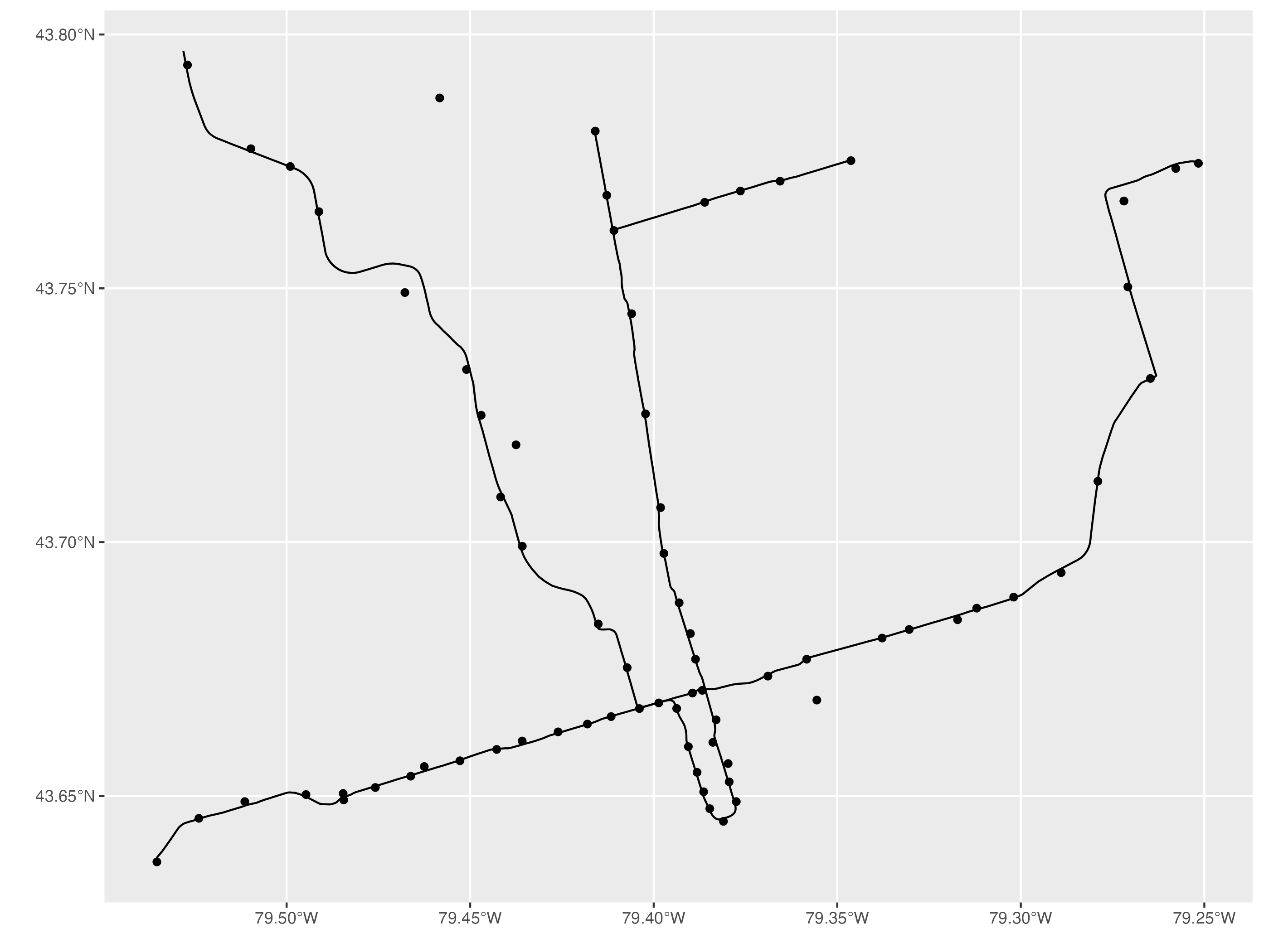
3. Polygon Features
Let’s move on to polygon features. The spatial dataset we will use for polygon features is the City of Toronto’s neighbourhood boundaries shape file. In the section, we will import and map the Toronto neighbourhood boundaries dataset. We will also import the Toronto cultural hot spots point features dataset to combine it with the neighbourhood dataset later in this tutorial.
The Toronto neighbourhoods dataset is called Neighbourhoods - 4326.shp. To import this spatial dataset, we can use the read_sf() function. And we save it as neighbourhoods_sf.
When we run neighbourhoods_sf by itself, we can see that it is a simple features object with 158 polygons or neighbourhoods and 11 fields or variables.
# 3. Polygon Features
# Import Toronto neighbourhoods
neighbourhoods_sf <- read_sf('Neighbourhoods - 4326.shp')
neighbourhoods_sf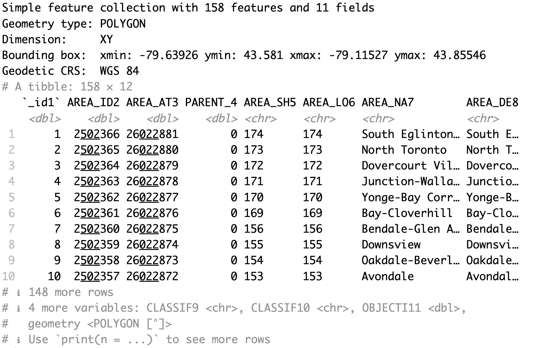
To make a basic map of a polygon features spatial dataset using ggplot2, we use the same approach as we did with point features and line features. We initialize the plot area using the ggplot() function then we specify the neighbourhoods sf object using the geom_sf() function.
# Map Toronto neighbourhoods
ggplot() + geom_sf(data=neighbourhoods_sf)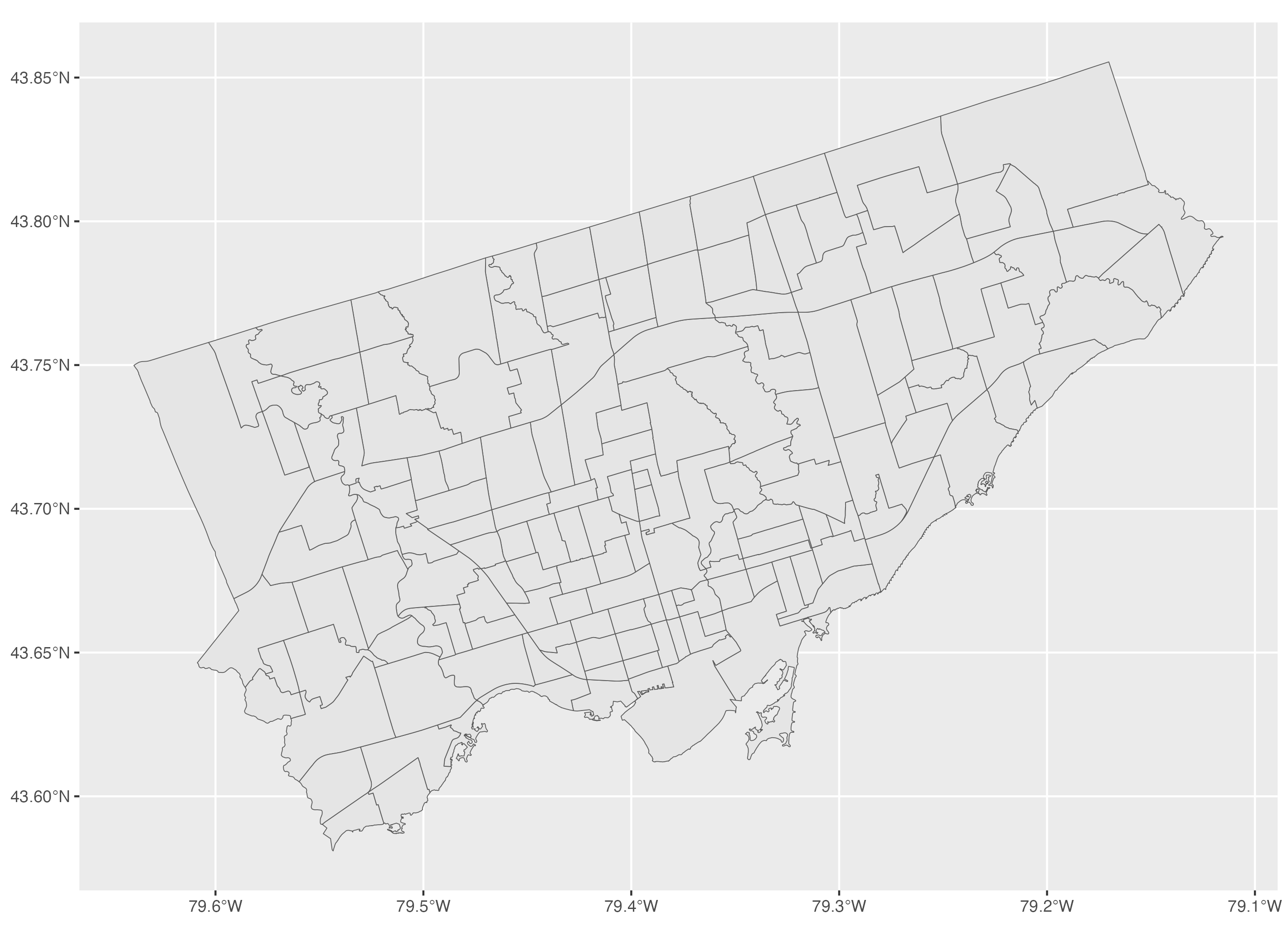
We will also import the Toronto cultural hot spots dataset. This dataset is called points-of-interest - 4326.shp. We will combine this dataset with the neighbourhoods dataset in section 5. To import this spatial dataset, we can use the read_sf() function. And we save it as culturalhotspots_sf.
When we run culturalhotspots_sf by itself, we can see that it is a simple features object with 895 point features or hot spots and 29 fields or variables.
# Additional data for Toronto neighbourhoods: Cultural Hot Spots (point features)
culturalhotspots_sf <- read_sf('points-of-interest - 4326.shp')
culturalhotspots_sf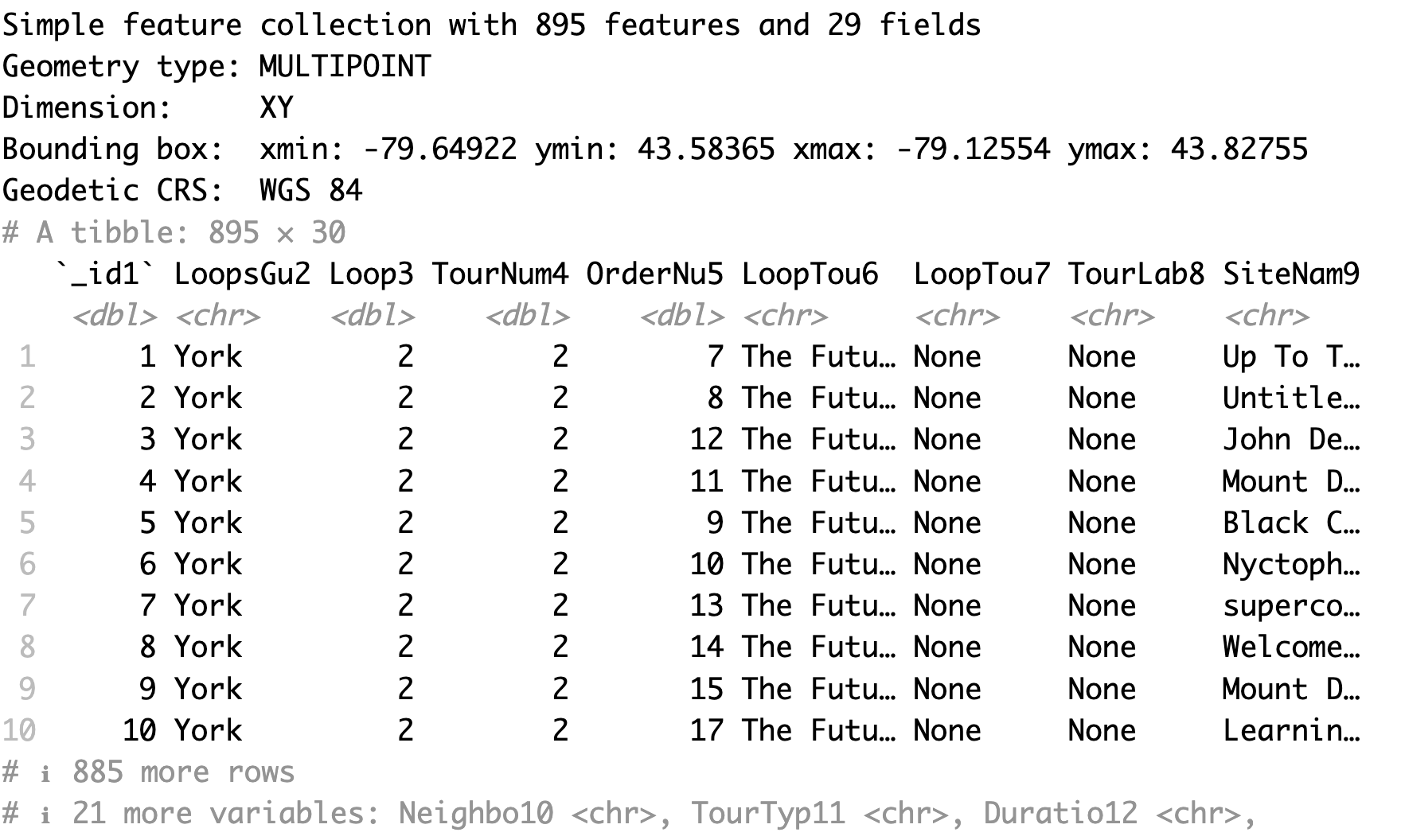
4. Mapping using ggplot2
In this section, we will cover how to make maps using ggplot2. We will use the neighbourhoods, subway lines, subway stations and museums spatial datasets.
We have covered how to make basic maps in the previous sections. To make a map that includes polygons, lines and point features, you can add each layer individually using the geom_sf() function. We use the order of polygons, lines and point features to have the layer of point features on top of the line features on top of the polygons.
# 4. Mapping using ggplot2
# Mapping multiple spatial data layers
ggplot() +
  geom_sf(data=neighbourhoods_sf) +
  geom_sf(data=subway_lines_sf) +
  geom_sf(data=subway_stations_sf) +
  geom_sf(data=museums_sf)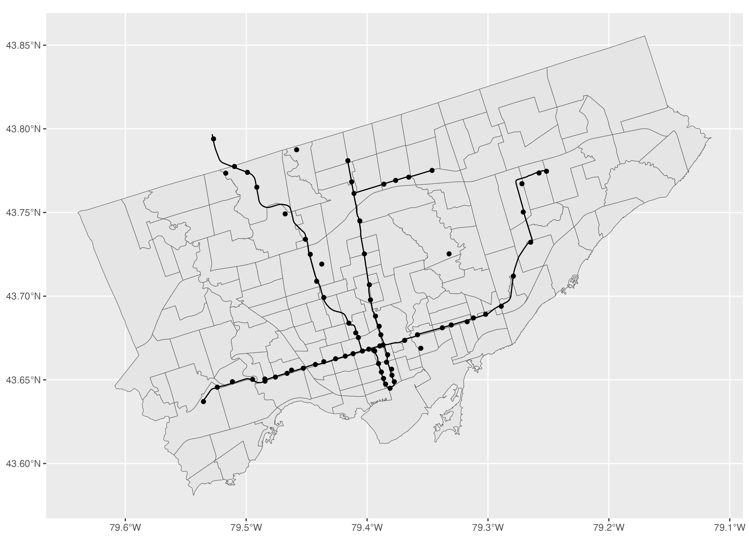
To modify the colour inside the polygon, you can use the colour argument and to modify the colour of the polygon boundaries, you can use the fill argument.
# Polygon features: to modify colours within the polygon and the border
ggplot() +
  geom_sf(data=neighbourhoods_sf, colour="darkgrey", fill="#354f52") +
  geom_sf(data=subway_lines_sf) +
  geom_sf(data=subway_stations_sf) +
  geom_sf(data=museums_sf)
For line features, to modify the colour of the line, we use the colour argument and to modify the line width, we use the linewidth argument.
# Line features: to modify the colour and line width
ggplot() +
  geom_sf(data=neighbourhoods_sf, colour="darkgrey", fill="#354f52") +
  geom_sf(data=subway_lines_sf, colour="lightgrey", linewidth=1) +
  geom_sf(data=subway_stations_sf) +
  geom_sf(data=museums_sf)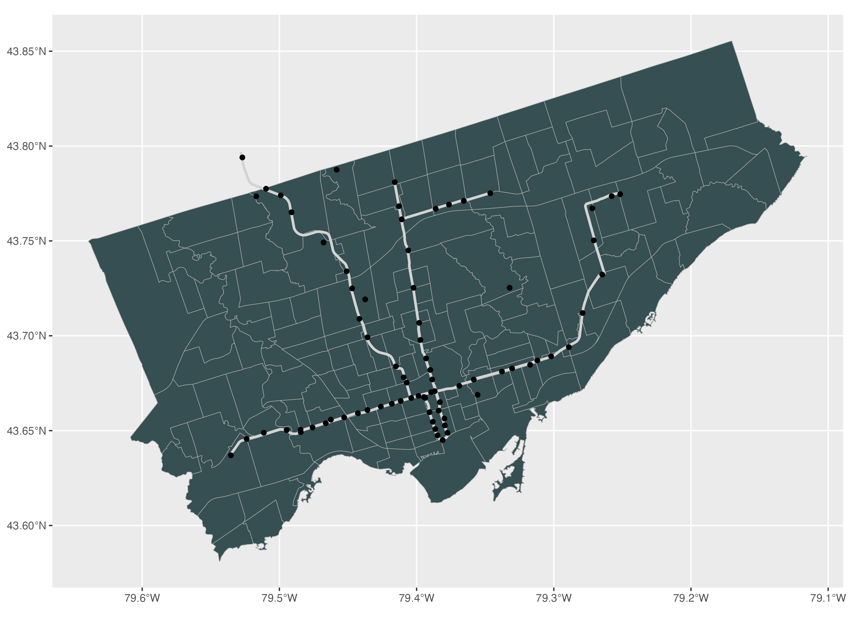
For point features, to modify the colour, size and shape of point features, we can use the colour, size and shape arguments respectively. You can find the full selection of possible shapes and their values in the help window by using the R code help(points) and going to the pch section.
# Point features: to modify the colour, size, and shape
ggplot() +
  geom_sf(data=neighbourhoods_sf, colour="darkgrey", fill="#354f52") +
  geom_sf(data=subway_lines_sf, linewidth=1, colour="lightgrey") +
  geom_sf(data=subway_stations_sf, colour="lightgrey", size=1.5) +
  geom_sf(data=museums_sf, colour="maroon2", size=3, shape=17)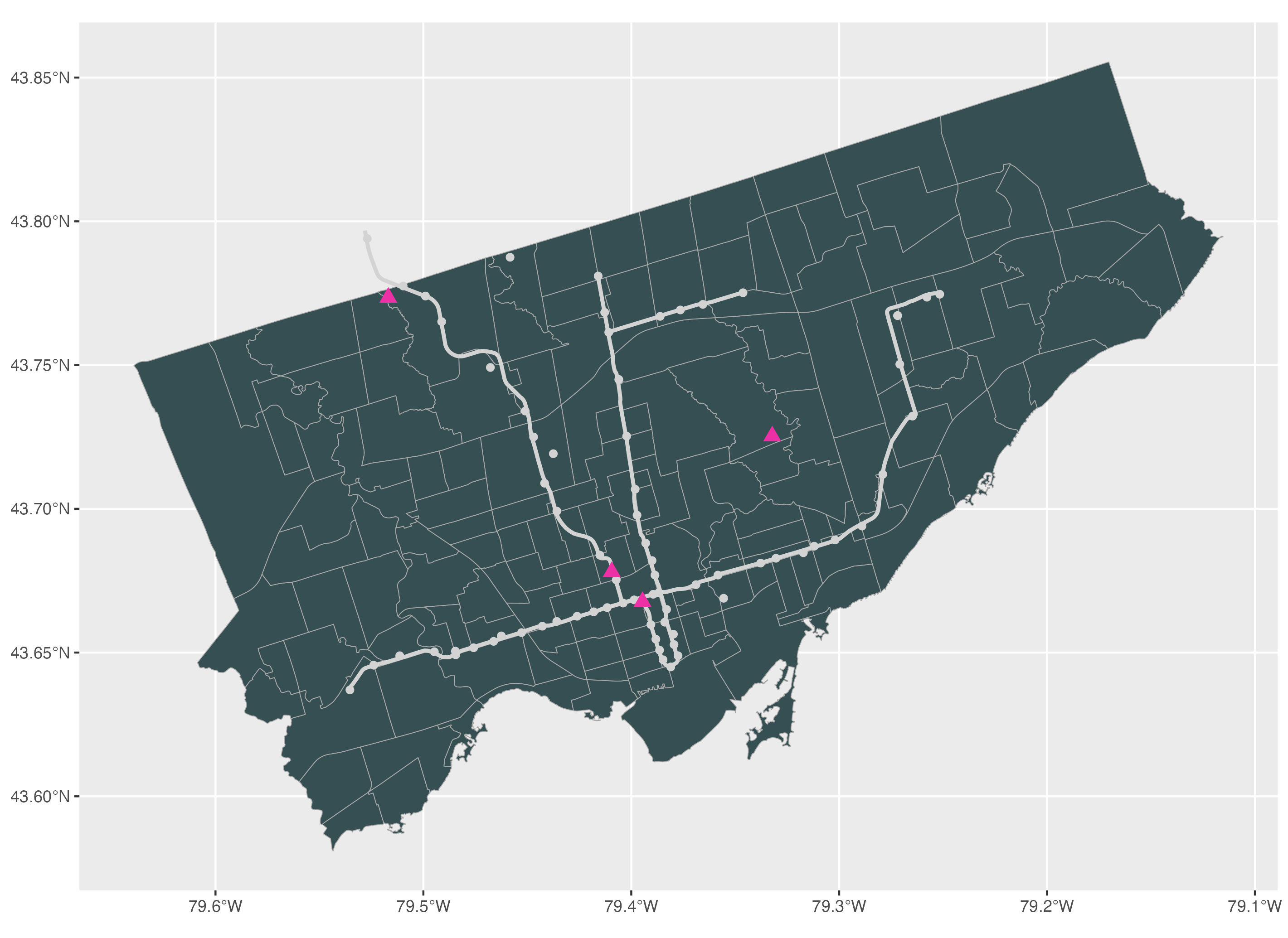
To apply a theme to the map, we can use one of the ggplot2 theme functions. If you type theme, you should see a dropdown menu with the list of themes that you can use. In this tutorial, we apply the classic theme to this map.
# To apply a theme to the map
ggplot() +
  geom_sf(data=neighbourhoods_sf, colour="darkgrey", fill="#354f52") +
  geom_sf(data=subway_lines_sf, linewidth=1, colour="lightgrey") +
  geom_sf(data=subway_stations_sf, colour="lightgrey", size=1.5) +
  geom_sf(data=museums_sf, colour="maroon2", size=3, shape=17) +
  theme_classic()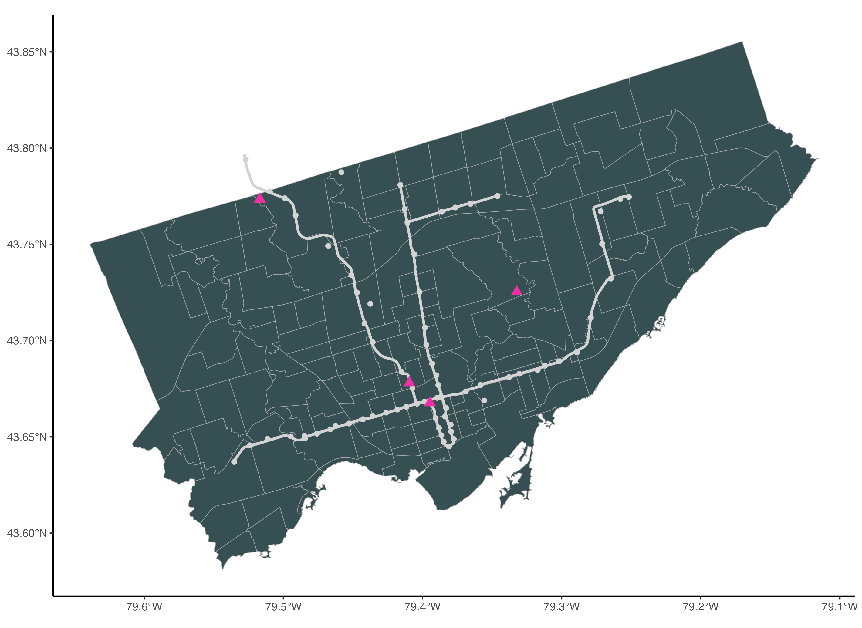
To add a title, we use the ggtitle() function. We also add a subtitle using the subtitle argument.
# To add a title
ggplot() +
  geom_sf(data=neighbourhoods_sf, colour="darkgrey", fill="#354f52") +
  geom_sf(data=subway_lines_sf, linewidth=1, colour="lightgrey") +
  geom_sf(data=subway_stations_sf, colour="lightgrey", size=1.5) +
  geom_sf(data=museums_sf, colour="maroon2", size=3, shape=17) +
  theme_classic() +
  ggtitle("Museums and Subway Lines",
          subtitle="Toronto, Canada")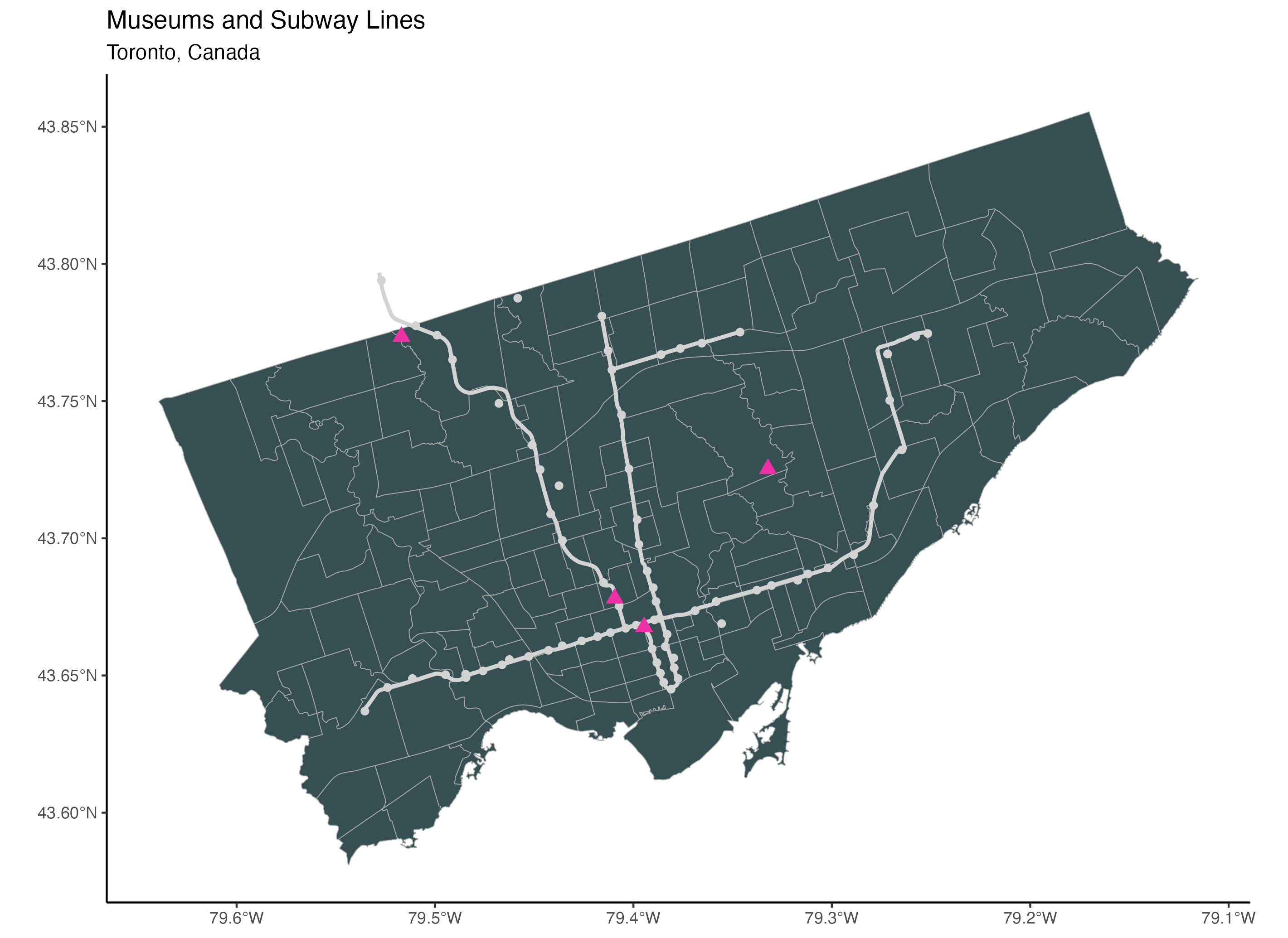
To add a scale, we use the annotation_scale() function from the ggspatial package. To place the scale in the bottom right corner of the map, we assign the location argument the value “br”. Then we use the bar_cols argument to select the two alternating colours of the scale. We use the R colours grey20 (a dark grey) and white.
# To add a scale bar (package: ggspatial)
ggplot() +
  geom_sf(data=neighbourhoods_sf, colour="darkgrey", fill="#354f52") +
  geom_sf(data=subway_lines_sf, linewidth=1, colour="lightgrey") +
  geom_sf(data=subway_stations_sf, colour="lightgrey", size=1.5) +
  geom_sf(data=museums_sf, colour="maroon2", size=3, shape=17) +
  theme_classic() +
  ggtitle("Museums and Subway Lines",
          subtitle="Toronto, Canada") +
  annotation_scale(location = "br", bar_cols = c("grey20", "white"))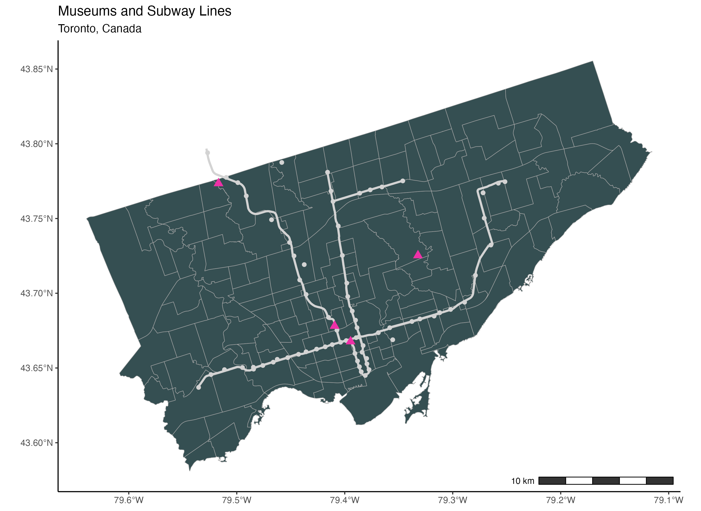
To add a north arrow, we use the annotation_north_arrow() function from the ggspatial package. Using the location argument, we place the north arrow in the bottom right corner of the map. To point the arrow to the true north, we set the argument which_north to “true”.
The pad_x and the pad_y arguments are used to specify the distance of the arrow from the edge of the frame. We specify the distances from the edge in units of inches here but you can also use centimetres for example.
Finally, the style argument is used to specify the drawing style of the arrow. You will find the full selection of north arrow drawings here. We are using the north_arrow_nautical() style here. For this specific style, we select the two alternating colours used to fill the arrow using the fill argument and the colour of the border of the arrow using the line_col argument.
# To add the north arrow (package: ggspatial)
ggplot() +
  geom_sf(data=neighbourhoods_sf, colour="darkgrey", fill="#354f52") +
  geom_sf(data=subway_lines_sf, linewidth=1, colour="lightgrey") +
  geom_sf(data=subway_stations_sf, colour="lightgrey", size=1.5) +
  geom_sf(data=museums_sf, colour="maroon2", size=3, shape=17) +
  theme_classic() +
  ggtitle("Museums and Subway Lines",
          subtitle="Toronto, Canada") +
  annotation_scale(location = "br", bar_cols = c("grey20", "white")) +
  annotation_north_arrow(location = "br", which_north = "true",
                         pad_x = unit(0.1, "in"), pad_y = unit(0.3, "in"),
                         style = north_arrow_nautical(fill = c("grey40", "white"),
 line_col = "grey20"))
5. Spatial Analysis
In this section, we will cover running common spatial analyses. We will calculate the length of line features, the distance between features, the nearest feature, and the number of points in a polygon.
First, to calculate the length of line features such as subway lines, we can use the st_length() function and add the subway lines spatial dataset inside. This gives us a list of 4 values which are the lengths of the 4 subway lines in metres.
# 5. Spatial Analysis
## 5.1 Length of Features
# Length of subway lines
st_length(subway_lines_sf)
We can store these lengths of subway lines as a new field or variable in the subway lines sf dataset as follows. We start with the subway lines sf object, then we type the name of the new field after a dollar sign, then we assign it the result of the st_length() function with the subway_lines_sf dataset.
Now, when we run the subway_lines_sf dataset, we have 4 fields instead of 3. And you can see the length_metres field is the last column or variable in this dataset.
# Store length as a new variable
subway_lines_sf$length_metres <-st_length(subway_lines_sf)
subway_lines_sf
Next, we will calculate the distance between different features. We will start with the distance between point features and line features. To calculate the distance between museums and subway lines, we can use the st_distance() function. Inside this function, we enter the museum and subway lines spatial datasets. This gives us a matrix of distances between each of the 4 museums and each of the 4 subway lines in units of metres. The museums are represented by the rows and the subway lines are represented by the columns.
## 5.2 Distance Between Features: Points vs Lines
# Distance between museums and subway lines
st_distance(museums_sf, subway_lines_sf)
We can save this matrix as a dataset or data frame as follows. First, we convert the matrix of distances using the data.frame() function then we store it as a dataset called dist_table.
Then we rename the rows of dist_table with the names of the museums using the names field from the museums_sf dataset. We also rename the columns with the route names of the subway lines using the route name field from the subway_lines_sf dataset.
Lastly, when we print the dist_table dataset, we can see the dataset of distances with row names and column names.
# Store values in data frame
dist_table <- data.frame(st_distance(museums_sf, subway_lines_sf))
# Assign names to rows and columns
rownames(dist_table) <- museums_sf$names
colnames(dist_table) <- subway_lines_sf$ROUTE_NAME
dist_table
Next, we will calculate the distance between two sets of point features: the distance between museums and subway stations. Again, we use the st_distance() function to calculate the distance between the museums and the subway stations sf datasets. This gives us a matrix of distances in units of metres. Again here, the rows are represented by the museums and the columns are represented by the subway stations.
## 5.3 Distance Between Features: Points vs Points
# Distance between museums and subway stations
st_distance(museums_sf, subway_stations_sf)
Next, we want to find the nearest subway station to each museum and store it in the museums dataset. To find the nearest subway station, we can use the st_nearest_feature() function. We enter the museums sf dataset first then we enter the subway stations sf dataset. This gives us the index of the nearest subway station for each museum.
## 5.4 Nearest Feature
# Find the nearest subway station index for each museum
st_nearest_feature(museums_sf, subway_stations_sf)![]()
We can use the indices to identify the subway station names as follows. We type the name variable from the subway_stations_sf dataset. Then inside square brackets, we add the code above with the subway station indices. This gives us the four names subway stations associated with the four indices above.
# Use index to identify subway station name
subway_stations_sf$Name[st_nearest_feature(museums_sf, subway_stations_sf)]![]()
To save the nearest station names in the museums spatial dataset, we assign the line of code above to a new field or variable that we call nearest_subway_station in the museums sf dataset.
Now, when we run the museums_sf dataset, we can see that it has two fields instead of just one. And the last column is the nearest subway station.
# Save list of nearest stations
museums_sf$nearest_subway_station <- subway_stations_sf$Name[st_nearest_feature(museums_sf, subway_stations_sf)]
museums_sf
Finally, we calculate the number of points in a polygon. In this tutorial, we will calculate the number of cultural hot spots in each Toronto neighbourhood. To do this, first we use the st_intersects() function with the neighbourhoods and the cultural hot spots spatial datasets to identify the cultural hot spots that intersect with each neighbourhood. This code gives us, for each neighbourhood, the list of cultural hot spots that intersect with it.
Then to count the number of cultural hot spots in each neighbourhood, we use the lengths() function around the st_intersects() function. As you can see below, this gives us a list of the number of cultural hot spots for each neighbourhood.
## 5.5 Number of points in polygon
# Number of cultural hot spots in each neighbourhood
lengths(st_intersects(neighbourhoods_sf, culturalhotspots_sf))
We save this number as a new field in the neighbourhoods_sf dataset and name it counthotspots. We will use this new field counthotspots in the next section.
# Store number as a new variable
neighbourhoods_sf$counthotspots <- lengths(st_intersects(neighbourhoods_sf, culturalhotspots_sf))
6. Choropleth Map using ggplot2
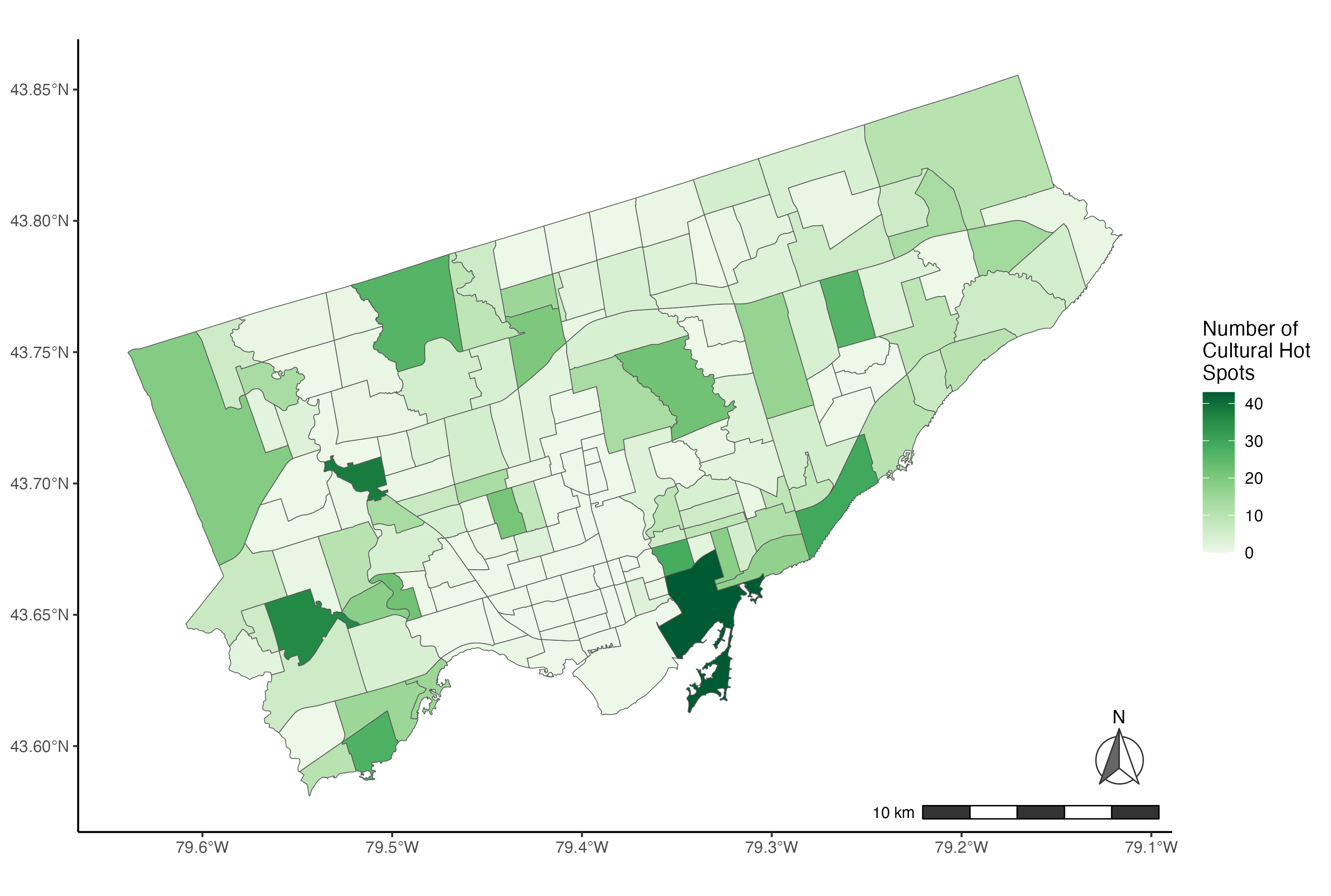
In this section, we will cover how to make choropleth maps using ggplot2. Using the Toronto neighbourhoods dataset we worked on in section 5, we will make a choropleth map of the number of cultural hot spots per neighbourhood. We will make one choropleth using default R colours and a second one using colours from the R ColorBrewer palette.
To make a choropleth map using ggplot2, we use the geom_sf() function with a polygon dataset such as neighbourhoods_sf and we add the variable that we want to use for the choropleth next to the fill argument inside the aes() function. This will create a gradient of colours for the variable of interest: number of hot spots per neighbourhood.
To specify the colour we want to use for the choropleth, we can use the scale_fill_gradient() function. Using the low and high arguments, we specify the two extremes of the colour gradient. In this example, we use white and dark green so the colour gradient varies from white for neighbourhoods with few hot spots to dark green for neighbourhoods with a high number of hot spots.
# 6. Choropleth Map using ggplot2
# Example 1: Basic choropleth using default colours
ggplot() +
  geom_sf(data=neighbourhoods_sf, aes(fill=counthotspots)) +
  scale_fill_gradient(low="white", high="darkgreen")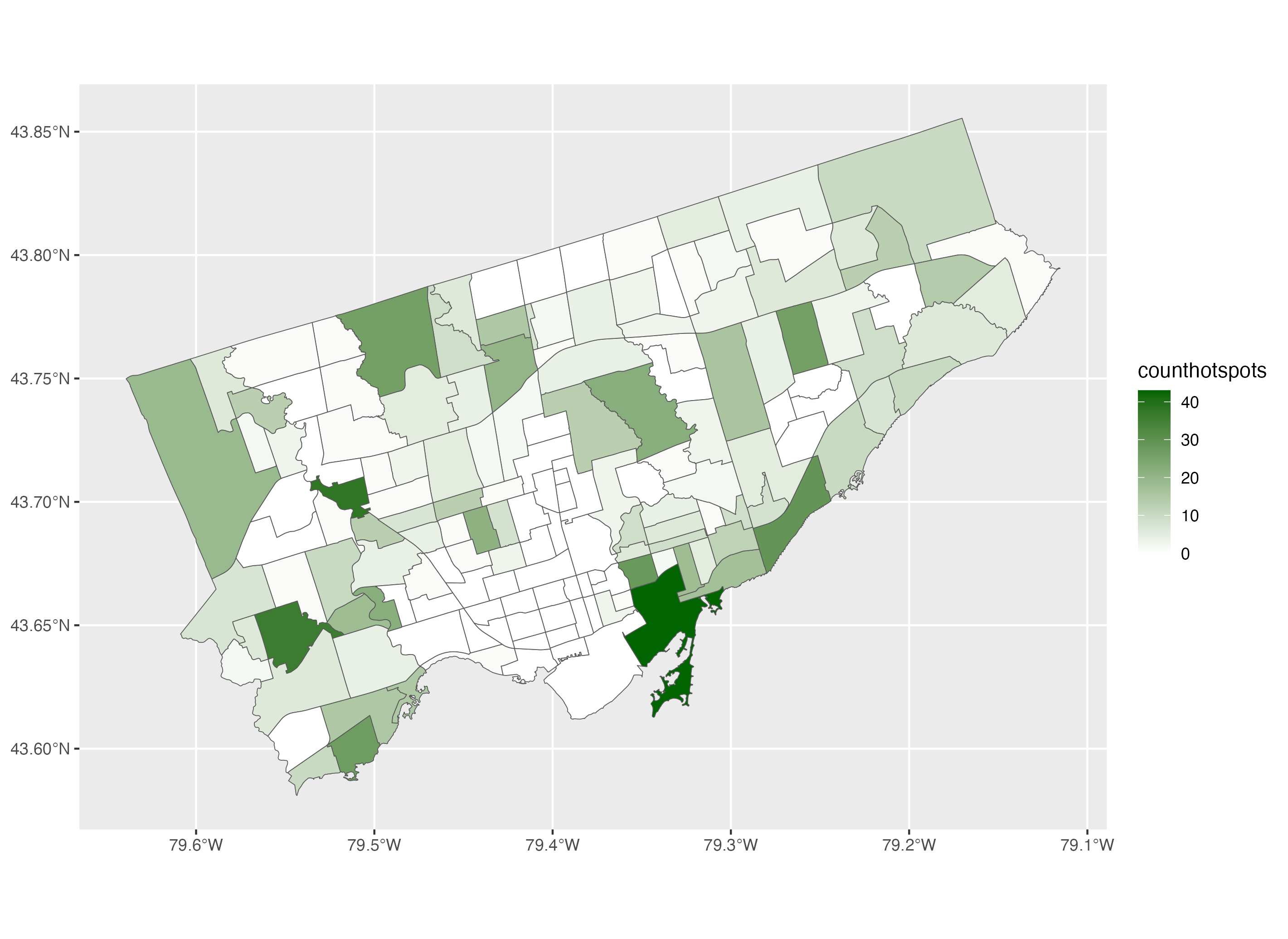
To improve this map further, we apply the classic theme using the theme_classic() function. Then we modify the label of the legend using the fill argument inside the labs() function. And we add the title “Number of Cultural Hot Spots”. We use “\n” inside the legend title to break it up into multiple lines.
To add a scale, we use the annotation_scale() function. We want the scale to be in the bottom right corner of the map so we assign the location argument the value “br”. Then we use the bar_cols argument to select the alternating colours of the scale. We use the R colours grey20 (a dark grey) and white.
To add a north arrow, we use the annotation_north_arrow() function. Using the location argument, we place the north arrow in the bottom right corner of the map. To point the arrow to the true north, we set the argument which_north to “true”. The pad_x and the pad_y arguments are used to specify the distance of the arrow from the edge of the frame. We specify the distances from the edge in units of inches here but you can also use centimetres for example.
Finally, the style argument is used to specify the drawing style of the arrow. You will find the full selection of north arrow drawings here. We are using the north_arrow_nautical() style here. For this specific style, we select the alternating colours used to fill the arrow using the fill argument and the colour of the border of the arrow using the line_col argument.
# Example 1: Complete choropleth using default colours
ggplot() +
  geom_sf(data=neighbourhoods_sf, aes(fill=counthotspots)) +
  scale_fill_gradient(low="white", high="darkgreen") +
  theme_classic() +
  labs(fill= "Number of\nCultural Hot\nSpots") +
  annotation_scale(location = "br", bar_cols = c("grey20", "white")) +
  annotation_north_arrow(location = "br", which_north = "true",
                         pad_x = unit(0.1, "in"), pad_y = unit(0.3, "in"),
                         style = north_arrow_nautical(fill = c("grey40", "white"),
 line_col = "grey20"))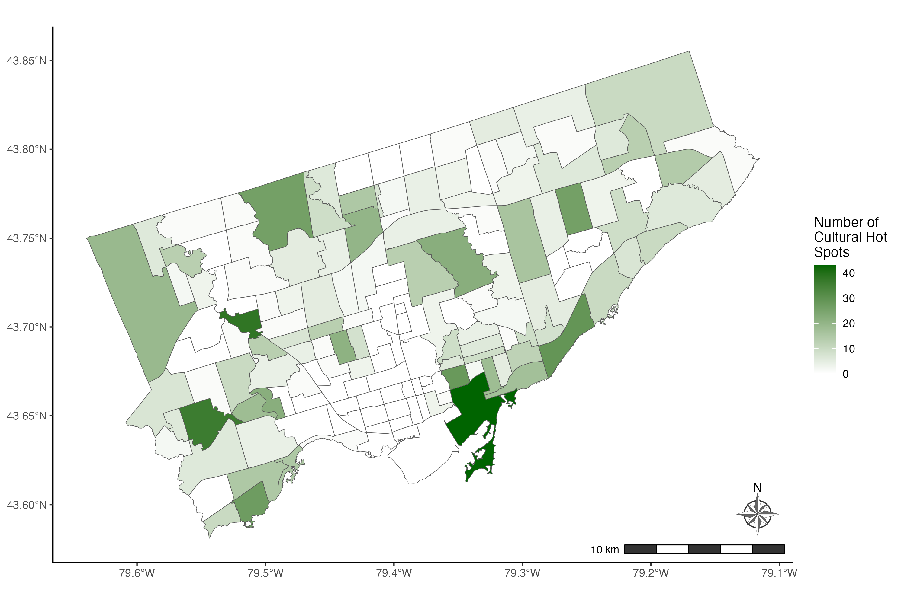
In the second example, we are going to make the same map using colours from the R ColorBrewer palette. Similar to example 1, we start by adding the dataset neighbourhoods_sf in the geom_sf() function and we add the variable of interest, number of cultural hot spots next to the fill argument.
Then to choose the colours of the choropleth, we use the scale_fill_distiller() function. We choose the colour palette using the palette argument. Then to apply light green colours to neighbourhoods with a low number of cultural hot spots and dark green colours to neighbourhoods with a high number of cultural hot spots, we set the direction argument to 1. This reverses the default colour gradient direction of dark green for low values and light green for high values.
# Example 2: Basic choropleth using the ColorBrewer palette
ggplot() +
  geom_sf(data=neighbourhoods_sf, aes(fill=counthotspots)) +
 scale_fill_distiller(palette="Greens", direction=1)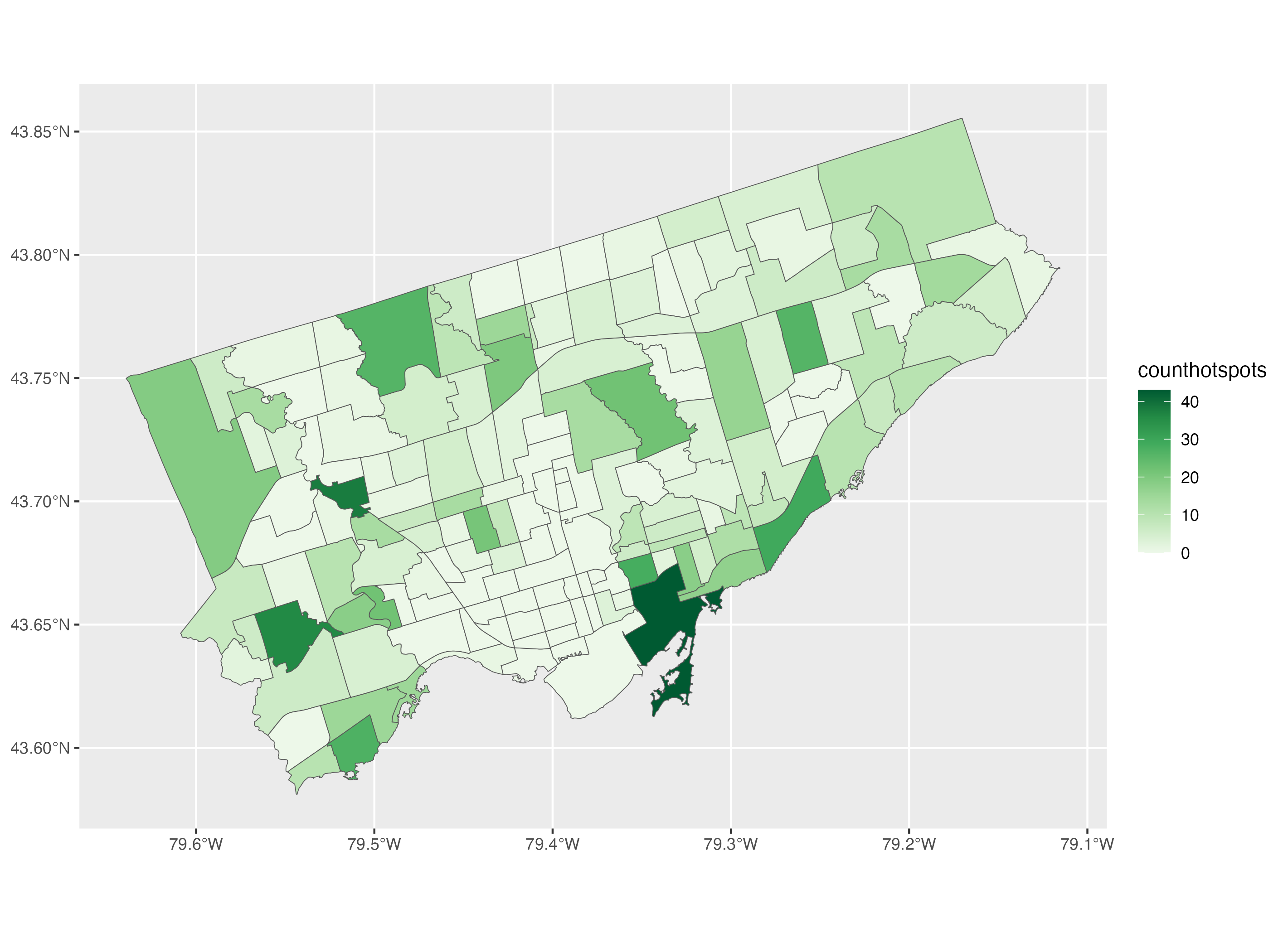
Then we improve this choropleth map by applying a theme, adding a legend title, adding a scale, and a north arrow similar to what we did in the first example.
# Example 2: Complete choropleth using the ColorBrewer palette
ggplot() +
  geom_sf(data=neighbourhoods_sf, aes(fill=counthotspots)) +
 scale_fill_distiller(palette="Greens", direction=1) +
  theme_classic() +
  labs(fill="Number of\nCultural Hot\nSpots") +
  annotation_scale(location = "br", bar_cols = c("grey20", "white")) +
  annotation_north_arrow(location = "br", which_north = "true",
                         pad_x = unit(0.1, "in"), pad_y = unit(0.3, "in"),
                         style = north_arrow_nautical(fill = c("grey40", "white"),
 line_col = "grey20"))