Set Up and Starting Up
-
Download the 3 example dataset Excel files and save them somewhere on your computer where you can find them, such as your Desktop:
- Open up Tableau Desktop (tutorial uses version 2022.2).
Creating Bar Graphs
-
We are going to start with a built-in dataset. Under Saved Data Sources, select Sample - Superstore.

-
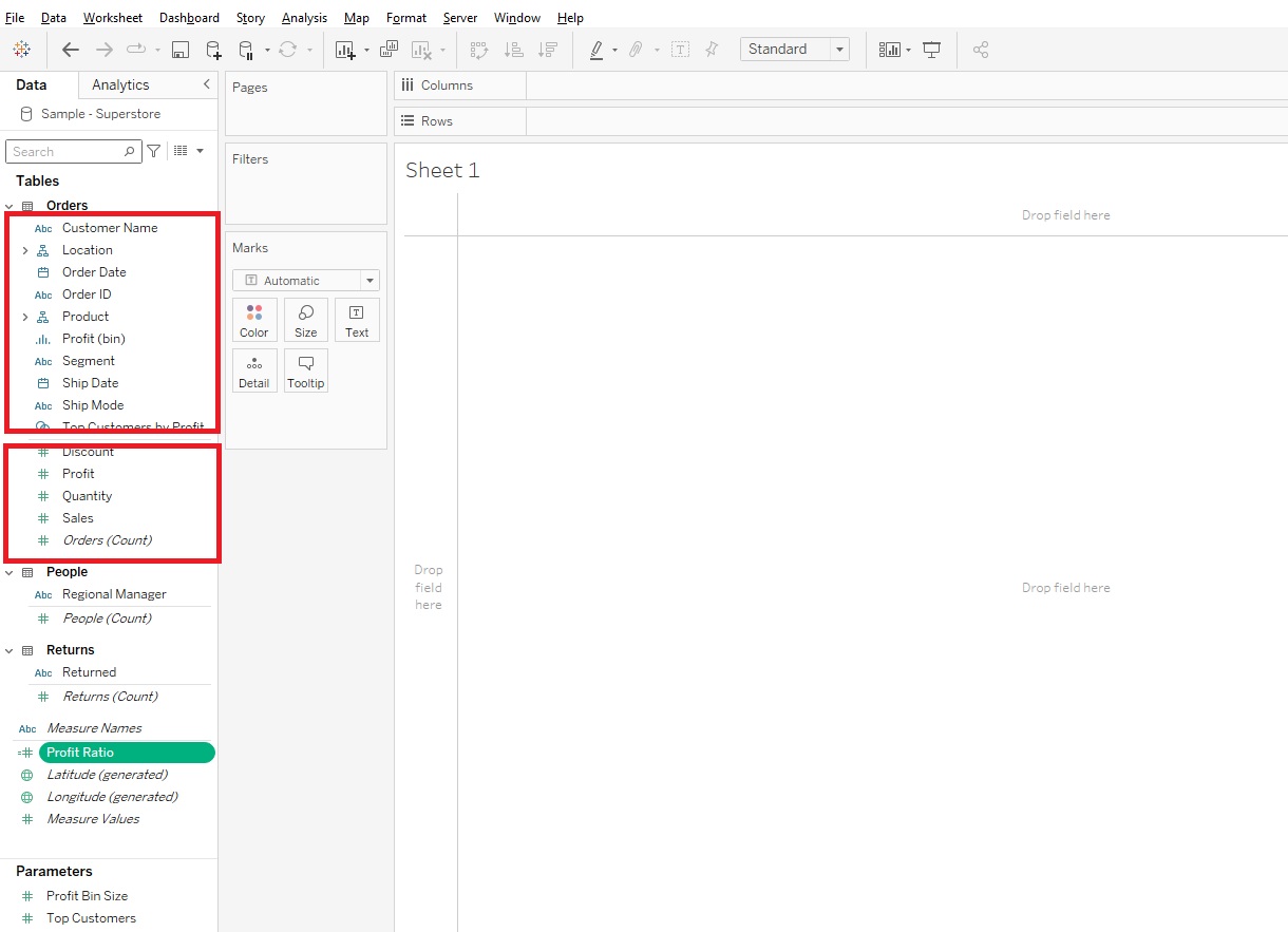
Let’s look around first before we dive in. On the left you can see Tables listed. Within a Table, the variables are listed, but divided by a thin grey line. Tableau categorizes variables as either Dimensions (above the line) or Measures (below the line). Dimensions are roughly qualitative data and Measures are roughly quantitative data.
-
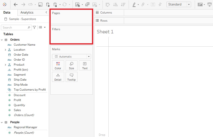
The centre area is where you’ll be dragging and dropping your variables on to different areas, such as Rows and Columns, or to vary Marks like Colour or Size by your variable, or filtering by a variable. Those areas that say Filters or Pages are called Shelves.
-
The Marks area have what are called cards, and when the variables are showing up in those areas, they are called pills, as they are shaped like a pill.
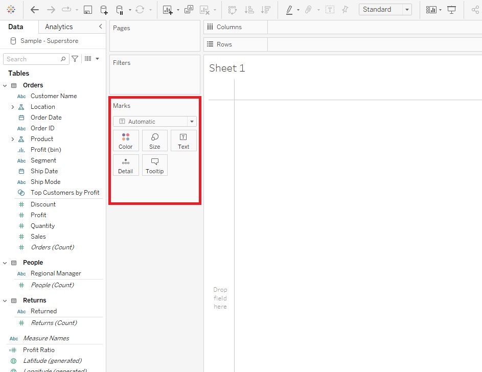
We’ll take a look at all these options as we go through the demo. One of the useful features of Tableau, to take a look at when you’re new to the tool and/or data visualization, is the Show Me feature. If you hold down Control and click on a couple of variables (hold down Command if on Mac), and then expand the Show Me tab, you’ll see that Tableau is giving you suggestions for what type of visualization to use.
-
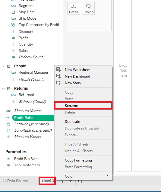
Okay, we’ve loaded in some data about a US fictional superstore, so let’s start by creating some visualizations that are used to make comparisons. Let’s start by making a simple bar graph. To keep track of all the visualizations we’re going to create, let’s rename our sheets as we go. Right-click on Sheet 1 at the bottom, select Rename, and give it the name “Sales Bar” and press Enter.
-
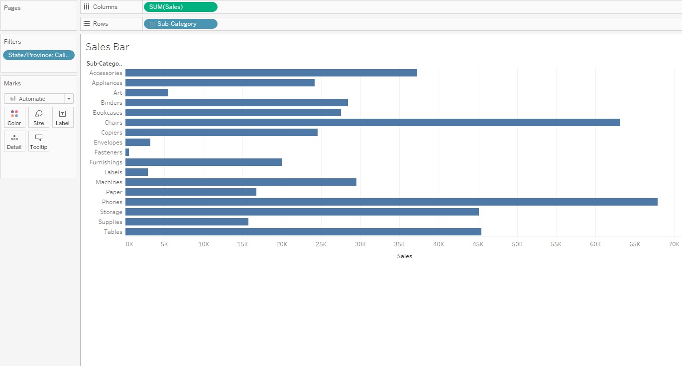
We’re going to create a horizontal bar graph to compare the amount of sales for different subcategories of products, with Sub-Category along the y-axis and Sales along the x-axis. Bar graphs are great for comparing categories. So drag the Sales variable (in the Measures section) next to Columns and Sub-Category (in the Dimensions section under Product) next to Rows.
-
You can see that when we dragged Sales, Tableau automatically summarized it by adding up all the Sales values for each Sub-Category. Right now it is showing data combined for all of our States/Provinces, but let’s say we just want it to show one of them. We can filter by State/Provinces by dragging the State/Province variable (in the Dimensions section under Location) over to the Filters shelf and selecting one State/Province from the list.

Let’s pick California in the pop-up window and click OK.
- Now we have a bar graph showing the Sales by Sub-Category for California.

-
Next let’s look at the Marks card. You can also see 5 smaller boxes labelled Colour, Size, Label, Detail, and Tooltip.
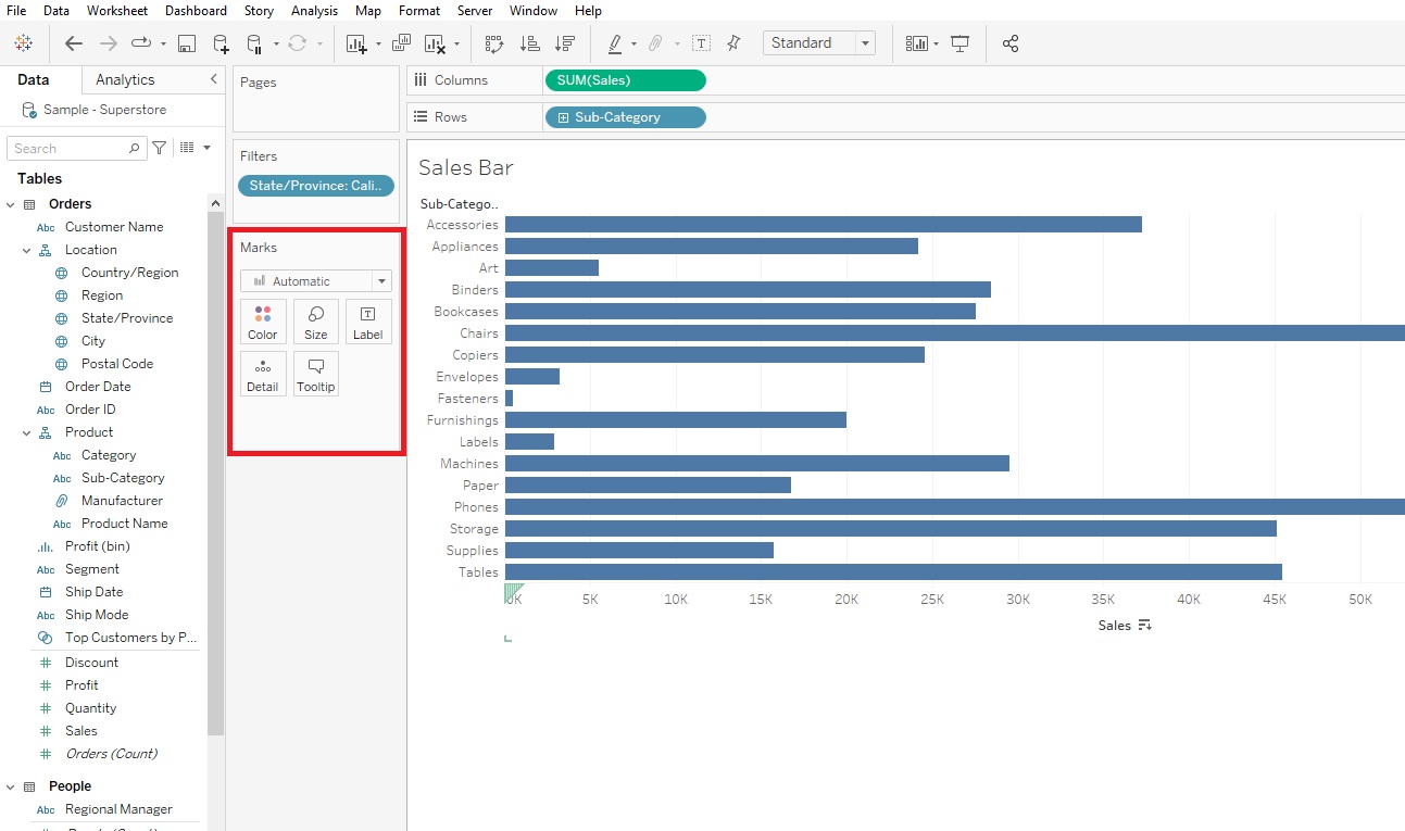
If you click on Colour, you you can change the colour of the bars in the bar graph. Let’s pick a different shade of blue.
-
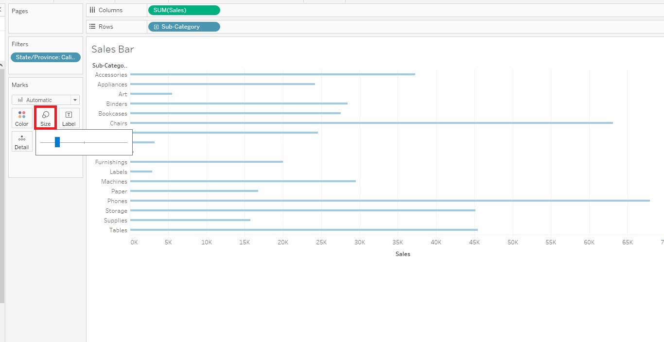
We can also adjust the size/width of the bars using the Size slider.
-
The Label section allows to create and customize labels. We can click on Show mark labels to see the values for each bar.
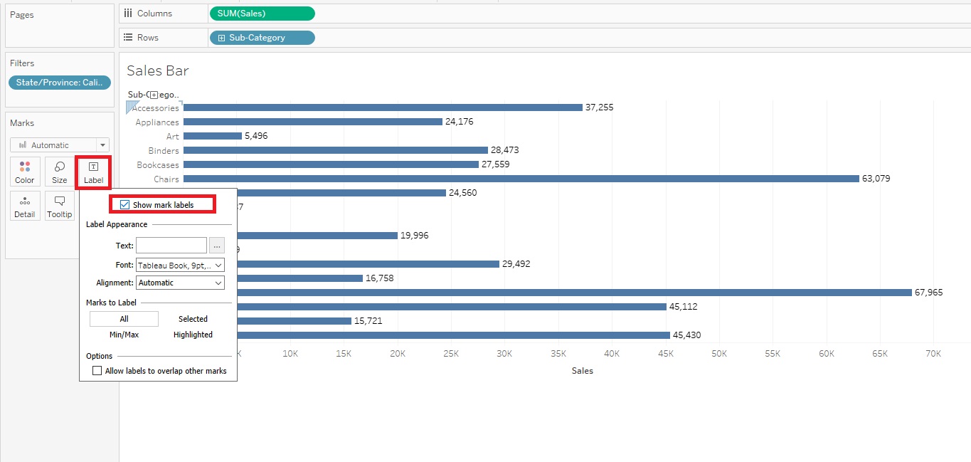
But you can see this makes our bar graph look cluttered, so let’s keep Show mark labels unchecked.

- You normally drag a variable on to the Detail section to expand out what’s plotted or visualized. We’ll look an example of this later.
-
Finally, the Tooltip section allows you to customize the text and format in the pop-up that shows up when you hover or click on a particular bar. For example, let’s add the broader Category that the product falls under in the Tooltip. To do this, drag the Category variable (in the Dimensions section under Product) to the Tooltip box.
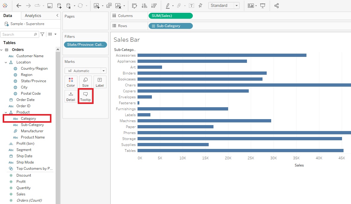
Then click on Tooltip. In the edit box, you’ll see that Category has been added underneath Sub-Category to the Tooltip. However, if you want to change the order, perhaps to have the broader category go first, you can click on Tooltip and edit the box. Let’s switch the order and click on OK.
-
As you can see there are options to customize a lot of parts of the visualization. You can also customize the axes. For example, right-click on your x-axis title, select Edit Axis.
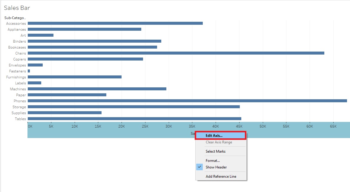
Let's edit the x-axis Title to say 'Sales in US Dollars'. Then click the top right x button to close the pop-up.
![The X button at the top right and Sales in US Dollars Axis Title at the bottom left are outlined with a red box at the of the Edit Axis [Sales] General menu.](/sites/default/public/pictures/ReTableauWorkshop1-12.2.jpg)
- Right now the bars are sorted in alphabetical order by Sub-Category, but if you hover over the x-axis label, Sales in US Dollars, a small sort icon appears. Click on it to sort your bars by Sales instead. Every time you click the icon, it cycles through different sort orders. Let’s have it sort descending with the Sub-Category with the largest sales at the top. You can now easily see the top and bottom sub-categories in terms of sales.

- If we wanted to, we could also spread this visualization out a bit, so it isn’t squished up at the top. From the top ribbon where it says Standard, use the drop-down to select Entire View.
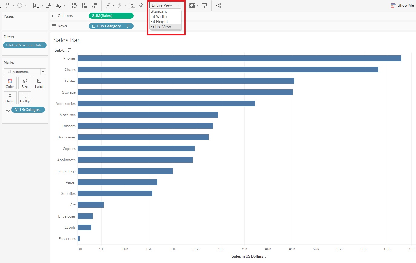
- Finally, we can give our visualization a more meaningful title by double clicking where it says “Sales Bar” at the top. You’ll see the default title is the sheet name, but we can change that. Let’s put “Sales by Sub-Category for “ then instead of typing in “California”, we can make the title dynamic by click on Insert and selecting State/Province. Then if we change the filter, the title will automatically change. Now we’re done our first visualization!

Creating Line Graphs
-
Okay, let’s create a new visualization. We need a new worksheet. Click on the New Worksheet icon at the bottom of the screen. Rename this one to “Line”.

-
We’re going to create a line graph now, which is great to show trends over time. We’re going to create a line graph of change in total profit over time. Let’s drag Order Date variable (in the Dimensions section under Order) next to Columns. Next drag the Profit variable (in the Measures section) next to Rows. You’ll notice that our graph is summing Profit automatically.

- As we did before, from the drop-down at the top change it from Standard to Entire View.
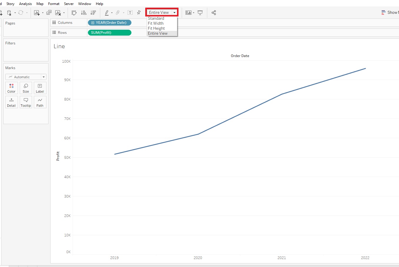
- It might be useful to see this graph broken down by Sub-Category – so basically adding a 3rd variable. The Sub-Category variable is just what it sounds like – a categorical variable, so we can assign different coloured lines for each category to display this information on the graph. To do this in Tableau, you drag Sub-Category (in the Dimensions section, under Product) on to Colour.
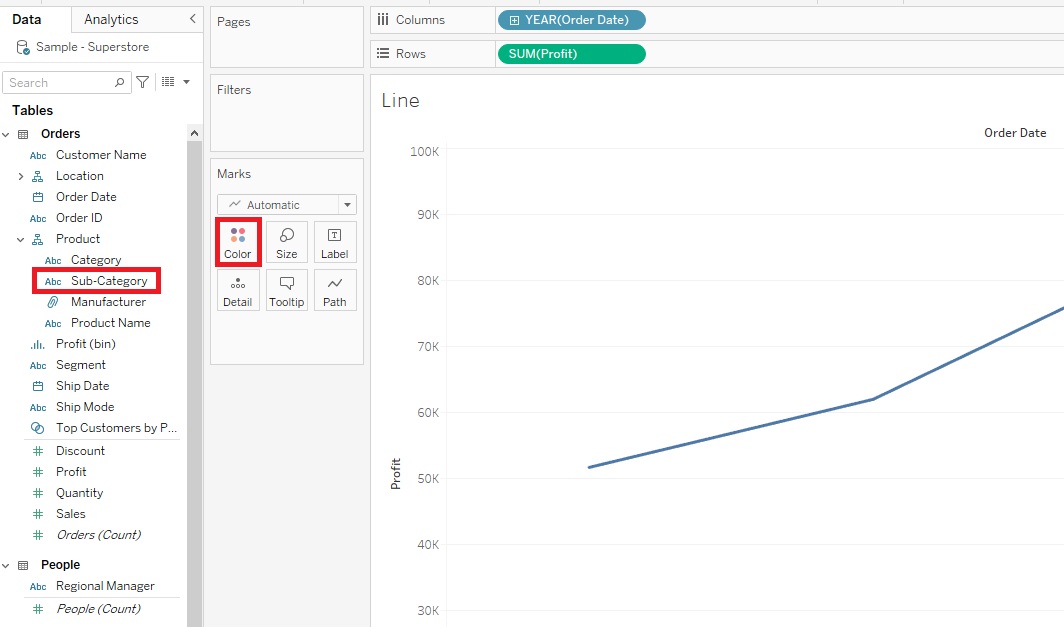
Tableau has assigned a qualitative colour palette scheme, assigning different colours to represent our Sub-Category, but we do have a lot of them, so it is a bit overwhelming.
-
When creating visualizations, you always need to figure out what your main message is. What is the story you are trying to tell. One way to simplify this would be to show a comparison between 2 particular sub-categories of interest. We can do this by dragging Sub-Category over to the Filters shelf.
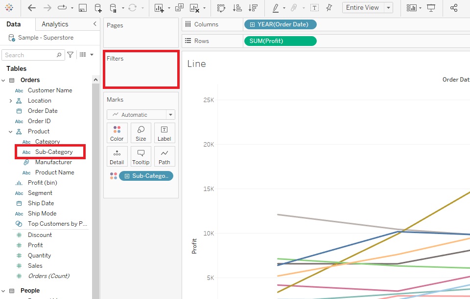
Select two sub-categories. Let’s pick Phones and Tables. (Select None first to clear the selections).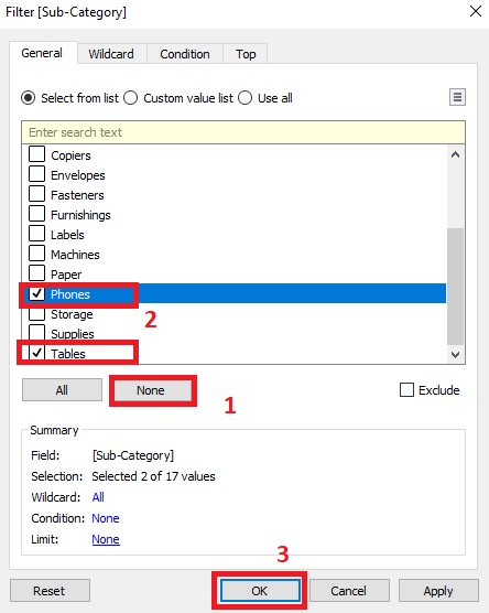
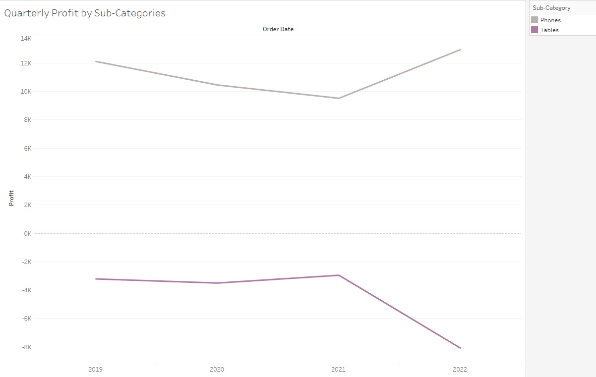
This tells a story that Phones are increasing in profit, while Tables are decreasing.
-
Another way we could tell a story would be to allow the user to filter it themselves based on what sub-categories they are interested in – so adding an interactive element. To do that, go back to Filters shelf, right click on Sub-Category and pick Edit Filter.
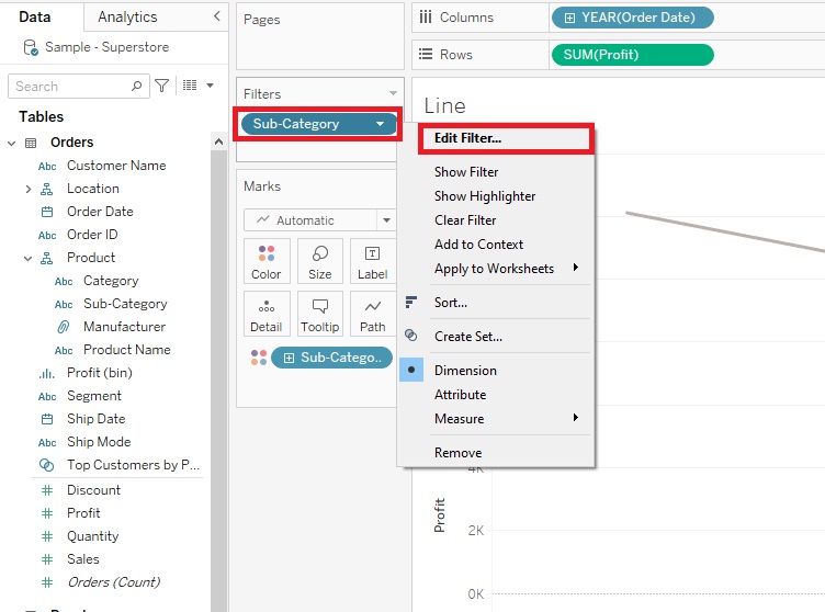
Select All and click on OK.

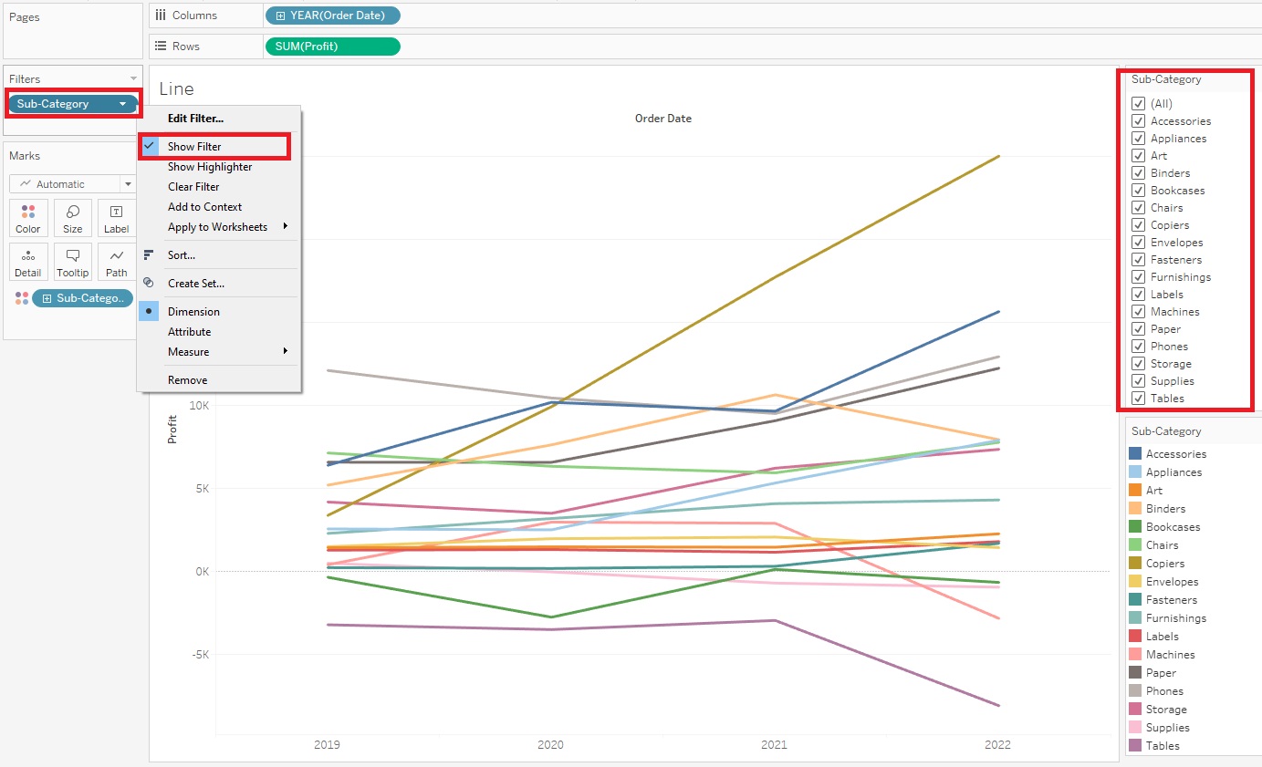
Then right click Sub-Category in the Filters shelf again, but this time select Show Filter. Now you can see the Sub-Category filters show up on the right. We can select or deselect as we like and the graph changes. Or select (All) to have them all come back. (if you don’t see the filters, click on Show Me to close its options panel that is blocking the view)
- To further help the user read your graph, you could also add a Highlighter. Go back to the Filters shelf, right click on Sub-Category, but this time pick Show Highlighter.

Now Highlight Sub-Category box shows up on the right. The user can pick a sub-category and the graph emphasizes that Sub-Category – try it out. You should see it emphasized on the graph.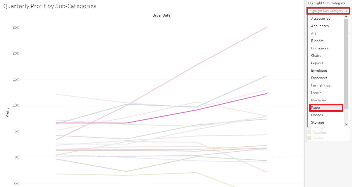
- Right now it is showing the change in profit over time by years, but we can also change it to display more detail by quarters. One way to do this is to click on the plus sign next to the Year (Order Date) pill next to Columns. This subdivides each year by its quarters.

You might see a pattern of end of year growth, cycling over each year, depending on what sub-categories you have selected.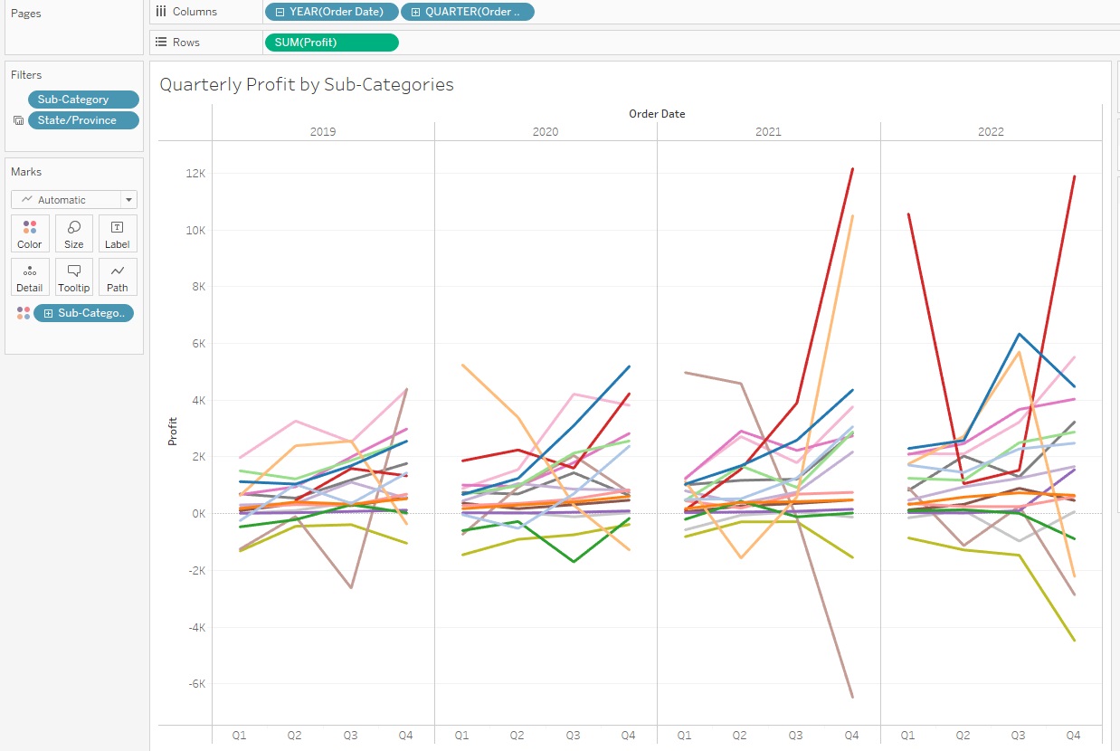
-
Finally, let’s say you didn’t like these colours. Click on the Colour Box and select Edit Colours.
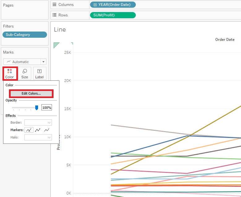
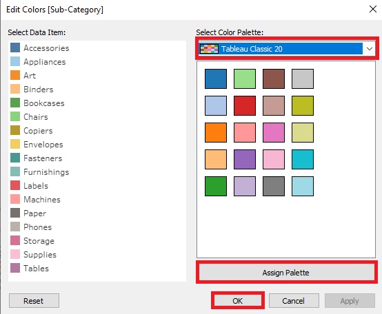
Here you can pick from a drop-down menu of various colour palettes. Select one you like and click on Assign Palette. Then click on OK.
-
Again, give your graph a title “Quarterly Profit by Sub-Categories”. Lovely!

Creating Pie Charts
- Let’s try loading our own data – this time some qualitative humanities data. Tableau is not meant to work directly with text data files, but you can use other better-suited textual analysis tools to create datasets that you can then visualize in Tableau. What I did was take the freely available text for Shakespeare’s play Romeo and Juliet. I ran it through a free online tool called Voyant Tools and it generated a word frequency table that we are now going to use as our dataset. If you want to learn more about textual analysis and visualization tools, such as Voyant, you can take a look at the Tools & Tutorials page in the data viz guide.
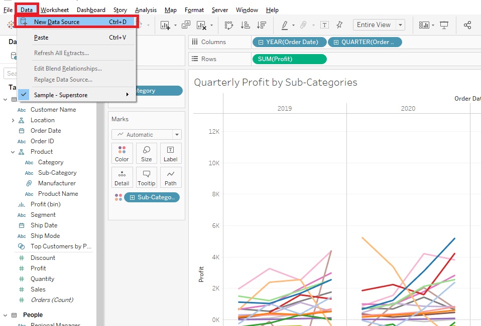
- Let’s load this word frequency data into Tableau. Again, go to Data->New Data Source.
Select Microsoft Excel.
Pick RomeoAndJulietWordFrequenciesByAct.xls. in your folder.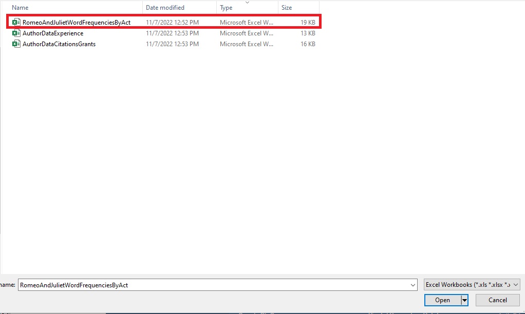
- You can see that it is a simple spreadsheet that counts how many times a term/word came up in each act. Let’s click on new worksheet to get started. Let’s rename this one to “Pie”.
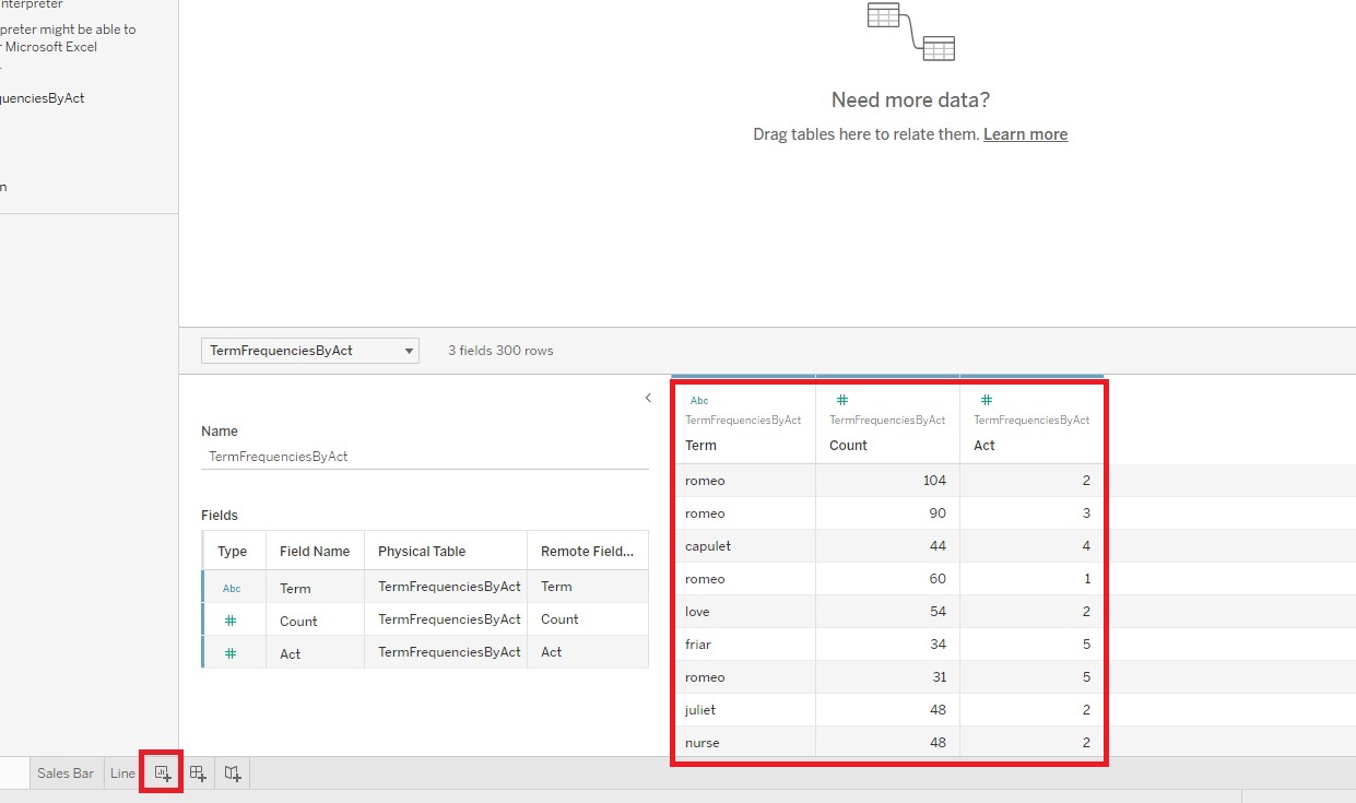
- Let’s first make a simple pie chart to show how many words are in each Act of the play, to see which Act is the longest and shortest and how they contribute to the whole.
-
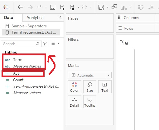
Before we begin building our visualization, let’s make sure our variables are correct. If we look at what the variable types Tableau’s has identified in our dataset, you’ll notice that it thinks Act is a numeric variable in the Measures section, when really it is categorical in this case. So let’s change it to move it to our Dimensions section. Drag the Act variable into the Dimensions section.
-
Using Show Me, hold down the Control Key and click on Act and Count (hold down the Command Key if on Mac), and then expand the Show Me tab. I see that pie chart is one of the recommendations. Let’s pick it.
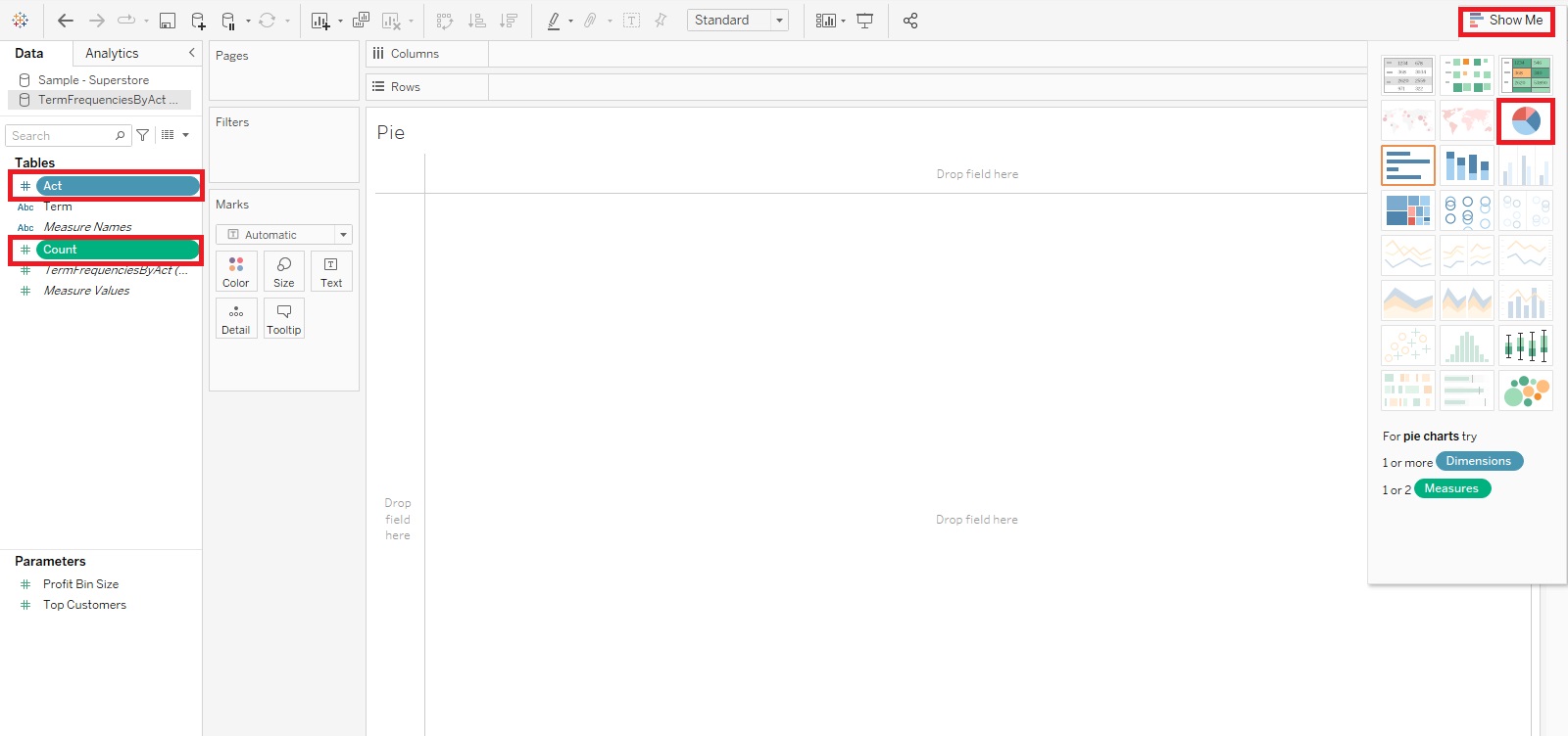
- It is very small, so let’s make it larger by selecting Entire View from the ribbon drop-down.
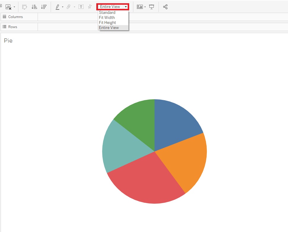
-
Next, let’s label it. Drag Act on to Label, and then Count on to Label. Then click on Label, and click on the ... icon next to the Text field to edit the label.

Add the word “Act” to just before the <Act> number to clarify the label, and then click on OK. Then click away to close the window

-
Currently it is showing the frequency count as a raw number, but we could show a percentage of the total instead, which is more common for pie charts. Right click on the SUM (Count) Label Pill (the last one listed on the Marks card). Select Quick Table Calculation and then Percent of Total.
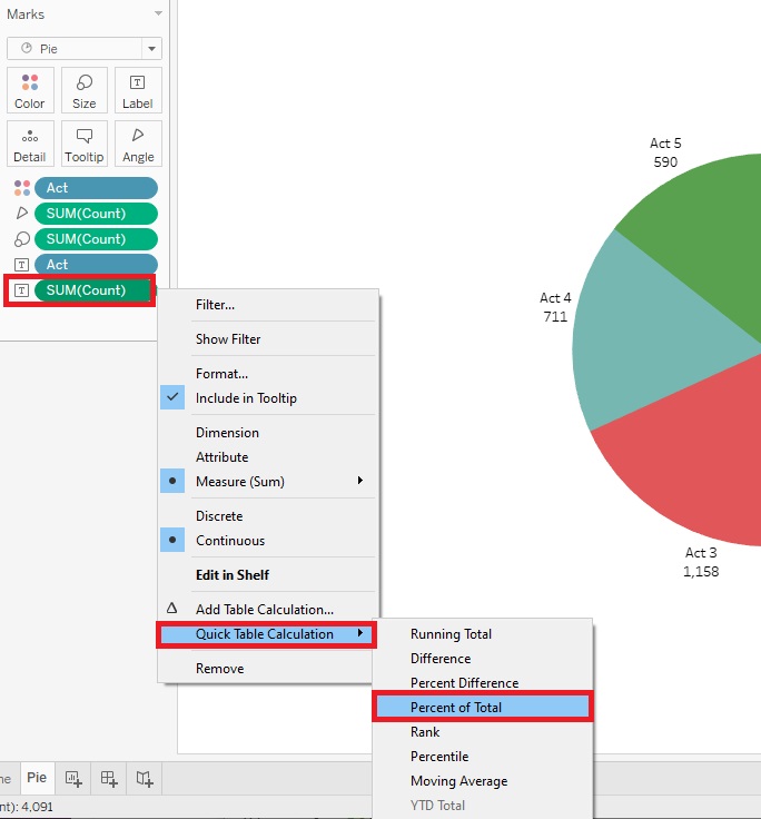
-
We could also format the percentages to round to whole numbers. Right click on the SUM (Count) Label Pill again, and this time select Format.

From the Format window that appears on the left, in the Pane tab, under the Default section, from the drop-down for Numbers, select Percentage and then change the number of Decimal places to zero. Then click away to close the window.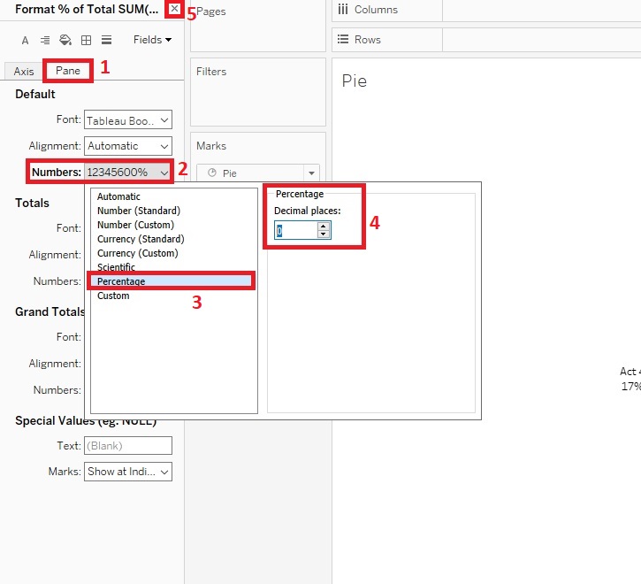
- We can see the number of words used is quite evenly distributed throughout the acts, but Act 3 uses the most and Act 5 uses the least.

Creating Scatter Plots
- Sometimes you have to pull data from multiple sources instead of having it all in one file. Let’s add a couple more datasets, but this time we’re going to match them up or join them together to create one large dataset to work from.
-
Go to the top Data Menu and select New Data Source.
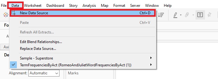
Select Microsoft Excel.

Choose AuthorDataCitationsGrants.xls.
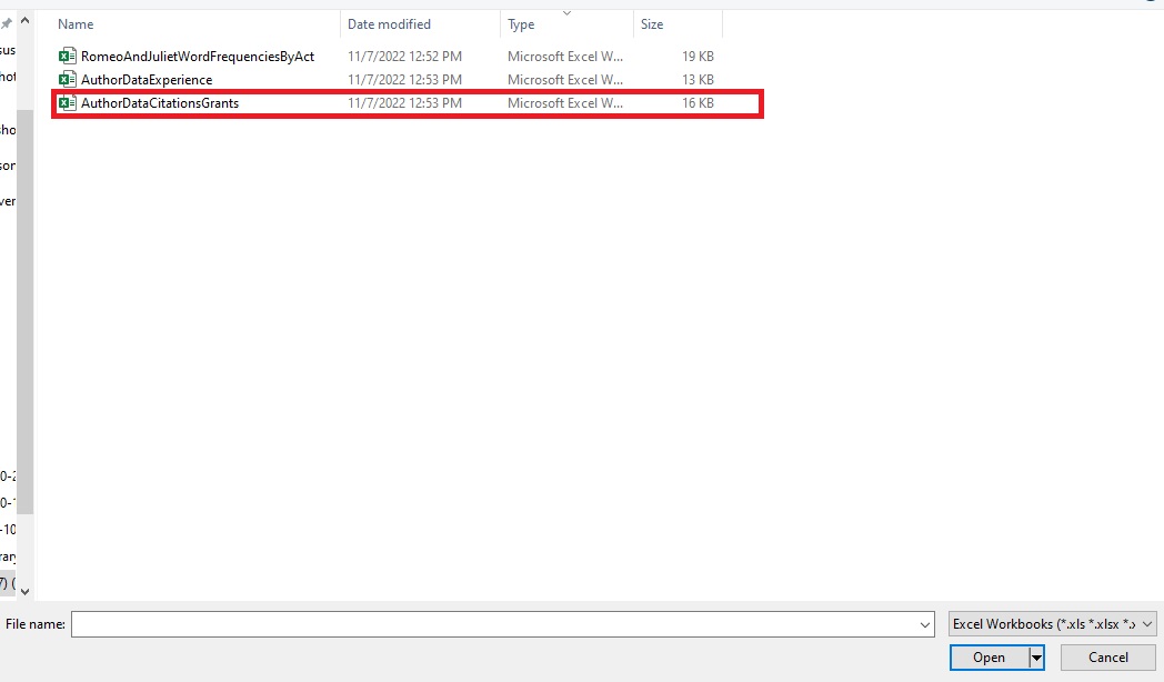
This is the dataset containing names of authors, their countries and institutions, research interests, how many citations they’ve received over a few years, and how much grant money they’ve received over a few years.
-
Now click on “Add” next to Connections on the top left to add a second dataset, select Microsoft Excel.
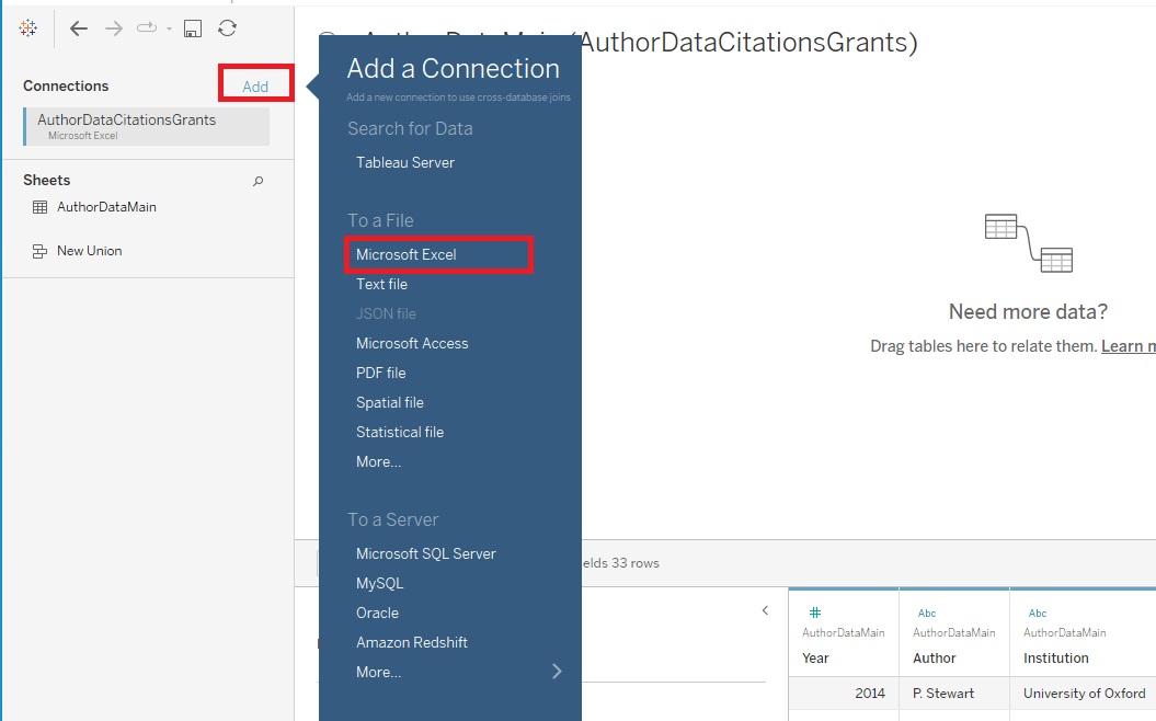
Then pick the AuthorDataExperience.xls file. This dataset has just author names along with how many years of experience they have as a researcher.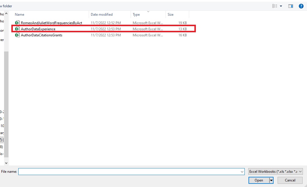
-
To relate or connect the two datasets, drag AuthorDataExperience under Sheets over to the section where it says, “Need more data?” (if you don't see AuthorDataExperience under Sheets, make sure that AuthorDataExperience is selected under Connections).
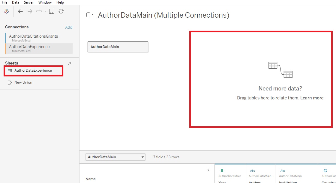
The bottom window shows us that the data has been related together based on a common column, Author. Now the years of experience data will also be associated with the appropriate authors additional data found in the first table. Tableau performs relates and joins on the fly, as needed. If these terms are new to you, see these articles on relationships and joins in the slides.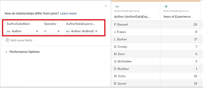
-
Then we can click on the New Worksheet icon at the bottom. Let’s rename this one to “Scatter Plot”.
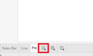
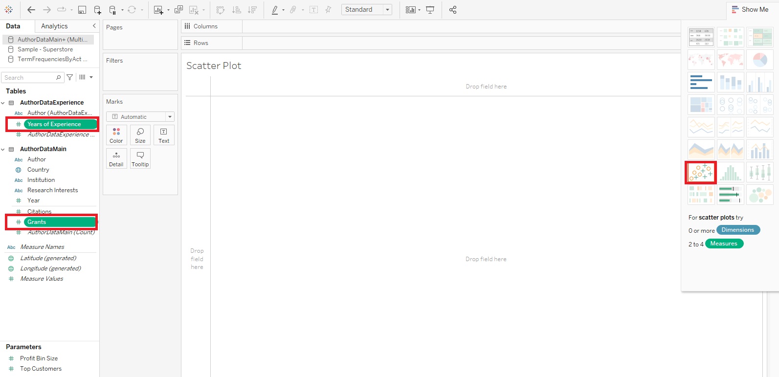
- Scatter Plots are great to use to identify if there is any relationship between numeric variables. Let’s see if there is a relationship between grants and years of experience.
-
Again, let’s create this scatterplot using the Show Me feature. This time, hold down the Control Key and click on Grants and Years of Experience (hold down the Command Key if on Mac), and then expand the Show Me tab. I see that Scatter Plot is one of the recommendations. Let’s pick it.
-
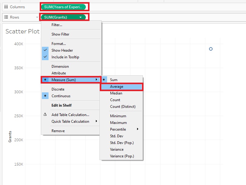
Doesn’t look like much yet, but let’s make some adjustments. First, instead of summing these variables, let’s take the averages. So right click on the Grants Pill next to Rows, select Measures (Sum) and then change it to Average. Do the same for the Years of Experience Pill next to Columns.
-
Our next problem is that it is plotting just one x/y pair – the averages of the whole dataset. We need to plot the points either for each Author, Country, or Institution. Let’s do it by Author. This is where that Details box comes up. If you drag Author over it, it explodes out the aggregation to plot it by Author.
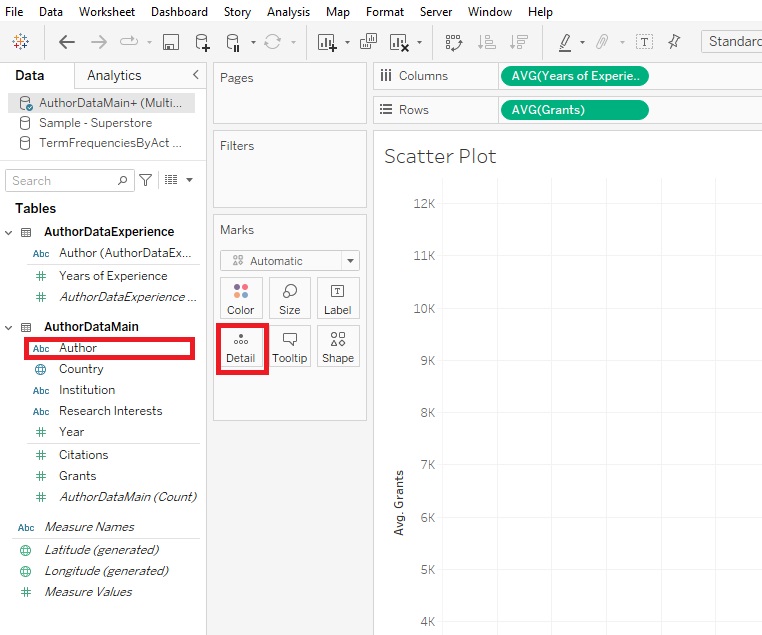
When you hover over a point, you can see the details.
-
You may notice there is now also another box on the Marks card called Shape. If you want to add another categorical variable to your Scatter Plot, you could do so by using different shapes to represent different categories. Drag Institution on to the Shape box. Now you should see that there is a legend on the right, using different shapes for different institutions.

-
If you want to add trend lines in Tableau, right-click in the centre and select Trend Lines -> Show Trend Lines.
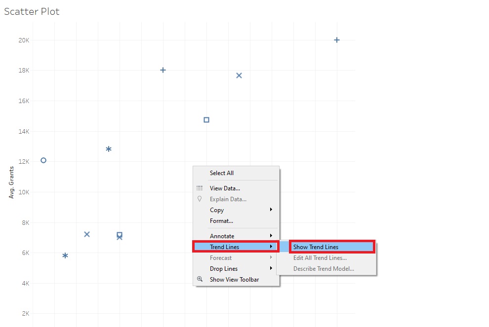
Hovering over the lines also gives you statistical information, such as P-values.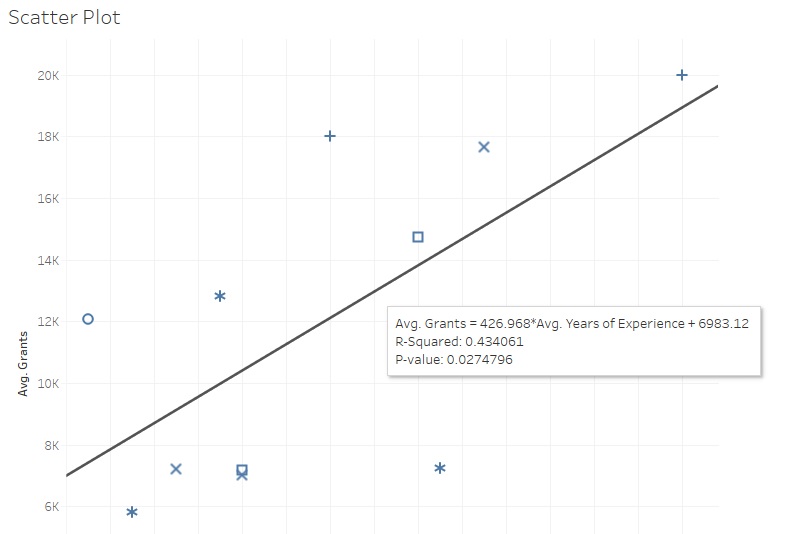
-
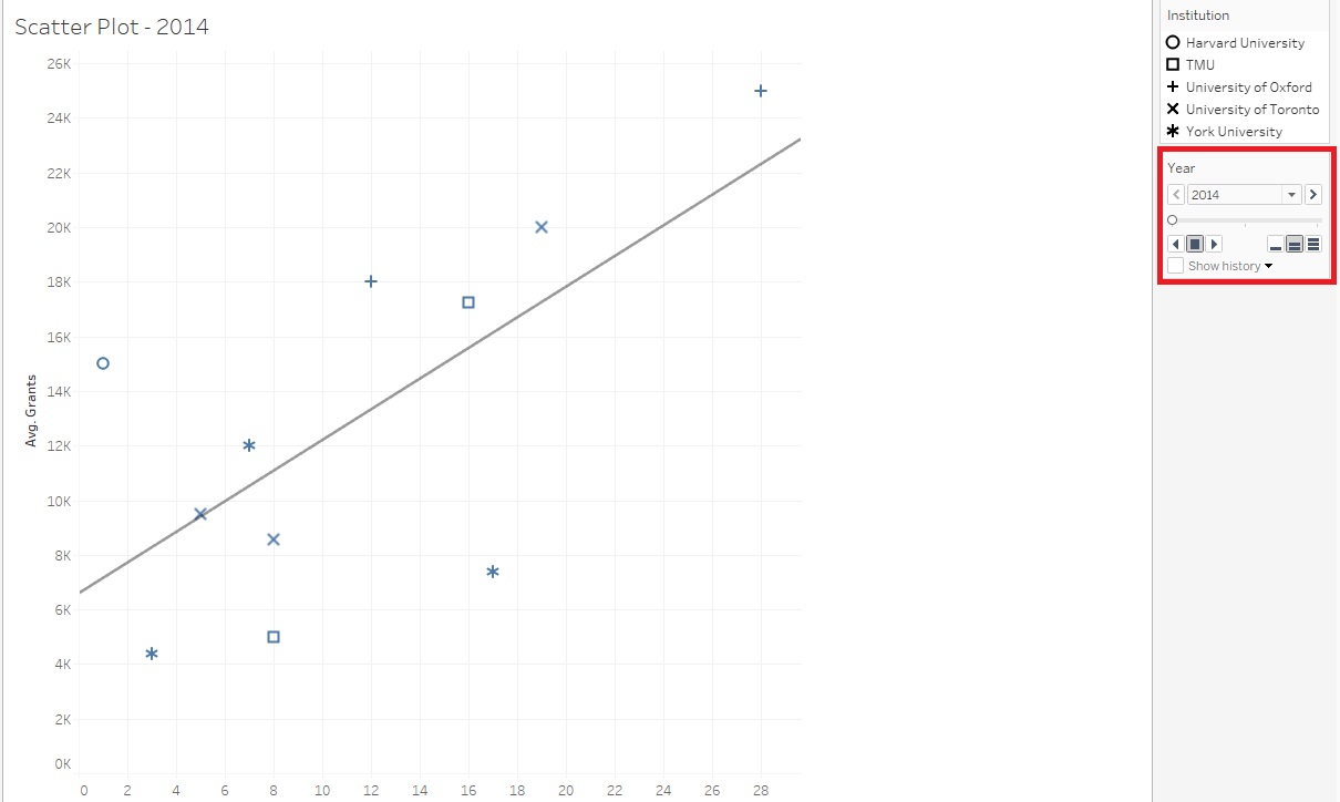
Finally, one interesting feature of Tableau is to create not just one visualization, but a series of them, using the Pages shelf. Drag Year on to the Pages shelf.

Now you should see some controls on the right. The user can scroll through three different Scatter Plots, one for each year, or they can click on the Play button to have it animate through the years.
Creating Dashboards
-
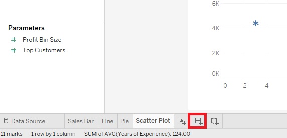
Now so far we’ve been creating visualizations within worksheets. But you can also create Dashboards that combine a number of visualizations together to present a more complex story than a single visualization can show. So for example, let us click on the Create New Dashboard icon at the bottom, next to the New Worksheet icon.
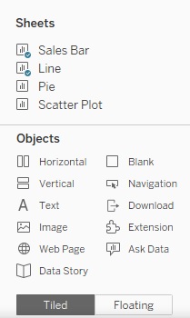
- You then can drag and drop various sheets to layout a dashboard. You can see it really helps to label your sheets. You can also drag other Objects (bottom left), such as text or images to create your dashboard. So let’s create a Dashboard showing Sales and Profit by Sub-Category and being able to filter by State/Province.
-
Before we start building our dashboard, I just want to adjust the Sales Bar sheet slightly. Go to it by clicking on its tab at the bottom.

Right click on the State/Province filter, and select Edit Filter...

-
Select All and click on OK.

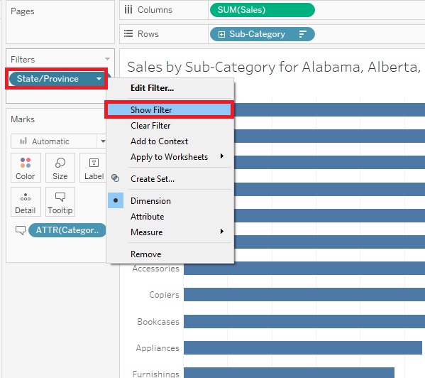
Then right click the State/Province filter again, but this time select Show Filter.
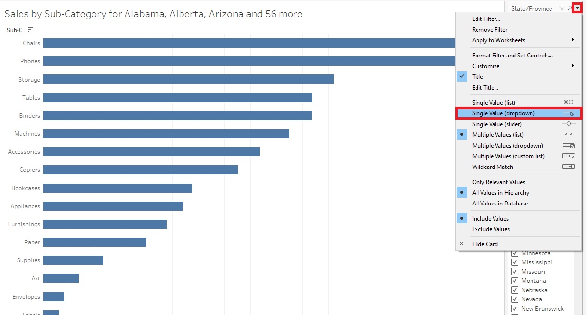
Now you can see the filters show up on the right. Hover over the legend until you see a small arrow. Click on it to get the drop-down menu, then select Single Value (dropdown). Now we have a State/Province filter that the reader can use to filter the graph. We’re going to take this filter and use it in our Dashboard to apply to all the graphs we add into the Dashboard.
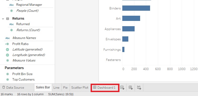
- So let’s go back to our Dashboard by clicking on the Dashboard 1 tab at the bottom.
-
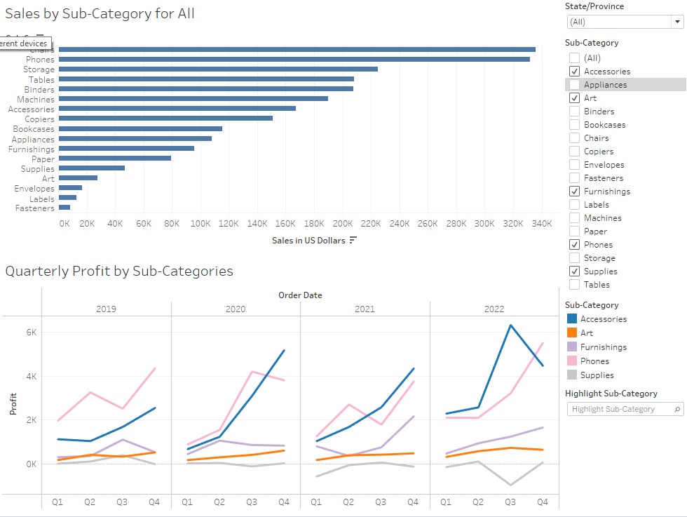
First, let’s drag the Sales Bar sheet into the Dashboard.

Then drag the Line sheet underneath and select a few categories of interest.

Your Dashboard should now look like this.
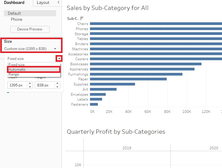
- Our Dashboard seems a bit squished, so to improve how it displays, under Size on the left, change Fixed size to Automatic.
-
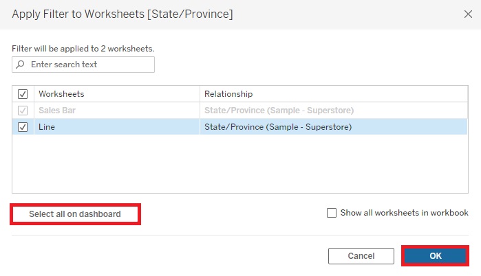
To make the filter for the Sales sheet apply to both, right click on the title of the filter, State/Province, select Apply to Worksheets, and then pick Selected Worksheets...
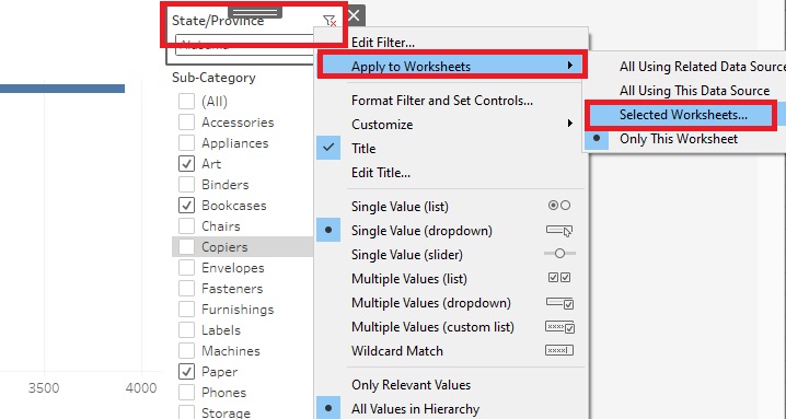
Click on Select all on dashboard in the pop-up window, and then click on OK. Now you’ll see that when you select one State/Province, both graphs refer to that State/Province. End up picking all States/Provinces.
-
Let’s add a title to our Dashboard. Drag Text from under Objects to the top of the Dashboard. As you drag, make sure the grey rectangle is narrow, spanning the top of the whole Dashboard.
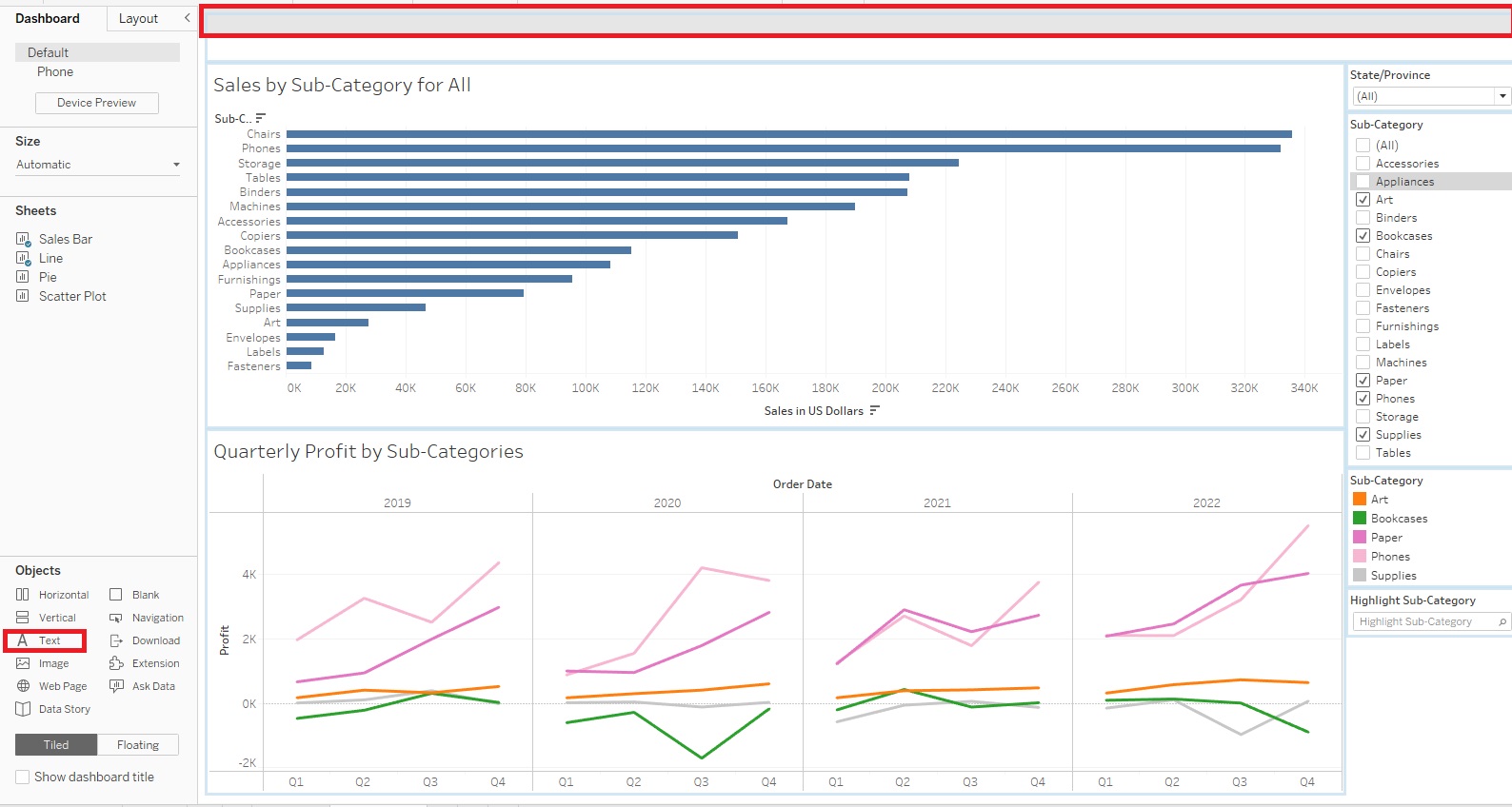
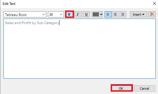
Make the title “Sales and Profit by Sub-Category”, set the font size to 20 and make it bold. Resize the height of the title to finish it off.
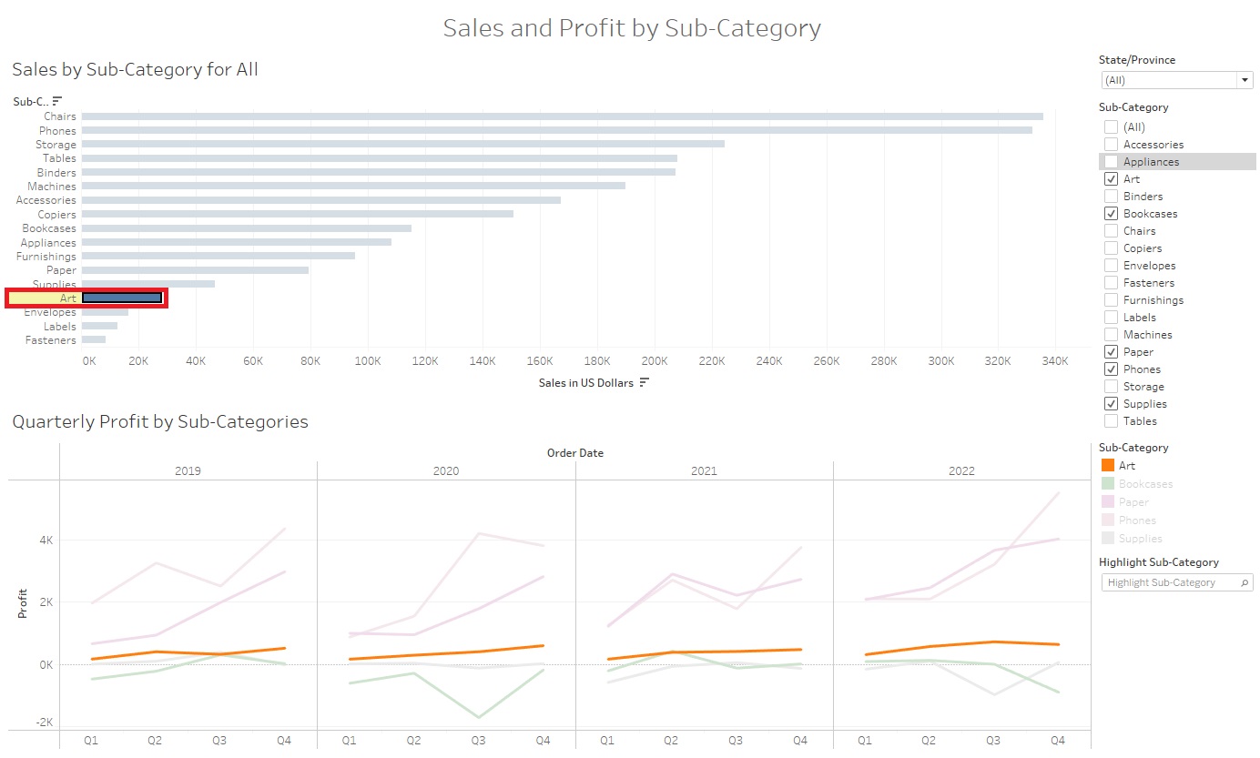
Your Dashboard should now look like this.

-
Finally, let’s add a Dashboard Action, where if you click on a Sub-Category in one of the graphs, it’ll highlight it in both to help the reader link the data together visually. From the Dashboard menu at the top, select Actions...
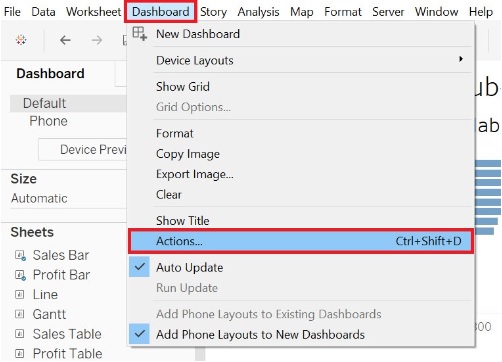
Click on Add Action and select Highlight... From this window, you could customize the settings if you wish to specify which sheets would be affected, and when the action will occur, for example.

Let’s keep the defaults and click on OK. Then click OK again.

Now if you select a Sub-Category in one graph, such as the Arts Sub-Category in the Bar Graph, it should highlight it in the second graph (highlighting the line). Click it again to deselect it.
-
Once you’ve created some visualizations and Dashboards, your last steps are to save and publish them. If you’re working on some visualizations, like we have here, you can save work-in-progress as a Tableau Workbook file. Go to the File menu and click on Save. Give it a name and select where you want to save the file. (Note: If you do this, it doesn’t save the underlying data, so you have keep the data file(s) and workbook together). Or you can select Export Packaged Workbook… (also from the File menu). Then you could share that file with others who have Tableau (and this time it includes the data). In both cases, you can then come back to revisit your work later by reopening it in Tableau Desktop.

-
If you want to export one of your worksheets to an image you can use in a report or article, you can do so from the Worksheet menu. There are options to either Export it as an image or Copy it and paste it into a document or image editing software to work with it further. You can do the same thing for your whole Dashboard or Story from the Dashboard or Story menu respectively.

-
As our Dashboard and visualizations can also be interactive, there may be times when you want to publish them to the web so that your users can view them. Your free option is to create a Tableau Public account and publish it there using that option in the Server menu (but note it is public; however, you can adjust the settings, if you don’t want readers to download the underlying data and/or workbook). There are also pay options (Tableau Cloud and Tableau Server), if you want to be able to limit permissions on who can view your visualizations or to publish to your own server; use the Publish Workbook option from the Server menu to access these options.

-
If you also go to Tableau Public Viz of the Day, you’ll see Tableau visualizations to provide inspiration. If there’s something you’re interested in, you can click on the Download icon (a small box with an arrow pointing down) at the bottom to see if you can download the workbook. You can also click on the Share icon (three staggered dots connected by lines) to share the visualization.
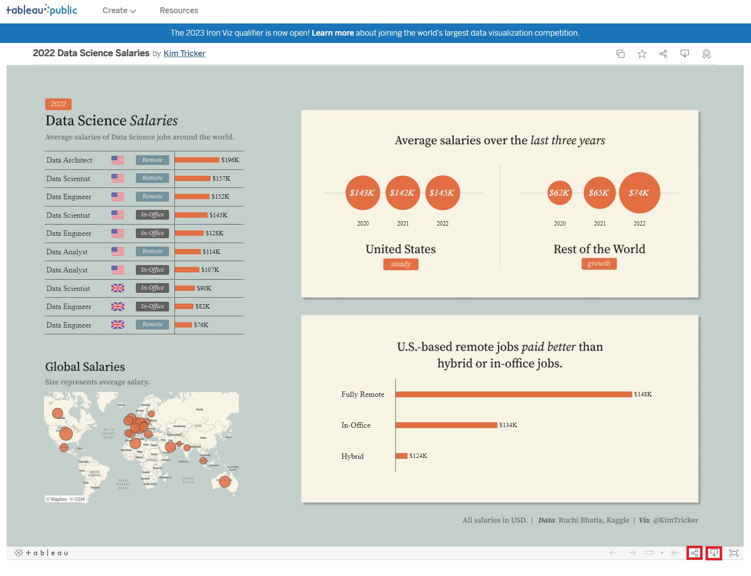
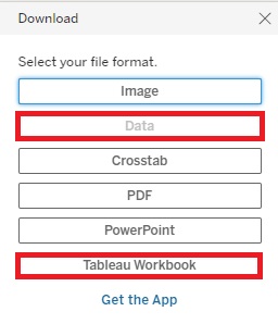
When downloading the visualization, you can click Data to download the workbook used for this visualization (if the Data button is not greyed out). You can then open the workbook to see how the author created this visualization.
When sharing the visualization, you can access its Embed Code. If you want to embed your own visualizations into your own website, you have to first upload them to Tableau Public, then click on the share icon to get the embed code to add to your website’s HTML code.

And that’s it!