Data Sources
TTC datasets downloaded from City of Toronto - Open Data
- The subset used in this workshop can be download from https://uoft.me/ExcelWorkshop2025
Table of Contents
Getting Started
Working With Data
Understanding Data
Number Data
Text Data
Error Data
Logical Data
Viewing and Editing Data Types
Viewing and Sorting Data
Conditional Formatting
Filtering Data
Transposing Data
Formulas and Functions
Using Built in Functions
Calling data from Other Worksheets
Nested Functions
Charts
Pivot Tables and Pivot Charts
Getting Started
1. Open the file Excel_TTCData_2024.xlsx in Excel (you download it alongside this PDF). You can do this either by browsing to the file on your computer and double-clicking on it, or by opening Excel from the Start menu and choosing File -> Open.
2. Before we begin, let’s briefly review the Excel interface. We are currently looking at the first worksheet in this Excel file (Excel files are also known as workbooks. A workbook can contain many worksheets, and you can link data across worksheets). You can click on the tabs at the bottom of the screen to switch between worksheets.

| Worksheet Naming Choose descriptive names when you name worksheets, so that it’s easy to remember what data they contain. Another good practice is to avoid whitespace - computers struggle to read whitespaces when you automate tasks, so avoiding spaces will even help when you want to refer to a cell in another sheet. Use_underscores or UseCapitalization between words instead. |
3. Across the top of the screen, you have what is known as the ribbon. There are a series of tabs across the top, each of which provides access to a range of tools. You’re likely very familiar with this layout, as it is similar across all Microsoft Office applications.

4. Notice at the very top of the screen there is a smaller set of buttons. This is known as the Quick Access Toolbar. By default, it contains Save, Undo and Redo. Click the three dots at the end of the toolbar. Notice you can add a range of other buttons to the toolbar.
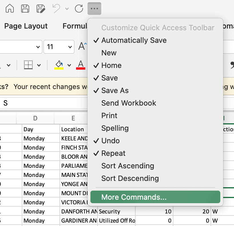
5. In addition, you can use the More Commands option to add any other tool you wish. This can be very useful if you use some tools all the time and find it frustrating switching between tabs on the ribbon. For example, imagine that you use Bubble Charts frequently, and you don’t wish to go to the Insert tab on the ribbon each time. Let’s use the More Commands option to add the bubble chart tool to the quick access toolbar. Click More Commands. The “Excel Options” window pops up. Under “Choose commands from” select Insert Tab. Scroll down in the list and select Insert Scatter (X, Y) or Bubble Chart. Click > to move this to the right side of the Options box. Click Save.
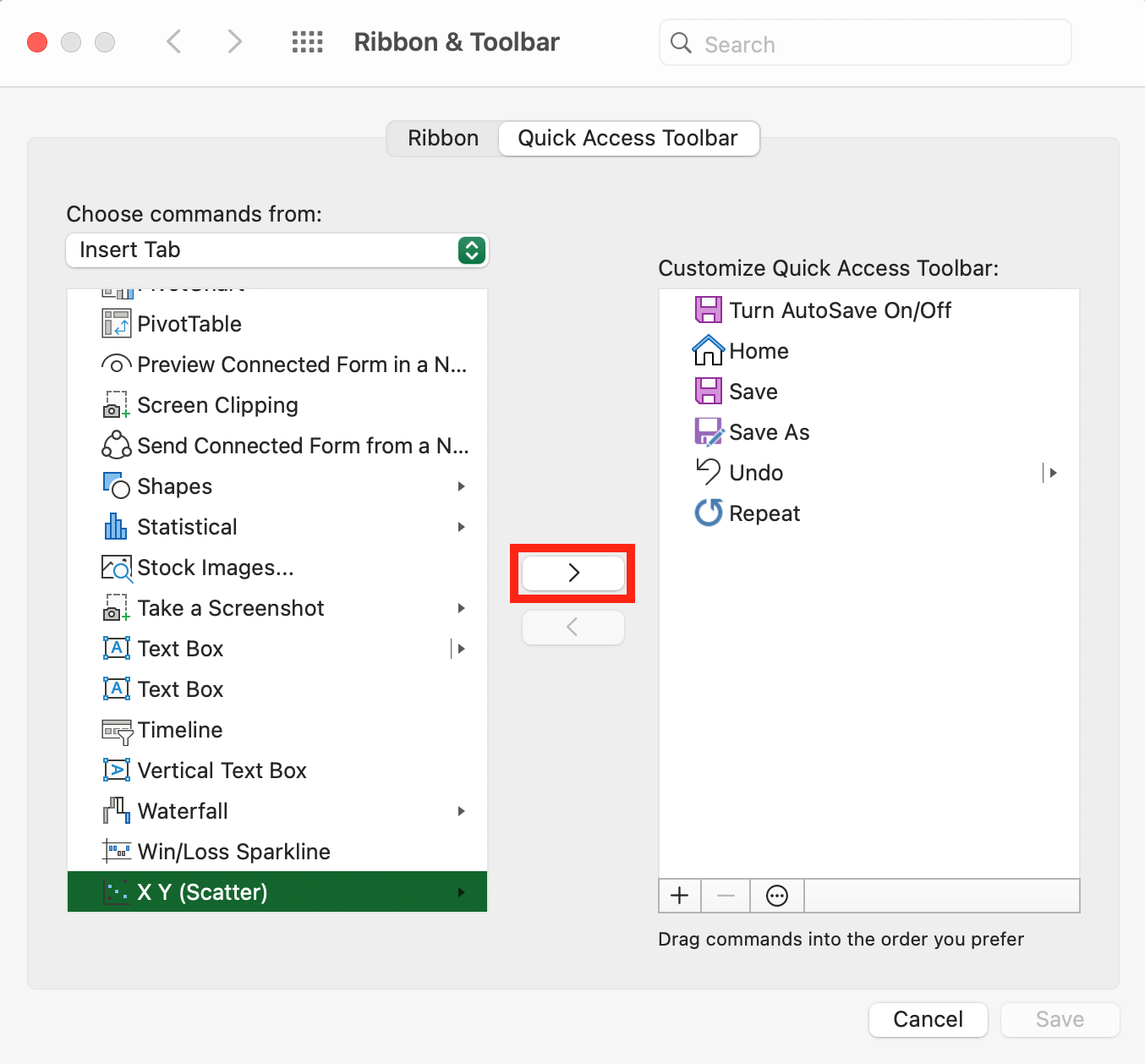
6. You can now access all the scatter and bubble chart options directly from the quick access toolbar! You can do this for any tools you use regularly.

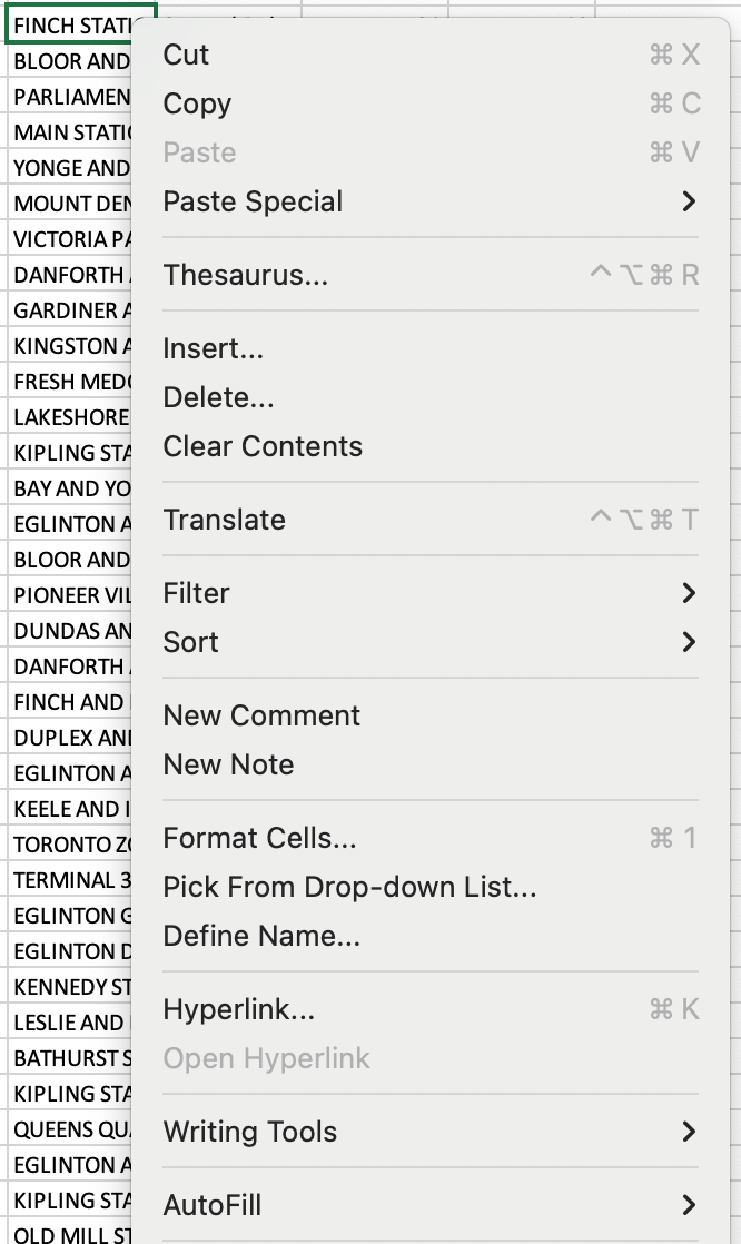
7. Two finger click on any cell in the current worksheet. The context menu will appear - this is another great way to access commonly used tools from the Home tab while you are working on another tab and cannot currently see the Home tab tools on the ribbon.
8. There are also many keyboard shortcuts you can use to access popular tools. You are probably familiar with Command+C for copy and Command+V for paste, but there are many others as well. We’ll point out a few throughout this workshop. A full list is available from the Microsoft Office support website
9. The convention in Excel is to organize your data with observations as rows and variables as columns
- Rows are identified by row numbers.
- Columns are identified by column letters.
- Cells are identified by the row-column combination.
- Ranges of cells are identified by a colon (i.e. in the selection below A2:D13, means the range of cells starting at A2 and finishing at D13)
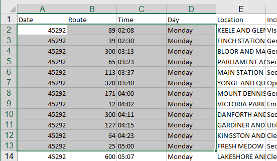
10. Let’s look a bit at the data in the current worksheet. These letters and numbers that identify our rows and columns are indicated in a grey area above and to the left of the data, which are known as the column headers and row headers. This allows for each cell to have a unique name indicated by its column letter and row number. Click on any cell in the worksheet. The name box immediately above the data will show the cell’s name.
| Column Naming Try to keep your names short but descriptive (so you remember what you meant the next time you open the workbook). Excel will let you type anything as a column name, but if your data might eventually be imported into other software (such as a database or a geographic information system), then you will want to follow a few additional rules: Use letters, numbers and underscores only (no spaces or special characters). Start all names with a letter, and do not use more than 64 characters in a name. |
11. Immediately beside the name box is the formula bar. It will show you the contents of the selected cell (even if the cell does not contain a formula). When you edit data, you can edit it within the cell or in the formula bar.
12. Next, in the current worksheet, highlight a few cells containing only number (numeric data) by clicking and dragging.
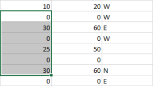
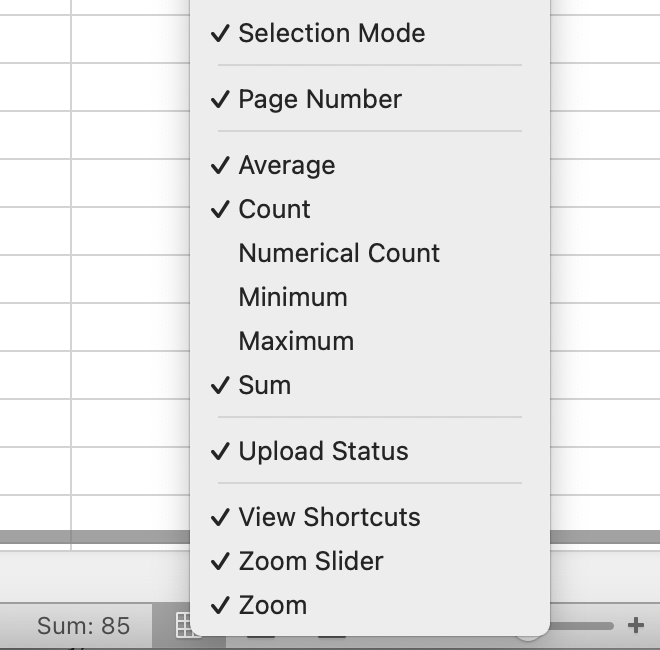
13. Have a look at the bottom bar on the screen. This is called the status bar. It will show you some information about your highlighted cells, including the number of cells as well as the sum and average of the values in the cells.
![]()
14. You can change the details shown by two finger clicking anywhere in the status bar. Notice also that the status bar contains your zoom tool which lets you zoom in and out on your view as needed.
Working with Data
Understanding Data Types
There are four different kinds of data in Microsoft Excel: text, number, error, and logical. Data types may change when pasting data into a spreadsheet, so it's important to understand what type your data exists as. Since the type of data determines what functions you can perform on it, it's also important to know which ones to use and when to use them.
Number Data
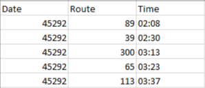
Number or numerical data can include any type of number, of any size (including fractions and negatives). There are many different subtypes of numerical data in excel, including whole numbers (integers) and real numbers (decimals), dates and times, phone numbers, and monetary totals in varying currencies.
Text Data
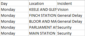
Text data can include letters, numbers, and symbols, and is often used in column names as well as data cells. However, unlike numerical data you can’t perform calculations on text data. Excel will often classify data as text by default if it doesn’t recognize the type, so you may need to manually change the format of your cells before running any calculations! We’ll talk more about this in a minute.
Error Data
Error data will pop into your cell when there is a mistake or missing information when Excel is processing a formula. There are several types of error data in Excel, which are helpful in determining what may have gone wrong. A full list of these errors can be found via Microsoft support).
| #DIV/0 | You’re trying to divide two values, but the first number is a zero or an empty cell. |
| #N/A | Your formula can’t find the value it’s looking for. |
| #NAME? | You’ll get this error if your function contains text that Excel doesn’t recognize (for example, your function contains a typo ie =VLOKUP instead of =VLOOKUP |
| #NUM! | This error is caused when a number for an argument in a function is not valid. For example, if you’re trying to find the square root of a negative: =SQRT(-2) |
| #REF! | This reference error occurs when we accidentally delete or move the cell we reference in a formula |
| #VALUE! | This error might pop up if you use the wrong data type in a function or formula. For example, if you try to add text using the + operator. |
Logical Data
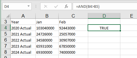
Logical data values are often shown as either TRUE or FALSE. Like with error data, they cannot be typed in Excel manually by the user and instead will show up as a result of an expression or function. Logical data type is useful in making comparisons, creating conditions, testing these conditions, and checking the contents of a cell location.
Viewing and Editing Data Types
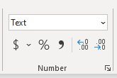
1. When you select a cell in Excel, the data type is visible by default from the Numbers section of the Home ribbon. You can change the data type by selecting your cells, and then choosing a new option from this drop-down menu.
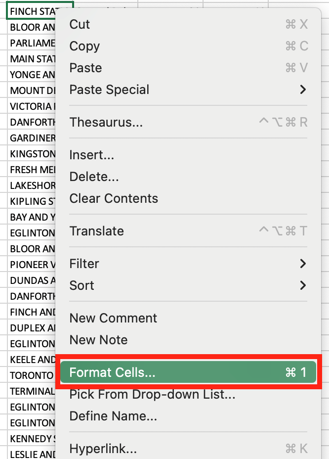
2. Data type can also be reviewed and changed by selecting a cell or group of cells, two finger clicking, and selecting Format Cells from the drop-down menu.
| Data alignment By default, all numeric data (including dates) are what is known as right-aligned, while all text (string data) are left-aligned. This is a helpful way to see when something you entered wasn’t quite right and hadn’t been recognized as the correct kind of data by Excel. |
3. Navigate to the 5Y_Revenue worksheet. You can see right away that something isn’t right - these don’t look like revenue numbers! Click on any cell with revenue data and check the numbers section of the home ribbon - you’ll notice that this value is being displayed as Text data. This means that Excel has not recognized the data as numerical data, and so it’s displaying the contents exactly as entered. So, our revenue data is being displayed as strings of text.

4. We need a way to manually tell Excel that these cells are revenue data (numerical / currency data). We also want to make sure that all other numbers and dates are also being considered number data, with the correct subformat types.
5. In the 5Y_Revenue Sheet, select only the cells that contain currency information, not the row/column headers. Navigate to the numbers section of the Home ribbon, and use the dropdown menu to select currency.
6. Excel is now recognizing and displaying our data as number data in the form of a monetary value (currency) and has included by default a dollar sign. Note that this sign may not be the default if you’ve set the region/language settings for your entire operating system to something other than “English (Canada)”. You can always easily change the symbol of currency values in Excel by selecting the $ dropdown menu from the numbers tab of the Home ribbon. Choosing More Accounting Formats will provide you with a fairly complete list of national currencies and symbols, including CAD.
| Shortened Numbers in Excel When you punch in long numeric strings into Excel, say, 12345678901234567890 (20 digits), Excel will generally convert it for you, meaning that the 20 digit number you've just tapped in has been cut back to be only about fifteen significant figures. |
7. Let’s go back to the 2024_Bus_Delays sheet. The values in our “Date” column also look odd, and the culprit is the same! Ensure that the cells under the “Date” column are selected, and then choose data type Short Date from the numbers tab of the Home ribbon.
| Selecting Multiple Cells An easy shortcut to selecting all cells below your current selection in a column is to use Command + SHIFT + ↓. Note that this selection will only extend to the first blank cell. |
8. Our dates are now formatted as short dates, which are a lot easier to understand.
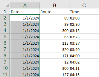
| Working with Numbers Don’t worry if your dates look odd after you copy/pasting into a worksheet. Excel stores dates as sequential serial numbers so that they can be used in calculations. These dates start at January 1, 1900 by default. So this date is serial number 1, which means that January 1, 2024 is serial number 45292 because it is 45,291 days later. These mean the same thing to Excel; the number can always be converted to a date format later on without losing any details. |
Viewing & Sorting Data
1. Let’s move to the 2024_Routes worksheet in our workbook. In this section, we’ll start to look at strategies to manipulate your data to help you make sense of it.
2. Have a look at the data. Often, you’ll be working with data you received from someone else; for example, it might be provided by an instructor for an assignment, or you might have downloaded it online. Data created by someone else can sometimes be messy and require some cleanup. Or, as in this case, it might contain extra information that you don’t need.
3. The first thing we might notice is that we can’t read all of the column names in full. Hover your cursor over the line between columns A and B in the column header. An icon that looks like a vertical line with arrows pointing right and left appears. When you see this icon, you can manipulate the width of the columns. Click and drag to the right to make column A wider.
4. Another option you can use when you see this icon is to double-click the line between columns in the header, which will “auto-fit” the data in that column. Warning: if you have very long column names, you will produce very wide columns using this tool! Try this for column B.
5. You can also auto-fit the data for the entire sheet at once. Click in the top left-hand corner of the data. This will select your entire worksheet. Then you can double click in the column header between any of the columns, and it will auto-fit all columns at once.

| ##### If Excel displays ##### in a cell after you apply currency formatting to your data, the cell probably isn't wide enough to display the data. To expand the column width, double-click the right boundary of the column that contains the cells with the ##### error. This automatically resizes the column to fit the number. You can also drag the right boundary until the columns are the size that you want. |
6. Before we start sorting our data, let’s freeze the column names at the top of the screen so we can always see them, even as we scroll. Select the View tab in the ribbon, then in the Window area, choose Freeze Panes -> Freeze Top Row. It’s also possible to select and freeze multiple rows or columns using Freeze Pane, depending on your needs. Do this for both the 2024_Routes and the 2024_Bus_Delays worksheets.
7. You’ll notice a column titled route_type, which tells us if the route is a subway (1), streetcar (0), or bus (3). Now let’s sort the data based on that value. Select any single cell within the route_type column. Then go to the Data tab on the ribbon, and in the Sort & Filter section, choose the A-Z button.

8. The entire worksheet has now been sorted A-Z (or smallest to largest in the case of numerical data) based on the value in Column E.
9. Always check sort results carefully to ensure that all relevant columns were affected by the sort. If you have blank rows or columns, this can confuse Excel. For more sorting options (and to verify the sort will impact all of your data), select the Custom Sort button from the Data ribbon (Note: Depending on how your Excel is configured, this option might also be under “Sort”).

10. But what happens when two observations have the same value? If we sort by route_type and there are multiple routes of each type, what order should those routes be listed in? By adding a second variable, you tell Excel exactly what to do. For all the route types, let’s say that we also want to sort them alphabetically by route name.
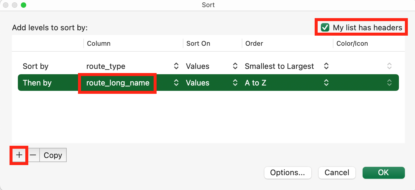
11. Open the Custom Sort menu. Ensure that “My list has headers” is highlighted, so that your variable names are not sorted like an observation.
12. Click on + to add a second variable to sort by ie. route_long_name. Excel will sort initially on your first variable, and then those results based on your second variable. Ensure Sort On is set to “cell values”, and Order is set to “A to Z”. Press OK.
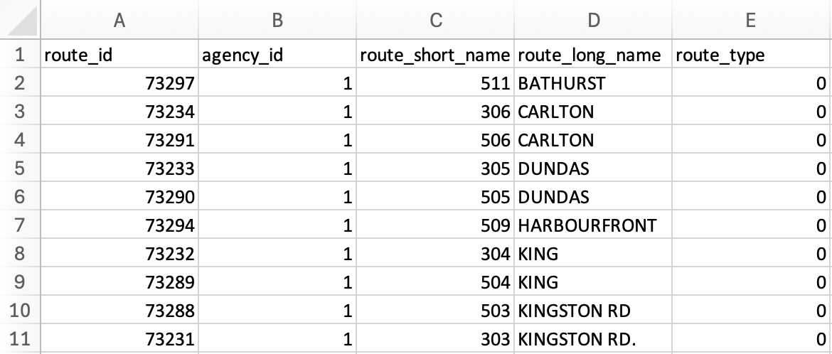
13. Our data has been sorted according to the variables we chose.
Conditional Formatting
Conditional formatting allows you to automatically apply formatting, such as colour, to cells based on the cell value. This can make it easier to quickly identify cells that meet certain conditions (such as outliers in your data or the top 10% of values). This can also help you to better sort your data, since you can sort by colour using the same method we just applied. To do this, you'll need to create a conditional formatting rule.
1. Let’s go to our 2024_Bus_Delays worksheet. Let’s say we want to highlight in yellow all delays longer than 15 minutes, and in red all delays that lasted longer than 30 minutes.
2. Select the cells you’d like to format. In this case, let’s select the entire Min_Delay column excluding the column name.

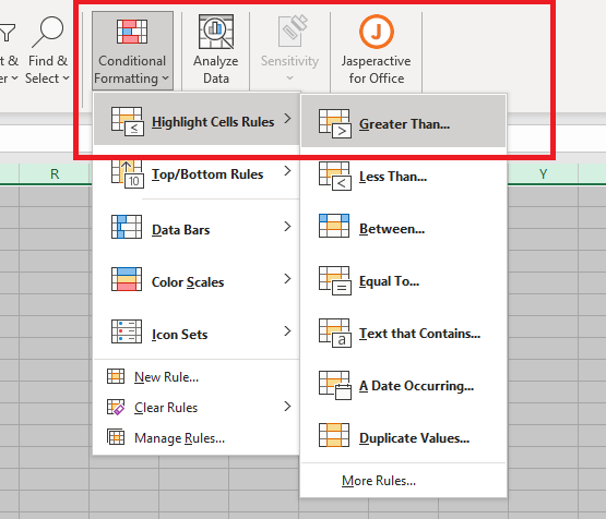
3. From the Home tab on the ribbon, select the Conditional Formatting button. Navigate to Highlight Cell Rules and select Greater Than…
4. You have the option to select a custom combination of colours, borders or text, or otherwise use default presets to highlight your cells. Let’s use the defaults in this case. Input “15” under format cells that are GREATER THAN. Select Yellow Fill from the highlight rules menu. Click OK.
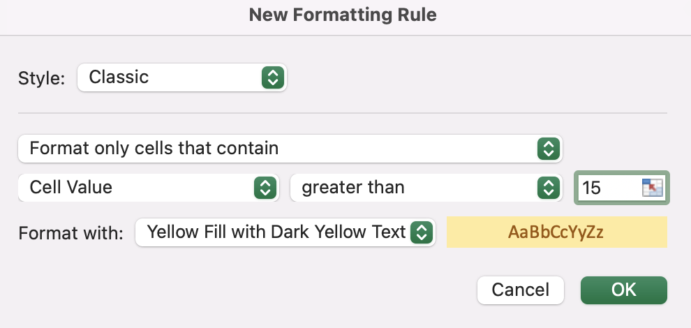
5. Let’s repeat this process with a Red Fill, for cells with a value greater than “30”.

6. Our cells have now been highlighted to reflect our new conditional formatting rules.
7. You can review and manage conditional formatting rules by clicking on Manage Rules under the Conditional Formatting options in the Home ribbon. Here you can edit or delete rules. You can also change the order of rules if you would like one rule to take precedence over another.

| Note If you want to highlight based on multiple conditions at the same time, you can do this by navigating to New Rule and selecting Use a formula to determine which cells to format. We'll learn more about formulas later in this workbook. |
Filtering Data
1. Another key tool to help you explore your data is filtering. On the Data tab of the ribbon, in the “Sort & Filter” section, choose Filter.

2. Little arrows should appear on each of your column names. These contain the filter options for each of your columns.

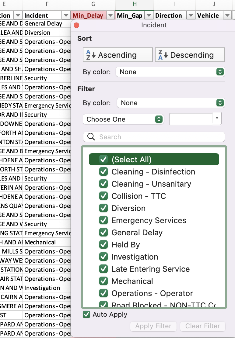
3. Click the arrow to open the filter options for Incident. Notice that sorting options are also available here. In the lower part of the menu, uncheck “Select all”. Then, manually check off several options. In this case, we are only interested in delays caused by collisions, investigations, operator or mechanical reasons. Click OK.
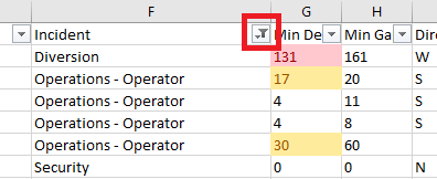
4. Only the selected incident types now appear in your view. Notice that column F now has a filter graphic on the button, which indicates that a filter has been applied on that column. You’ll also notice hidden row numbers when scrolling through your worksheet - the data is still there, it’s just been hidden from view. Note: When you run calculations, Excel will still calculate these hidden rows unless you ask it to ignore hidden rows!
![]()
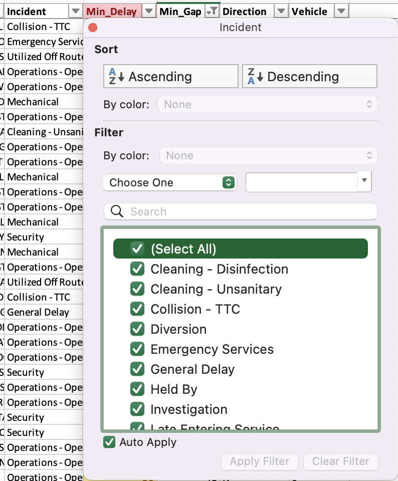
5. Let’s imagine that we want to add a further filter to this dataset. We only want to see those rows where the delay resulted in a vehicle gap (ie. time between vehicles at a given stop) of greater than 10 minutes. Open the filter options for the Min_Gap column. Choose Number Filters, then Greater Than Or Equal To…

6. The “Custom AutoFilter” window pops up. Enter the expression “is greater than or equal to 10” and click OK.

7. We can see that now any values less than 10 have been removed from our view.
8. You can remove filters from specific columns, by opening the filter options for that column and selecting Clear filter from [column name]. Let’s clear our filters for now.
Transposing Data
1. Transposing data is another helpful data management task. Switch over to the 5Y_Revenue tab. Looking at the table, you decide that you wish this data had the years across the top of the table (as column headings) and the months along the side (as row headings).
2. There is a very quick way to fix this. Select all the cells in the data table, excluding the table name and descriptive information. You’ll notice this is the first worksheet we have looked at which contains extra information that is not strictly part of the data table. This is something you will commonly find in Excel, and it can make it more challenging as you always need to check to ensure that Excel is able to correctly identify the range of data you want to use when you perform operations (and exclude anything that is extraneous).

3. Copy all the cells you have selected. Next, place your cursor in column A, at least 2 rows below the existing data Now, two finger click in the selected cell, and in the Paste Options, choose Transpose.
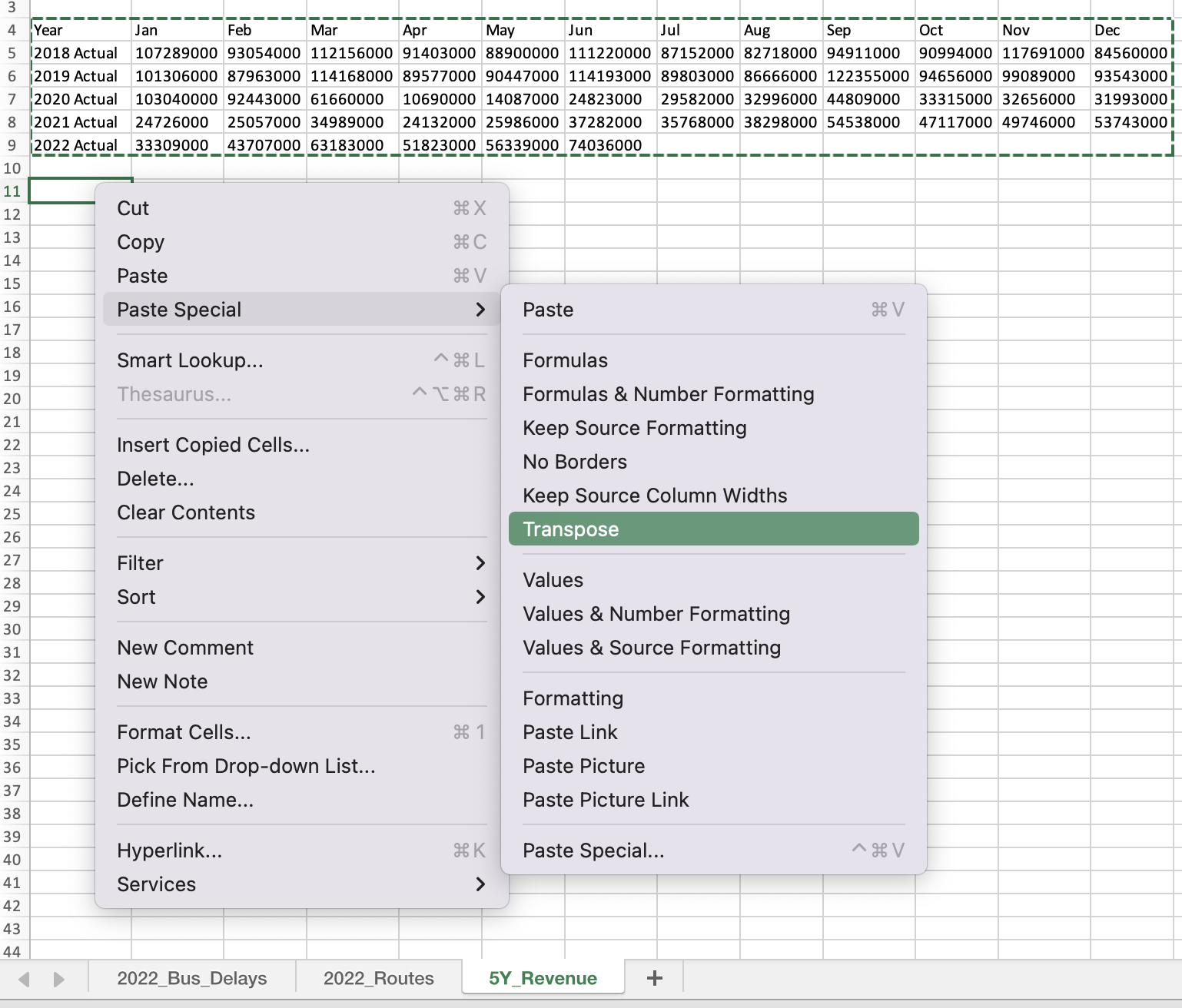
4. The values will be pasted, but with the row and column headings transposed, or reversed: the years will now be across the top, and the months across the rows. This feature is very handy when you find yourself looking at some data that is very wide – i.e. it has a large number of columns, and it would be much easier to read if those headings were in the rows instead.
5. Now select and delete the rows containing the original data; you prefer to use your new version of the table and no longer need the original one. Select Shift cells up when prompted - this will move all the cells below up to fill the gap.

Formulas and Functions
In this section, we’ll start using formulas to explore and analyze our data.
1. A formula in Excel is any mathematical equation. It’s made from values that we have entered into cells. You can create a formula from a direct value (ie. 5) or using cell references (ie. A2). All formulas begin with the symbol =. This tells Excel you’re entering a calculation, and it needs to evaluate it.
2. You can use formulas to perform tasks such as adding numbers and multiplying values in cells. Excel can understand and interpret a variety of mathematical operators, including:
+ (addition)
- (subtraction)
* (multiplication)
/ (division).
It can also understand comparison operators, such as:
= (equal to)
> (greater than)
< (less than
A full list of all operators is available via Microsoft Support.
3. A function is really just a formula - the only difference is that it’s a predefined formula that comes with Excel, not one that you create. Functions are built into Excel to perform specific calculations. For example:
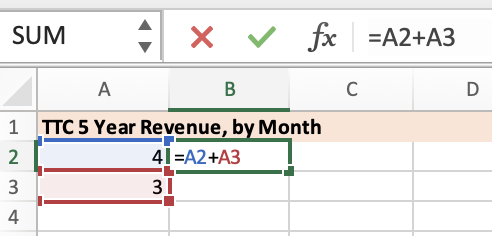
=A2+A3 is a formula, which adds the value of these cells together using the addition operator.
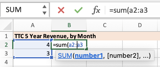
=SUM(A2:A3) is a formula in the form of a function. Excel knows that you want to add together a bunch of cells or numbers (this is what =SUM does), without needing to use the + (addition) operator. It also knows you want to add together all cells between A1 and A2, because you used a range operator (the colon!, : ).
4. Functions can increase productivity and make your formula much shorter. For example, if you wanted to add together all 5 cells you could write: =SUM(A1:A5). This is much shorter than =A1+A2+A3+A4+A5)!
Using Built in Functions
1. Rather than type out every calculation by hand, we can use Excel’s built-in functions. Common calculations like averages, medians, sums, and maximums have their own Excel functions. A full list of math and statistical functions in Excel is available from Microsoft.
2. If you think Excel may have the function you want to use you can go to the Formulas tab and select Insert Function. The functions are organized categorically in the function library (to the right of the Insert Function box).

3. In cell L1 of the 2024_Bus_Delays worksheet, type a new column heading “Avg_Jan_Delay”.
4. Select cell L2. Let’s use the “Insert Function” button to look up how to calculate the average bus delay in January 2024. Average is found under Category > Statistical, but can also be located by searching for a function by name.
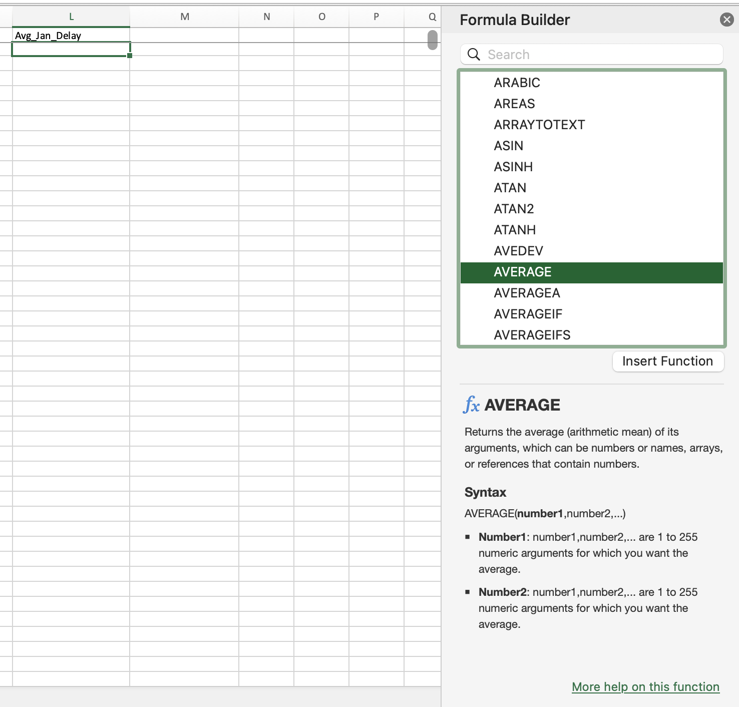
5. That is the first of two ways to access Excel’s built-in formulas. When you go this way, a pop-up window appears and gives you information about how to use the formula and what data the formula expects. When the formula asks for a number, you can enter a number, a cell identifier, a range. In this case, we want to calculate the average of all cells between G2 and G4765. Enter G2:G4765 Press OK to execute the formula.
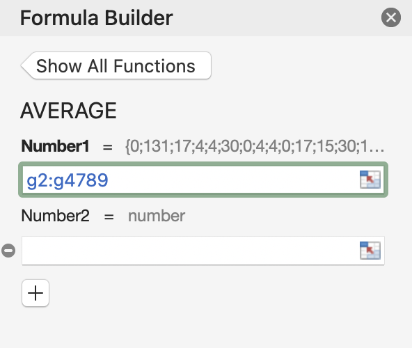
6. The cell now displays the average delay for the month of January

7. The other way to access built in functions is to begin typing the name of the formula In cell M2 of the 2024_Bus_Delays worksheet, type in “Avg_Feb_Delay”, and let’s try this same calculation for the month of February.
8. In this case, once you start typing “=A” a dropdown will appear. Formulas can be typed directly in the cell, or in the formulas bar above.

9. You can double-click on the formula you want. A shadow explanation will show up, helping you understand the formula.
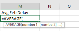
10. Enter the cell range G4766:G8966. Hit Enter on your keyboard to execute your formula. We can now see that February had longer delays on average than January in 2024.

| Formula not calculating? Sometimes when using a formula, Excel will show you that formula instead of the results. Check to make sure the data type in your cell is not set to text. If it isn’t, you might have accidentally enabled the “Show Formulas” button on the Formulas ribbon - select this again to turn it off. Finally, check your formula for any typos. A single space before the = sign will mean that Excel won’t recognize your entry as a formula! |
Calling Data from Other Worksheets
1. Let’s explore another mathematical function in Excel. Say we want to count how many times each bus route logged a delay in 2024. So, we want to know how many rows have 127 (ie. Bus #127) in column B “Route” of our 2024_Bus_Delays worksheet, to determine which bus routes suffered from the most delays. We can do this using the COUNTIF function. This function counts the number of cells that meet a criteria that we set.
2. Let’s start by creating a new worksheet in our workbook. While still in 2024_Bus_Routes, click the + button beside the worksheet names. A new sheet will automatically appear after your active sheet in the workbook.

3. Two finger click on your new sheet and select Rename. Rename the worksheet Total_By_Route.
4. Go back to the 2024_Bus_Delays worksheet. Select all of column B, “Routes”, by clicking on column header B. Copy the contents of your selection. Now go back into Total_Bus_Delays and paste the copied cells into A1.
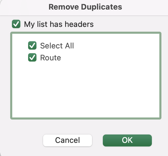
5. We’ll now want to remove duplicate values, so that each bus route appears only once. With your pasted cells still selected, navigate to the Data ribbon. Under the Data Tools toolbox, select Remove Duplicates.

6. Ensure that the correct column is selected. Make sure to leave “My list has headers” checked, and click OK. Excel will confirm the duplicates have been removed, and that 200+ unique values remain.
7. In cell B1, create a new column called “Total_Incidents”. Now let’s start typing our COUNTIF formula in cell B2. Remember, you can type this formula directly in the cell, or in the formulas bar at the top of your worksheet.
8. The COUNTIF function requires only two inputs: the range and the criteria. The range is the cells that you want to count (ie. where to look for matches, each match = 1 count) based on the criteria (ie. what you’re looking up).
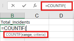
9. In this case, our range is all cells in column B of the 2024_Bus_Delays worksheet, since each entry represents a reported delay on that route. Since this data is in another worksheet, we’ll need to add “worsheet_name!” immediately before our range. Hint: there are 50,040 rows in our 2024_Bus_Delays worksheet.
10. When you’ve finished typing in your range, add the comma as shown in the shadow explanation. Our criteria in this case is the value of cell A2 - this is what we want Excel to look for and count in our range. Type A2 and close the formula using parentheses.
11. Hit Enter. You should now see that route 89 had 515 delays in 2024.

12. Now we want our calculation to apply to the whole column so that we know the total number of delays for each bus route. To do this, select cell B2 then place your cursor over the bottom right corner of cell B2; you will see the cursor become a small black cross. Click and drag down the whole column (until the data ends in column A). You should see the formula but the row numbers should refer to that row’s data.
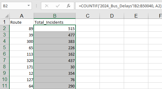
13. Let’s double check our results. Select any cell after row 2 in Column B. You’ll notice that our criteria has changed - which we want. But so has our range! This will cause issues, as the COUNTIF function is now skipping rows near the top of our worksheet.

14. To fix this, we’ll need to lock our cell values. If you need a cell reference to stay unchanged when copying down a formula, you can add the '$' symbol to the cell references in the formula. This will lock those cells in place.
15. Let’s change our original formula in A2. You’ll need to add the ‘$’ symbol before both the column and row number, to lock both in place.

16. Drag your new formula down. When you drag this formula down, the criteria changes but the range value will be locked in.

Nested Functions
1. Let’s dive a bit more deeply into Formulas. What if you want to calculate or check multiple things in a single line? In these cases, you’ll need to nest your formula. We’ll explore this using another common formula in Excel, the IF function.
2. The IF function isn’t a math function, but a logical function. Logical formulas return either TRUE or FALSE when their arguments are evaluated - they are extremely useful tool to have at your disposal! A full list of these functions is available from Microsoft.
3. The IF function is used when we want to test IF a condition is true or false, and return one value if the condition is met (TRUE) and another value if it is not met (FALSE). The IF function takes three inputs: the logical test, the value if True, and the value if False.
=IF(A1>30, “High Temperature”, “Low Temperature”)
4. Let’s say we want to manage several conditions though, with several possible TRUE answers. For example, we may want temperatures equal to or greater than 30 to be defined as “High Temperature”, anything greater than or equal to 20 to be “Warm Temperature”, anything greater than or equal to 10 to be “Average Temperature”, and anything under 10 to be “Cool”. In this case, we can use a nested function. Each subsequent IF formula is incorporated into the “value_if_false” argument of the previous IF. So, this formula works as follows:
Test condition1, if True return result1, if False:
    Test condition 2, if True return results2, if False:
        Test condition3, if True return result3, if False:
            Return Result 4
5. In the case of our temperature data, we might write something like:
=IF(A1>=30, “High Temperature”, IF(A1>=20, “Warm Temperature”, IF(A1>=10, “Average Temperature”, “Cool”)))
6. Formulas are evaluated in order from left to right, so in this case we don’t need to worry about setting a minimum value - the action on a cell is complete as soon as a condition is met. This means that if a cell has already been given the value “High Temperature”, the formula does not move on to check the next condition!
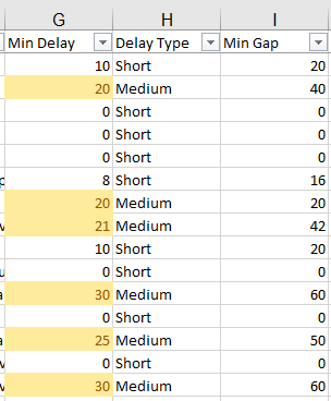
7. Let’s try this with our TTC data. In the 2024_Bus_Delays worksheet, let’s add a column that identifies if a delay is short, medium or long using a nested IF function.
8. For this function, we want any Min_Delay under “15” to be Short. Anything between “15-30” is Medium. And anything over “30” is Long.
9. First, let’s create a new column. We want it to appear immediately to the right of Min_Delay. To create a new column there, we need to select column H (Min_Gap). Then two finger click, and choose “Insert”. When you use the “insert” option, the new column is always inserted immediately to the left of the selected column. Let’s name our new column Delay_Type.
10. Now place your cursor in cell H2. We want to use the IF function to assign labels based on the length of delay. If none of those values are found (ie. our Min_Delay cell was empty), we want to return the value “Unknown”. You can type your formula either in the formulas bar, or directly in cell H2. Tip: There are several ways to type this formula correctly!

11. Hit Enter once your formula is complete. You should now see “Short” in cell H2.
12. Since we have a lot of rows, dragging this formula down 27000 rows might take a while. A quick shortcut in Excel is to select the bottom right hand corner of cell H2, but instead of holding and dragging down with your cursor, simply double click with your mouse.
13. Our Delay Type column has now been populated with values in all cases. Nicely enough, this information lines up with the conditional formatting we applied earlier!
Charts
1. While calculations like averages help us understand our data, charts are very useful for understanding multiple dimensions of our data. Let’s generate some charts for our TTC data, by building on some of the formulas we explored in the previous section.
2. We’ll start by creating a simple line chart that shows us the change in TTC Revenue between 2020 and 2024. Line charts are one of the most commonly used chart types. They’re useful for showing data changes over a period of time. A line chart is made up of several points linked by straight lines. It’s comprised of two axes called the “x-axis” and the “y-axis”.
3. Let’s go to our 5Y_Revenue worksheet. Select the relevant columns and rows, including column and row names. To select columns that are not right beside each other, make your first selection, and then hold down the Command key to shift to another group of cells.

4. Just like with functions, Excel can help us automate tables. From the Insert tab on the ribbon, within the Charts section, select the first option under the line charts logo. A shadow box with more information about each chart type will appear as you hover over it.
5. As soon as you click the button, the chart appears within the worksheet. Excel will use the column and row names to label the chart and axes.
6. The chart isn’t bad, but we should do a few things to fix it up. First, there isn't a title, so let's add that to our chart. From the Chart Design tab on the ribbon, select Add Chart Element. This allows you to add new title to your chart. Let's select In the chart, click on the chart title to select it, then click once more to edit it. Change it to “TTC Revenue, 2020, 2022, 2024”.
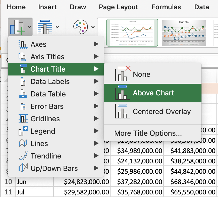
7. Next, from the Chart Design tab on the ribbon, select Add Chart Element. This allows you to add new axis title to your chart. Let's select Axis Titles, Primary Horizontal (X-axis) or Primary Vertical (Y-axis). This allows you to add new axis title to your chart. We can label the Y-axis “Total Revenue in $CAD”, and the X-axis “Month”.

8. Next, look up at the ribbon. Notice that when we added this chart, two new tabs appeared on the ribbon, marked as Chart Design and Format. These will only show when you have your chart selected; if you click elsewhere in the worksheet they will disappear.
9. Next, have a look through the style options. If you find an option you like better, click it to choose it.

10. These ribbons provide you with the same options we were just looking at for adding chart elements and changing chart styles, this is just another method for editing your chart. The Design ribbon also provides a few extra options, such as changing the chart type or transposing your data. The Format ribbon provides some formatting options, though we generally prefer to work with the panel that pops up to the right of the worksheet when formatting chart elements.
Pivot Tables and Pivot Charts
1. Pivot Tables and Pivot Charts are another way to graphically represent and analyze your data.
2. A Pivot Table allows you to make sense of a large, detailed data set. It’s a summary of your data that lets you group your data in different ways and explore trends in your information. Pivot tables are particularly useful if you have long rows or columns that hold values you need to track the sums of and easily compare to one another. They can help you draw helpful conclusions more easily, compared with writing a bunch of individual formulas
3. While a standard chart is linked directly to worksheet cells, Pivot Charts are based on their associated Pivot Table's data source.
4. The "pivot" part of a pivot table stems from the fact that you can rotate (or pivot) the data in the table to view it from a different perspective. To be clear, you're not adding to, subtracting from, or otherwise changing your data when you make a pivot. Instead, you're simply reorganizing the data so you can reveal useful information from it.
5. For example, we may want to use a pivot table to analyse our 2024_Bus_Delays data. Let’s say we want to easily understand which routes have the most delays overall, or in a given month or day of the week. We might also want to see how much individual amounts—such as a single incident type — contribute to a total amount— such as the total number of incidents resulting in TTC bus delays.
6. Let’s highlight the cells we’ll need to create our pivot table and chart. Select all of Columns A through to H in the 2024_Bus_Delays worksheet. Often with pivot tables, you'll want to sort your data in some way so it's easier to manage once you turn it into a pivot table. In our case, our data is already sorted by date so there’s no need to resort.
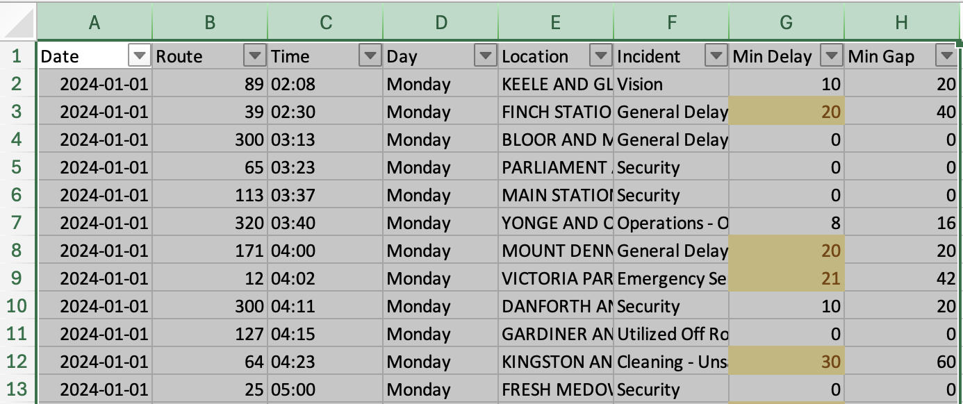
7. From the Insert Ribbon, select Pivot Chart. This will automatically create an interactive chart to accompany our table, that will change alongside our table as we reorganize our data.

8. Note you could also create the table only by selecting Pivot Chart or Recommended Charts from the Insert ribbon. The recommended option will preview some analysis possible with Pivot tables, and pre-arrange your data to present a chosen analysis as a starting point. But today, let’s start by creating a table from scratch, and one that comes with our visualization.
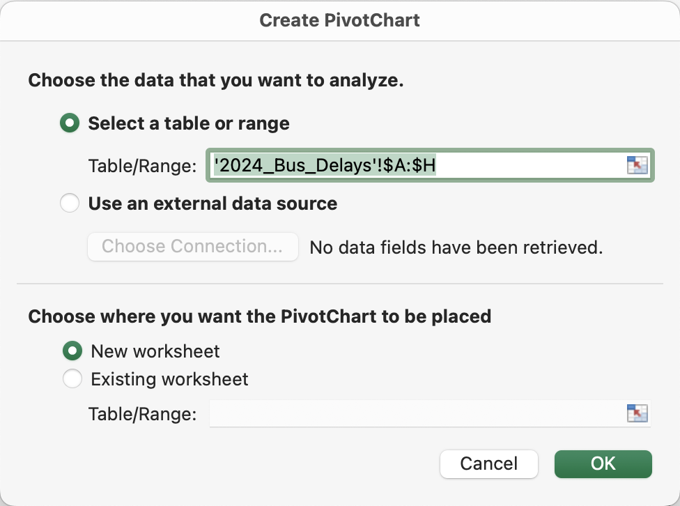
9. You’ll be asked to confirm your data range, which should match your selection. You’ll also be asked to choose where you want the PivotTable to be placed. Select “New Worksheet” and click OK.
| Note: If you're using an earlier version of Excel, "PivotTables" and “PivotCharts” may be under the Tables or Data ribbon, rather than Insert. In Google Sheets, you can create pivot tables from the Data dropdown along the top navigation. |
10. Excel has now created a blank Pivot Table in a new sheet and the start of our workbook.
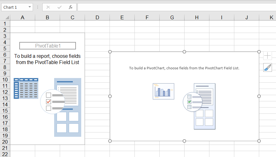
11. At the very right of the window, you should see a section entitled PivotChart Fields, which contains all the column titles for the data we had selected from the 2024_Bus_Delays worksheet to create our Pivot Table and Chart. This is the area where we’ll work with the data to analyze it in our Table and Chart.
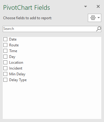
12. With your pivot table selected, let’s take a look at some additional areas of our PivotTables Field List. Any fields in your list can be dragged and dropped into any of the 4 areas or sections OR can be selected. If you select a field, Excel will by default add non-numeric fields to the Rows area, and numeric fields to the Columns Area.
13. Click on the Pivot Chart, to select it. You’ll note that when a Pivot Chart is selected, the area names change — Rows becomes Axis (Categories) and Columns becomes Legend (Series).
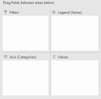
14. We can place a field into the ∑ Values area to summarize our PivotTable by that field (by default it uses the =sum function).
15. The Filters area can be used if you want to provide an option to filter your data by any given field without adding it to your table.
16. You’ll also notice two new tabs appear on the ribbon when your Pivot Table is selected, marked as Analyze and Design. There is also a Format tab when your Pivot Chart is selected (These will only show when you have your table or chart selected; if you click elsewhere in the worksheet they will disappear).
17. Let’s say we want to determine which bus routes have the most delays. Select Date from the Field List, and drag it into the Rows section.
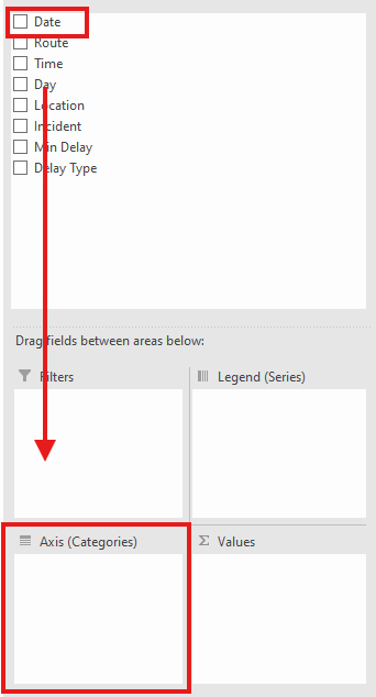
18. We now have a quick view of all the months we have in our data. You’ll notice that this data is now represented on both our table and chart.

19. You’ll also see that Excel has created a Month Field from our Date Column. This is an automatically calculated summary field that is now available for you to use in the PivotTable.
20. Since we prefer to analyze the data by month instead of date, let’s remove “Date” from our Rows area, leaving only the Month field that Excel has created for us. We can do this by either dragging the field out of the box, or clicking the drop down arrow beside the field name in Rows, and selecting “Remove Field”

| Group by Dates If you would like to aggregate date data in other ways for analysis, you can group these by selecting any date on your Pivot Table. Two finger click, and select “Group”. Any aggregate that you select will be automatically added as a new field to your Field list, and to the area your field is currently in (for example, Rows). |

21. We also want to be able to analyze the day of the week in our report. Take Day and drag this into the Rows area. Now you can see the Month, and each of the days under that month.

22. You can expand and collapse the different sections by clicking on the + - beside each, or expand or collapse all fields under the PivotTable Analyze Ribbon. Note that when you expand sections in your table, the data in your Chart will adjust as well!

23. Drag the Route field over to Columns. So now we have a blank table and chart containing Months, days and TTC bus routes.
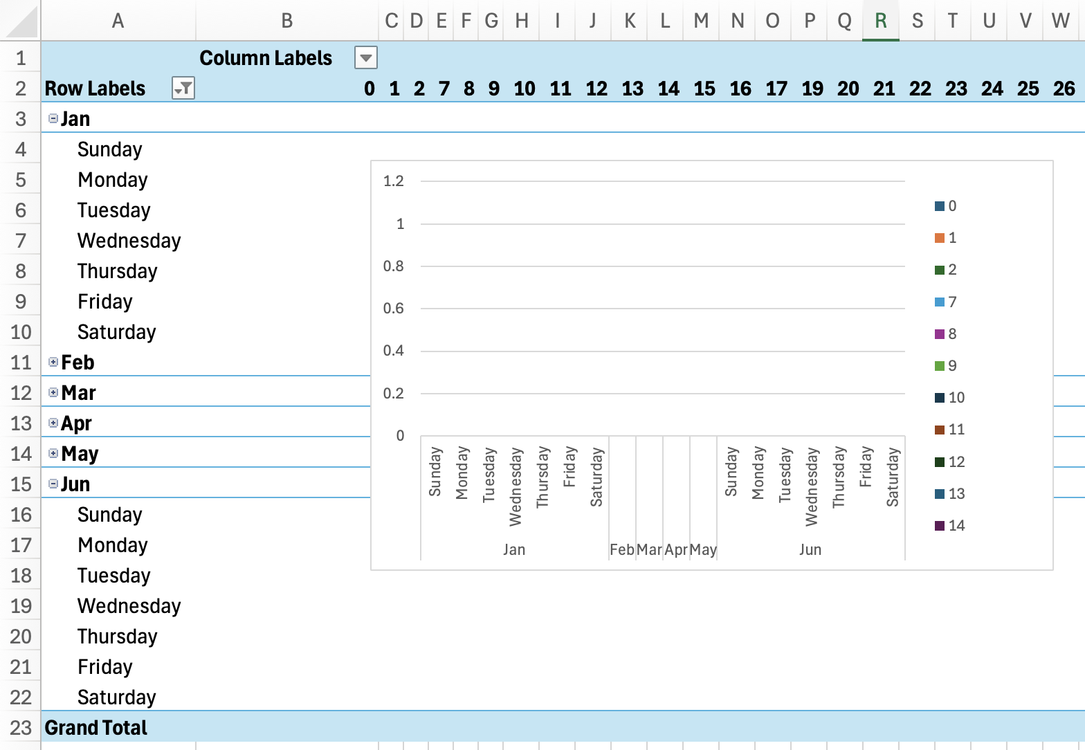
24. We have our x and y values (our axis), but we don’t have any data inside of them ie. we’re not summarizing our data by any value. Say we want to know how many minutes of delays were reported in a given month and on a given day of the week for each route - we want a sum or total of minute delays. Take Min_Delay and pull that into the Values box.
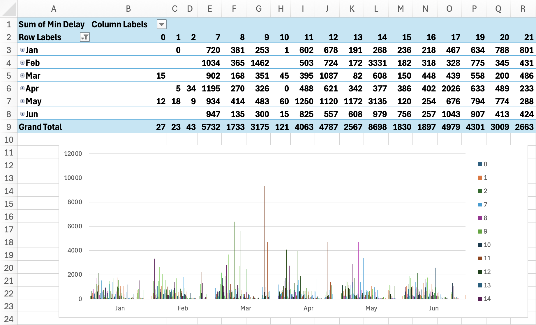
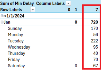
25. What this has done is it’s set our table to sum by that Value, or the total number of minute delays. So, for example, we can quickly see that the #7 Bus had 1640 minutes of delays in January, and looks like Saturdays are not a great time to be relying on that route…
26. Our table and chart also seem to contain some values that aren’t helpful at all. You’ll notice on both our table and our chart that all the fields have downward arrows beside them. This will allow you to further sort or filter those values, exactly as we did earlier in this workshop. Select the downward area beside the Row Labels in the Pivot Table, or Months on your Pivot Chart. Unselect the values “<1/1/2024” and “>11/1/2024”.
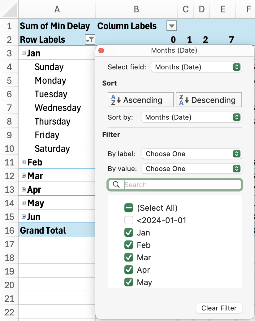
| Note: Instead of using filters, you could also remove these values by removing them from the source data ie. our 2024_Bus_Delays worksheet. After editing the sheet, you’ll need to select “Refresh” from the PivotTable/Chart Analyze Ribbon |
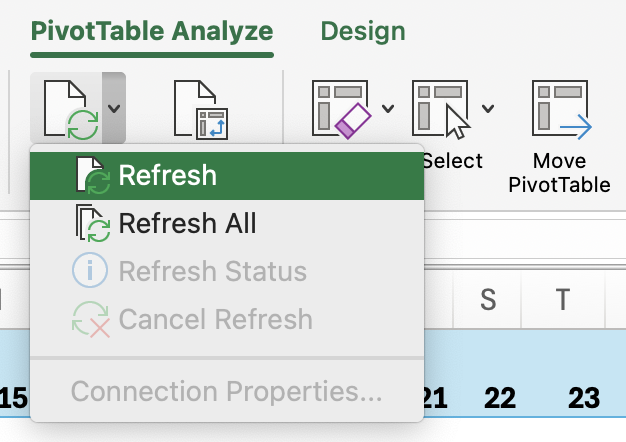
27. Next, let’s take a look at our chart - it’s also struggling to display this much information in a single view! Let’s help it out a bit. Select the downward area beside the Column Labels on the Pivot Table, or the Route label in your Chart. Select “Value Filters” and “Top 10…”
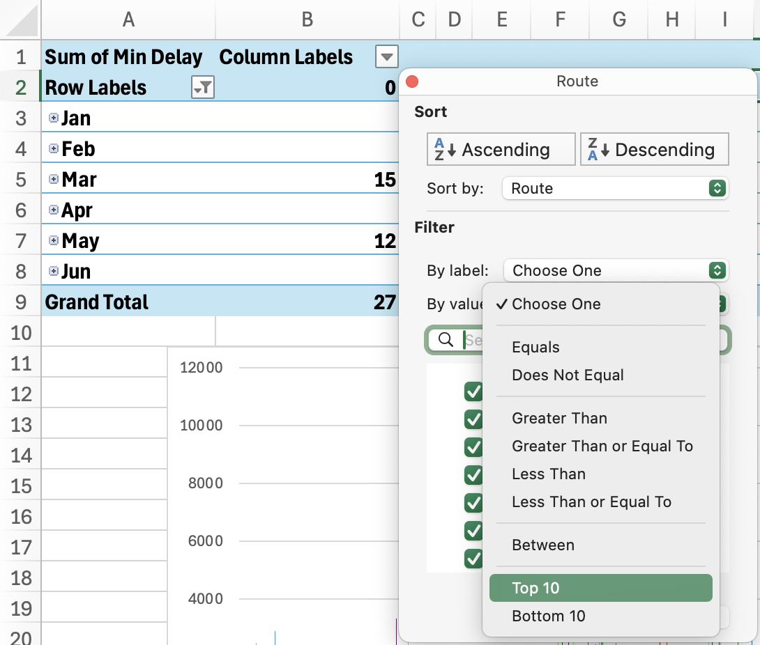
28. In the pop-up window that appears, choose top 10 Items by “Sum of Min Delay”.

29. Our Chart (and our Table) have now been filtered to show only the 10 Bus Routes with the most total minute delays in 2024. This is a lot more useful!
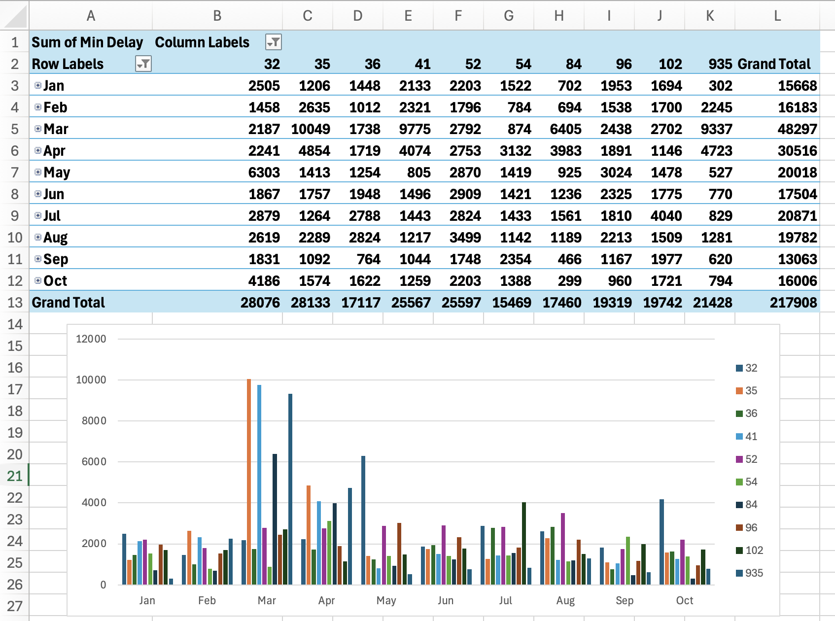
30. Let’s say, however, that we’re not interested in the total or sum of minute delays, but how many delays each route reports. So, for example, we don’t want to know that the #32 bus had 28076 minutes of delays - we want to know that it had 1175 delays in total.
31. Click the 'i' icon beside the Sum of Min Delays in the Values box to set the Value field.

32. This presents us with a popup that contains a number of options. We can re-label our Value; Change what we’re summarizing our value by; or show our value in a different way such as a percentage. Under “Summarize Values By” select Count. Click OK.
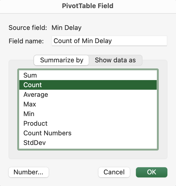
33. Our Table and Chart have now been updated to show the Routes with the top 10 total number of incidents, which you’ll notice is quite a different result (although some of the same routes are still in our top 10).
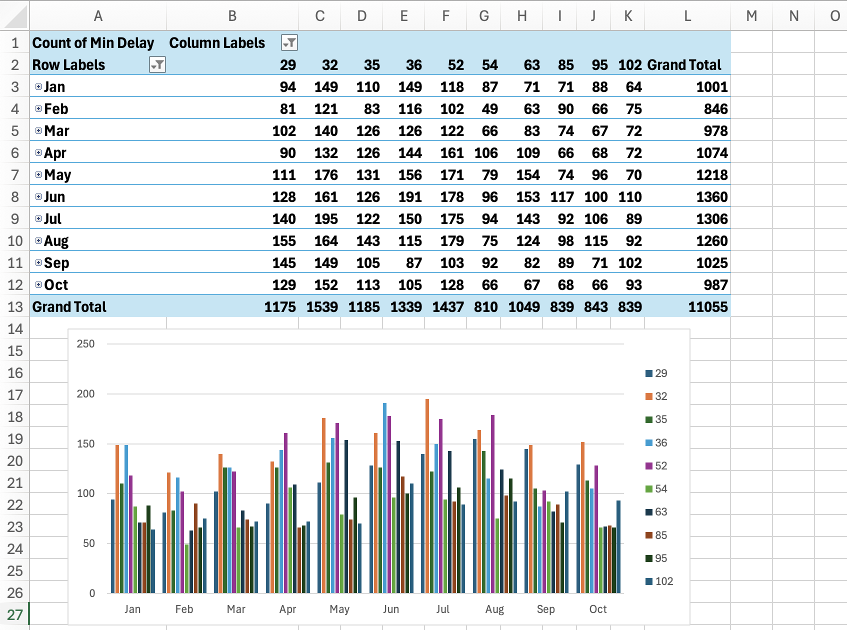
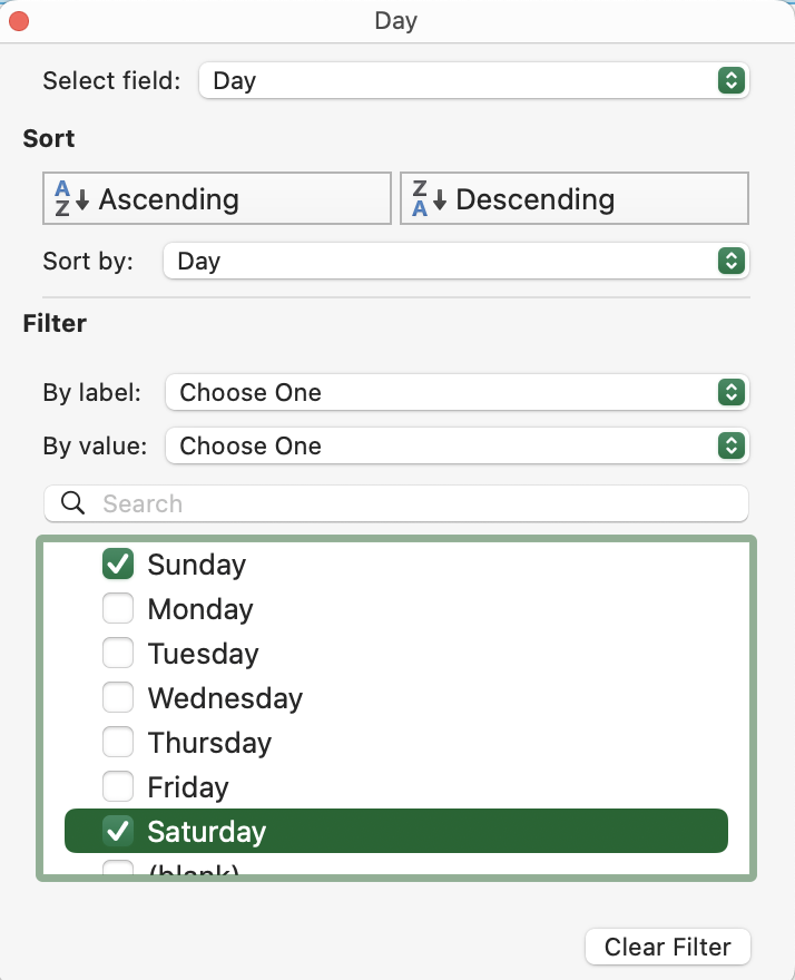
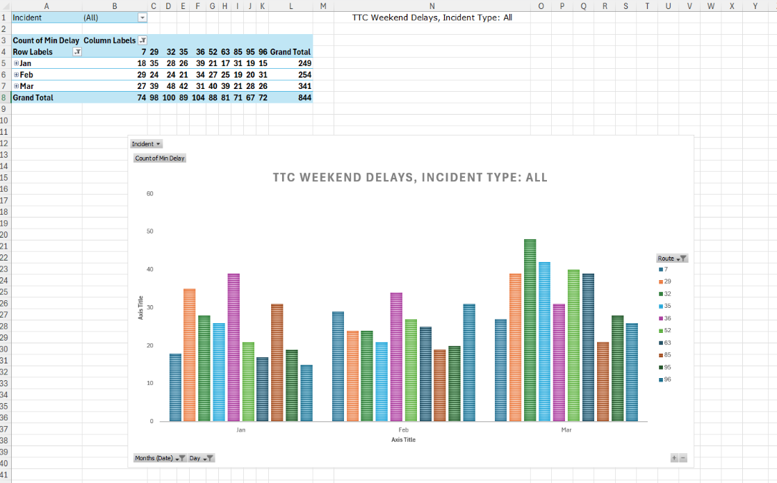
34. Let’s filter the data further to show the routes with the more delay incidents reported during the weekend (Sat, Sun) in the Winter of 2024 (Jan, Feb, March). Click the filter icon arrows on your chart to filter for only these data. Select OK for each filter when done. Our Chart and table is now only showing us the top 10 routes with the most incidents reported on these days.
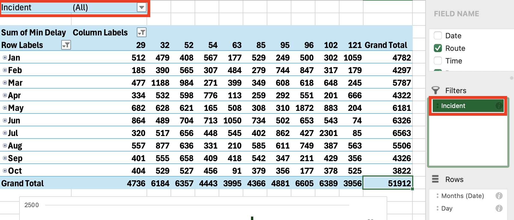
35. Now, let’s add a couple of filters to our Table and Chart. This will allow anyone interacting with the chart to quickly filter the data, without us needing to add these fields to our chart axes. Drag and drop “Incident” into the Filters box.
36. The filter has appeared at the top of our chart. Now we can, for example, see only the top 10 bus routes impacted by “Diversion” delays.
37. Finally, let’s say we want to add a title to our Chart that includes this incident information. We want a dynamic title that reflects the incident type we are filtering for. We can do this using an IF formula!
38. Select an empty cell at the top of your worksheet below your table (for example, E1) and type the function below:
="TTC Weekend Delays, Incident Type: "&IF(B1="(All)", "All",IF(B1="(Multiple Items)", "Multiple", B1))
39. The formula starts with a text string, "TTC Weekend Delays, Incident Type: “. The ampersand operator ( & ) joins that string with the text that follows it.
40. Our nested IF formula ensures that the ending of our string depends on what is selected in the pivot table’s Region filter:
| a. If ALL incident types are selected, the formula ends with “All” |
| b. If multiple incident types are selected, the formula ends with “Multiple” |
| c. If only one incident type is selected, that incident type, in cell B1, is shown. |
41. Once you’ve entered your formula, hit Enter. Our cell is now showing “Incident Type: All”

42. Next, let's add a chart title. From the Design ribbon, select Add Chart Element, Chart Title, Above Chart.

43. Click on your Chart Title to adjust. With your chart titles selected, in the formulas bar type = and select the cell containing your formula. Hit Enter. Your Chart Title will now adjust as we select / filter for different Incident Types.
| Text Styling Note Double clicking on any section of your chart, either the image or the text, will open a Format Data Series tab on the right side of your screen. This will allow you to adjust the colours of your text, as well as other styling options such as applying borders or shadows. |
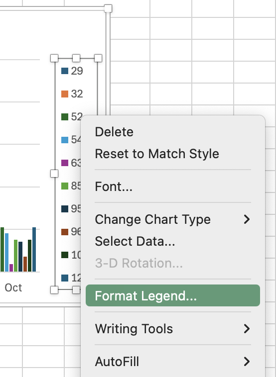
44. You did it! We now have an interactive Pivot Table and Pivot Chart that we can use to quickly analyze what buses have the most delays on any day of the week, and why.
Learning More
If you want to gain even more advanced Excel skills, here are a few resources you may find useful:
- The Bridge at UTSC has an excellent series of video tutorials
- LinkedInLearning, available from the Toronto Public Library (you need to have a valid library code to access - this is free!) also has some excellent workshops. Search for Excel workshops, there are a wide range of them, for all versions of Excel
- Contact the Map & Data Library for further assistance at mdl@library.utoronto.ca